The kitchen serves as the heart of the home, where families gather to cook, eat, and share their days. Choosing the right kitchen colour palettes directly impacts how welcoming this central space feels to you and your guests.
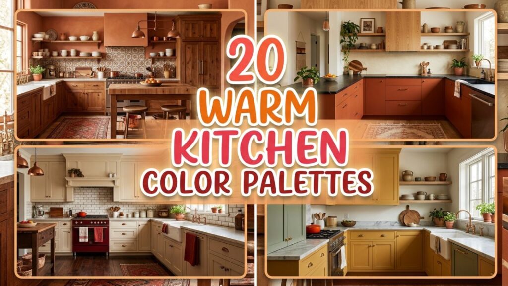
While cool tones have dominated design trends in recent years, a shift toward warmer, cozier shades is transforming how we experience our cooking spaces. Warm colors absorb light beautifully, create an inviting atmosphere, and make large rooms feel more intimate.
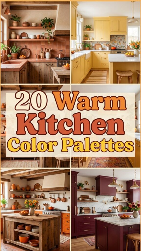
In this guide, we explore twenty exceptional color combinations designed to bring warmth and comfort to your home. You will learn how to pair different shades, balance dark and light tones, and select the perfect complementary materials. Whether you plan a complete renovation or a simple weekend painting project, these palettes offer practical inspiration for a space you will love spending time in.
1. Terracotta and Cream
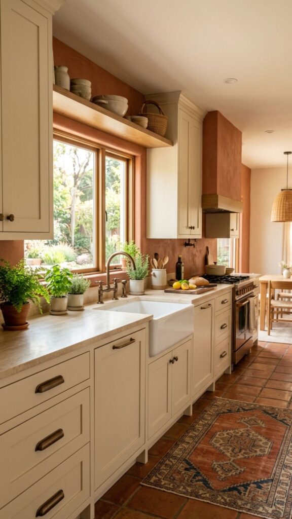
Terracotta brings an earthy, baked-clay richness that instantly warms up any room. When paired with a soft cream, the bold orange-red tones soften, creating a balanced and highly inviting atmosphere. This combination works exceptionally well in spaces with abundant natural light, as the sun enhances the natural warmth of the terracotta.
To implement this look, consider using terracotta for your lower cabinets or a feature island, while keeping the upper cabinets and walls a crisp, warm cream. Add bronze or antique brass hardware to tie the two tones together seamlessly. This approach anchors the room while keeping the upper visual field open and airy.
Popular Kitchen Colour Schemes Involving Clay Tones
Clay tones offer versatility. You can introduce terracotta through painted cabinets, natural tile backsplashes, or even durable floor tiles to ground the entire space.
2. Sage Green and Warm Oak
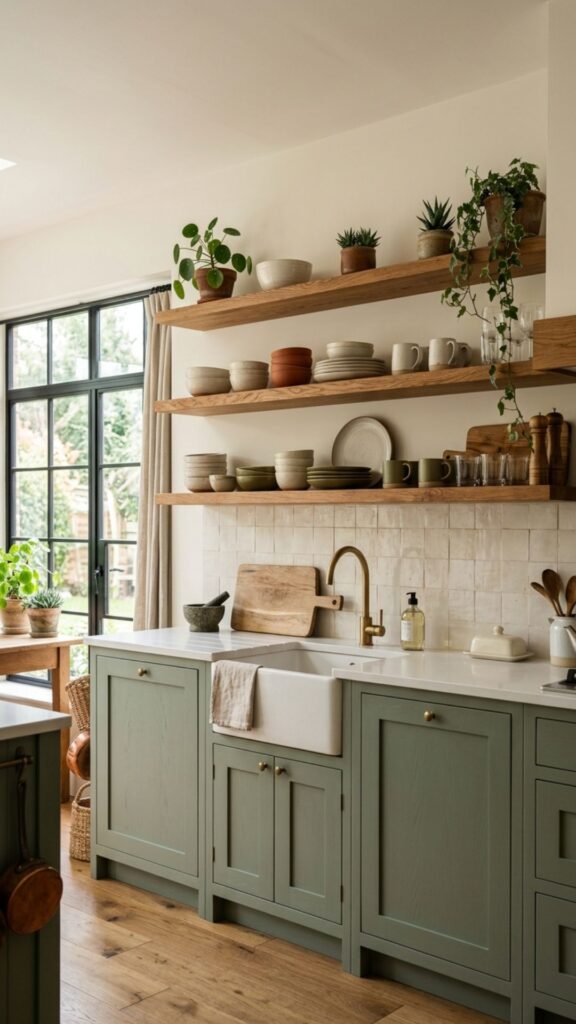
Sage green offers a subtle, muted connection to nature that feels incredibly soothing. Paired with warm oak wood elements, this palette creates a rustic yet refined aesthetic. The yellow undertones in the warm oak bring out the yellow base of the sage green, harmonizing the two materials beautifully.
You can use sage green on all your cabinetry while letting the warm oak shine through open shelving, butcher block countertops, or wide-plank flooring. This pairing minimizes visual fatigue and provides a timeless backdrop for both modern and traditional home styles.
3. Mustard Yellow and Charcoal Grey
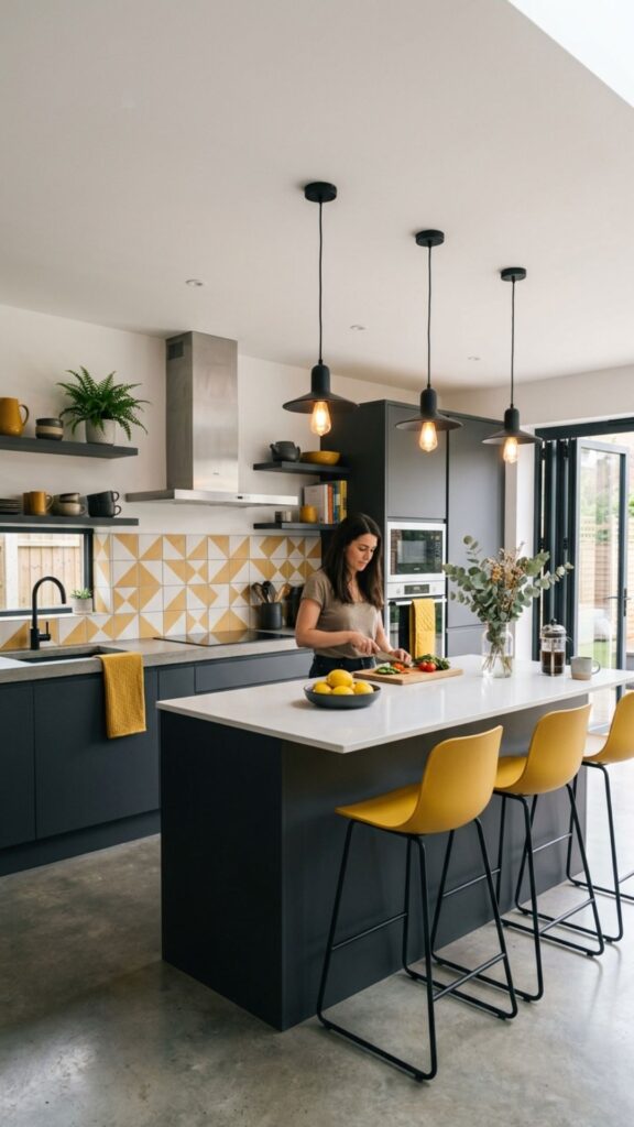
Mustard yellow injects instant energy and joy into a room without feeling overwhelming. By contrasting this vibrant, warm hue with a deep charcoal grey, you create a sophisticated and modern dynamic. The dark grey absorbs light, which allows the mustard elements to pop and take center stage.
Try using charcoal for the base cabinets to ground the room, and apply mustard yellow to an accent wall or the kitchen island. Matte black fixtures and dark stone countertops complete this modern palette, providing a highly tailored and deliberate design.
4. Creamy White and Rich Walnut
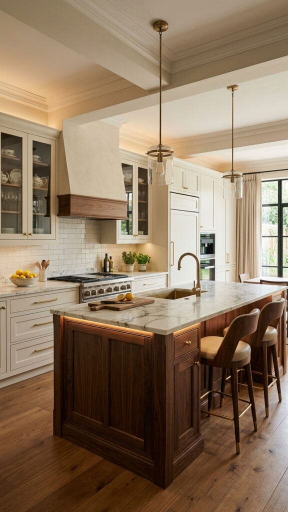
A creamy white palette avoids the stark, clinical feel of pure bright whites. Blending this soft base with rich, dark walnut wood introduces a layer of luxurious warmth and texture. The deep brown grain of the walnut provides a stunning contrast against the gentle white backdrop.
This pairing is perfect for transitional designs. Use creamy white on flat-panel cabinets and walls, introducing walnut through a large central island or custom range hood. The organic texture of the wood ensures the room feels lived-in and comfortable.
Elevating Warm Cabinet Colour Variations
Walnut pairs well with brushed nickel or champagne bronze hardware. Both metals highlight the warmth in the wood grain without clashing with the creamy surroundings.
5. Blush Pink and Matte Black
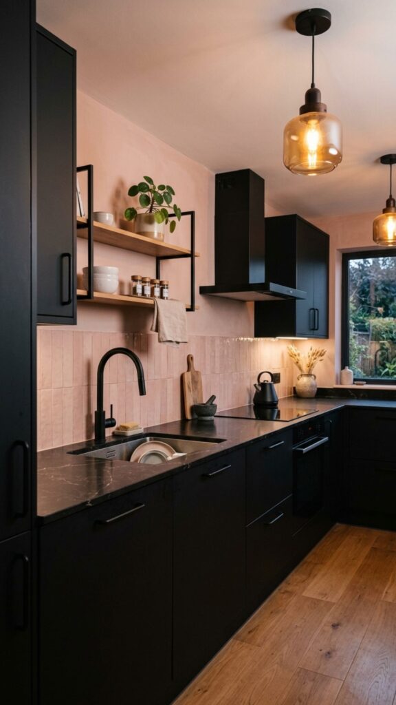
Blush pink has matured into a sophisticated neutral that offers a subtle, rosy glow to your walls or cabinets. Contrasting this delicate shade with matte black accents creates a striking, contemporary environment. The black prevents the pink from feeling overly sweet, anchoring the design with a strong visual weight.
Paint your walls or upper cabinets a soft blush and utilize matte black for hardware, faucets, and lighting fixtures. If you feel bold, black lower cabinets with blush upper walls create a dramatic, moody atmosphere that feels incredibly cozy at night.
6. Deep Burgundy and Soft Beige
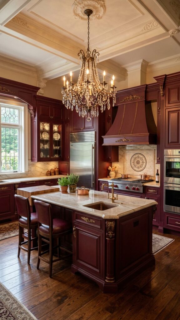
Burgundy carries a deep, wine-inspired richness that feels highly traditional and enveloping. Pairing it with a soft beige neutralizes the heaviness of the dark red, resulting in a balanced and elegant space. This palette echoes classic European kitchens while maintaining modern appeal.
Use burgundy on a central island or lower cabinetry to anchor the room. Keep the surrounding walls, backsplash, and upper cabinets in warm beige tones. A tumbled travertine stone floor or backsplash complements this color pairing perfectly.
7. Espresso Brown and Soft Ivory
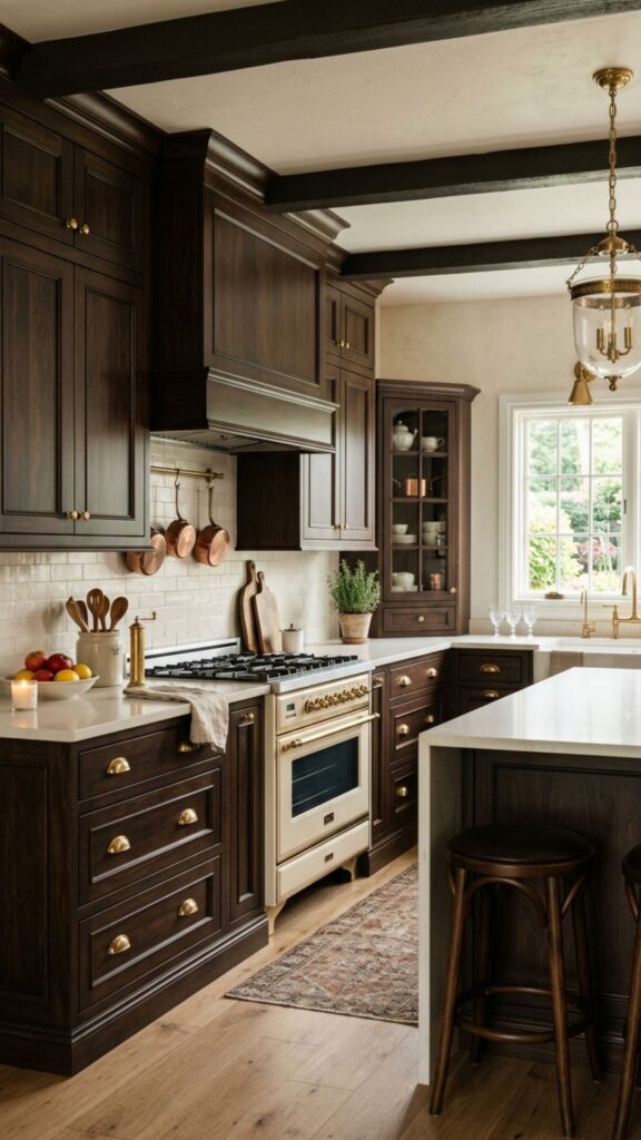
Espresso brown offers a dark, grounding presence that feels just as luxurious as black but with much more inherent warmth. When matched with soft ivory, the contrast is sharp yet inviting. This combination brings a classic, stately energy to your home.
Apply espresso brown to your primary cabinetry and use ivory for your countertops, backsplash, and wall paint. The ivory reflects light around the room, ensuring the dark brown cabinets do not make the space feel small or cramped.
Timeless Kitchen Paint Colours
Brown and ivory schemes rarely go out of style. They provide a neutral foundation that allows you to swap out colorful accessories as trends change.
8. Warm Taupe and Brushed Gold
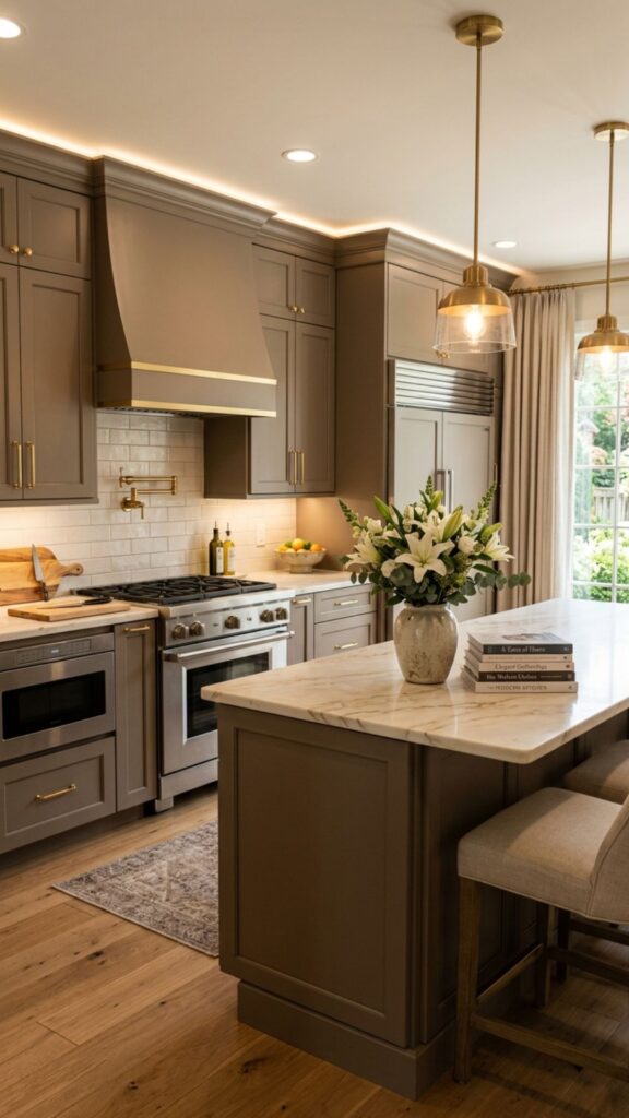
Taupe sits comfortably between brown and grey, offering a highly versatile neutral that flatters almost any light condition. Adding brushed gold accents elevates the taupe, highlighting its warm undertones and adding a touch of glamour.
Paint all cabinetry in a mid-tone taupe to create a cohesive, wrap-around effect. Install brushed gold cabinet pulls, a statement faucet, and matching pendant lights. This combination feels incredibly upscale while remaining understated and relaxing.
9. Olive Green and Copper
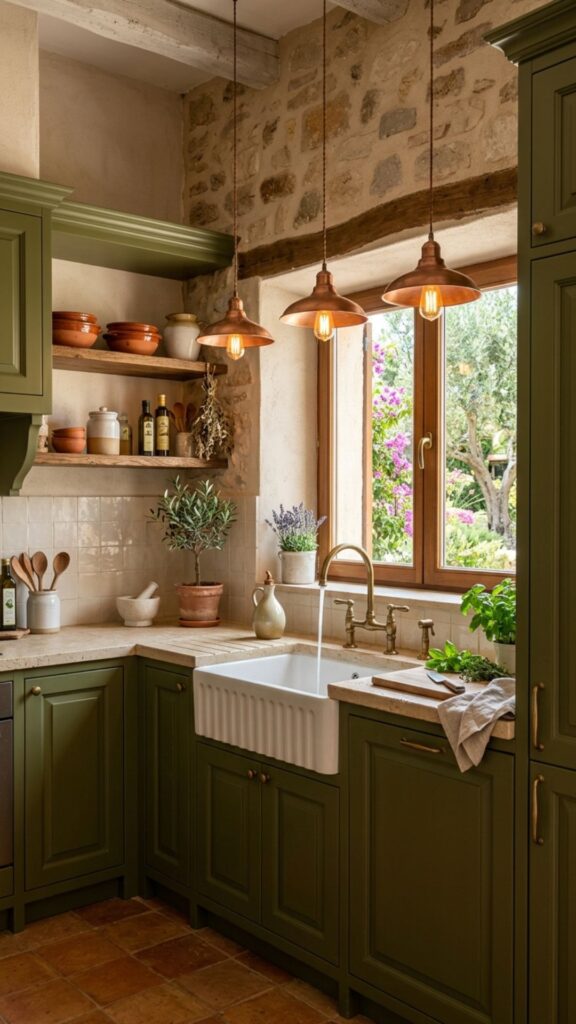
Olive green brings a deep, Mediterranean warmth to the home. Pairing it with reflective copper elements creates a glowing, dynamic environment. As copper ages and develops a patina, it adds character and history to the olive backdrop.
Use olive green on shaker-style cabinets and introduce copper through lighting fixtures, a farmhouse sink, or an exposed cookware rack. Natural stone countertops with subtle green or brown veining help tie this earthy palette together.
10. Burnt Orange and Navy Blue
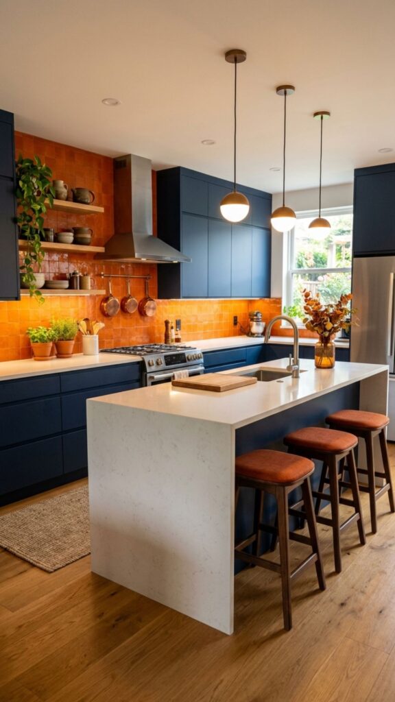
Burnt orange and navy blue are complementary colors on the color wheel, making this a highly energetic yet balanced pairing. The deep navy provides a sophisticated, moody foundation, while the burnt orange injects a vibrant, cozy warmth.
Consider navy blue cabinets paired with a burnt orange tile backsplash or orange upholstered bar stools. The rich blue absorbs light, while the warm orange accents draw the eye, making the room feel dynamic and layered.
Bold Cozy Kitchen Hues
When using bold complementary colors, balance is key. Let one color dominate the space while using the other strictly as a strategic accent.
11. Soft Peach and Warm Grey
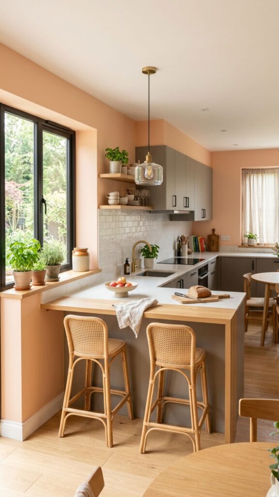
Soft peach brings a sunny, gentle warmth that feels cheerful and uplifting. Pairing it with a warm grey prevents the room from looking overly pastel or dated. The grey grounds the peach, offering a sophisticated, modern edge.
Paint the walls a soft peach and opt for warm grey cabinetry. Light oak flooring and white quartz countertops work beautifully here, keeping the overall aesthetic light, airy, and inviting for morning coffee routines.
12. Cocoa Brown and Cream
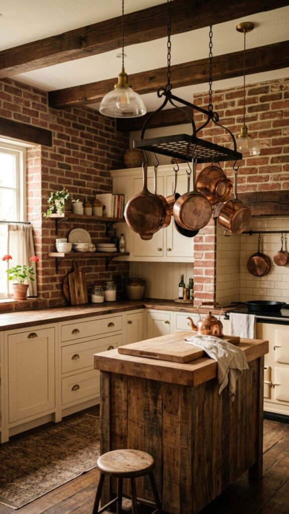
Cocoa brown is softer and lighter than espresso, offering a milk-chocolate hue that feels incredibly comforting. Paired with cream, this palette resembles a warm beverage, bringing an immediate sense of relaxation to the space.
Use cocoa brown for the lower cabinets or a built-in pantry unit, keeping the rest of the room wrapped in cream. This combination pairs beautifully with rustic elements like exposed brick walls or reclaimed wood beams.
13. Deep Plum and Warm White
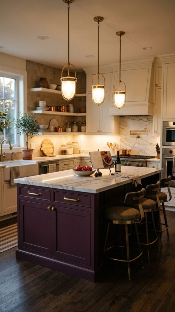
Deep plum offers a luxurious, velvety depth that feels highly dramatic and cozy. Pairing it with a warm white ensures the room remains bright and functional. The purple undertones in the plum add a unique, sophisticated flair to the home.
Apply plum to a feature island or base cabinets to ground the design. Use warm white for the countertops, upper cabinets, and backsplash to reflect light. Brass hardware looks particularly stunning against a deep plum background.
Sophisticated Kitchen Wall Colours
Plum serves as an excellent wall color for a dining nook adjacent to the kitchen, creating a distinct, intimate zone within an open-concept space.
14. Caramel and Charcoal
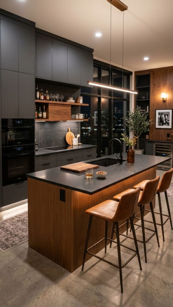
Caramel brings a sticky, golden warmth that feels inherently cozy and rich. Pairing caramel tones—often through natural wood or leather—with a deep charcoal creates a masculine, tailored, and highly comforting environment.
Use charcoal for your primary cabinetry and introduce caramel through a butcher block island, leather bar stools, or woven light fixtures. The contrast between the dark grey and the glowing amber tones creates a visually striking space.
15. Brick Red and Sand
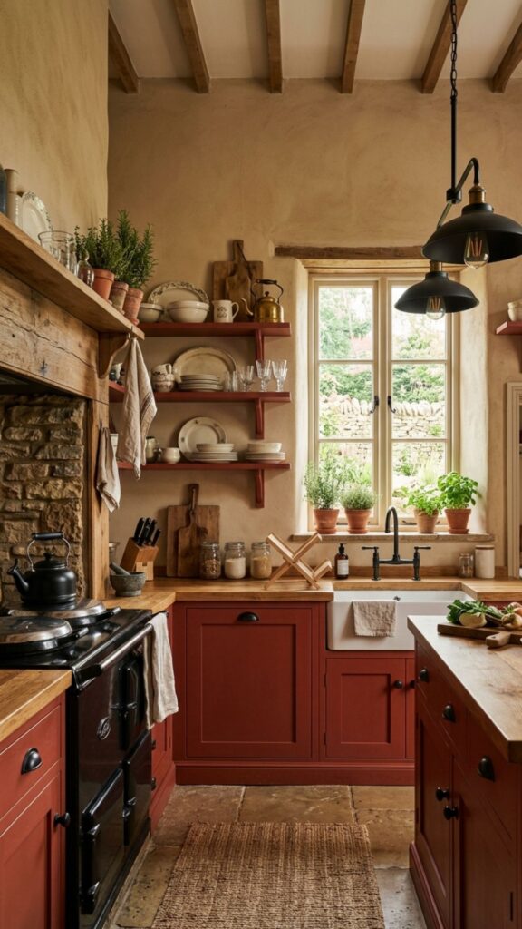
Brick red carries a weathered, rustic warmth that feels incredibly homey. Pairing it with sandy neutrals tones down the intensity of the red, creating a relaxed, farmhouse-inspired aesthetic.
Incorporate brick red through an actual exposed brick backsplash or painted base cabinets. Use sand-colored paint for the walls and upper cabinets. Natural stone floors and matte black hardware complement this rustic palette perfectly.
16. Spiced Pumpkin and Off-White
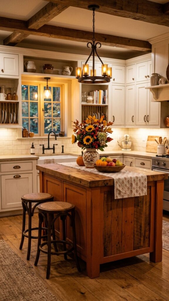
Spiced pumpkin is a muted, earthy orange that brings autumnal warmth indoors year-round. Paired with off-white, it feels cheerful and welcoming without overwhelming the senses.
Use this spiced orange tone on an accent wall or the kitchen island. Keep the remaining cabinetry and walls off-white. This palette works exceptionally well in cottage-style or vintage-inspired homes.
Warm Kitchen Island Palettes
Painting just the island in a vibrant hue like spiced pumpkin allows you to experiment with warm tones without committing to a full-room color change.
17. Warm Greige and Muted Gold
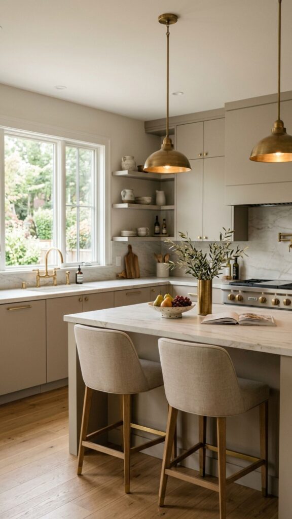
Greige combines the best of grey and beige, offering a highly adaptable neutral with distinct warm undertones. Pairing greige with muted gold creates an elegant, monochromatic look with a subtle metallic lift.
Paint all cabinetry and trim in the same greige tone for a seamless, built-in look. Add muted gold cabinet hardware and a gold-toned faucet to break up the neutral base and add points of visual interest.
18. Goldenrod Yellow and Slate Grey
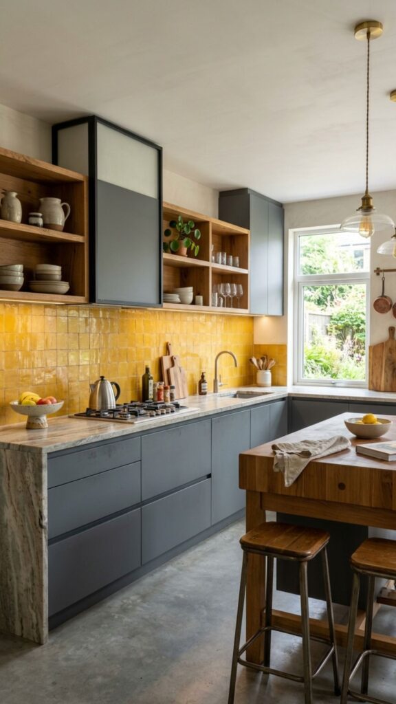
Goldenrod yellow is deep and earthy, offering a more subdued take on traditional yellow. Slate grey provides a cool, stony contrast that balances the warmth of the goldenrod perfectly.
Use goldenrod for a colorful tile backsplash or painted open shelving. Slate grey cabinets provide a beautiful, neutral foundation. This combination feels highly organic and grounded in nature.
19. Dusty Rose and Natural Birch
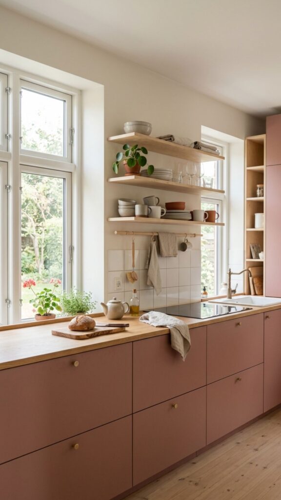
Dusty rose brings a muted, vintage-inspired warmth to the home. Pairing it with pale, natural birch wood creates a soft, Scandinavian-inspired environment that feels serene and cozy.
Paint the lower cabinets a dusty rose and use clear-coated birch for the upper cabinets or open shelving. Light concrete or white solid-surface countertops keep the aesthetic clean and minimal.
20. Rust and Forest Green
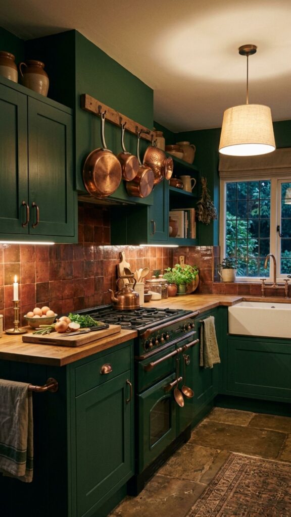
Rust and forest green combine two of nature’s warmest, most grounding hues. This combination feels incredibly lush, rich, and enveloping, perfect for creating a moody, intimate cooking space.
Use forest green for the cabinetry and introduce rust through a patterned runner rug, copper pots, or a rust-colored tile backsplash. Dark wood floors help tie these two rich colors together beautifully.
Conclusion
Creating a cozy, inviting home starts with selecting the right colors for your most-used spaces. The warm kitchen colour palettes we explored above offer endless opportunities to infuse your personality and comfort into your cooking area. By carefully balancing rich, warm hues with complementary neutrals and appropriate materials, you can design a space that feels both stylish and highly welcoming.
Now is the perfect time to evaluate your current space and imagine the possibilities. Grab a few paint swatches, test them against your cabinets and walls, and observe how they change in your home’s natural light. Start your kitchen transformation today by choosing a palette that truly makes your house feel like home.
What makes a kitchen colour palette feel warm?
Warm palettes typically feature colors with yellow, orange, red, or brown undertones. These hues absorb light and create a sense of closeness and comfort, unlike cool tones (blues and stark whites) which can feel distant and clinical.
Can I use warm colours in a small kitchen?
Yes. To keep a small space feeling open, use a warm neutral like cream, greige, or soft peach for the walls and upper cabinets. Reserve darker warm tones like terracotta or plum for base cabinets or small accent pieces to ground the room without shrinking it.
Which cabinet colours go best with warm oak floors?
Warm oak floors pair beautifully with sage green, creamy white, navy blue, and warm taupe. These colors highlight the natural yellow and amber undertones in the oak without clashing.
How do I transition from a cool kitchen to a warm one without renovating?
You can warm up a cool space by changing your cabinet hardware to brass or copper, adding warm-toned runner rugs, displaying wooden cutting boards, and painting just the walls in a warm beige or soft terracotta.