The colour on your bedroom walls does more than you think. It shapes how you feel the moment you walk in, how relaxed you get at night, and even how close you feel to your partner. The right shade can turn an ordinary room into a warm, intimate retreat that’s just for the two of you. The wrong one can leave the space feeling cold, busy, or strangely uninviting.

I’ve spent years helping couples find colours that strike that perfect balance between calm and romance. In this guide, you’ll find 20 bedroom colour ideas built specifically for shared spaces, from soft blush tones to deep, dramatic jewel shades.
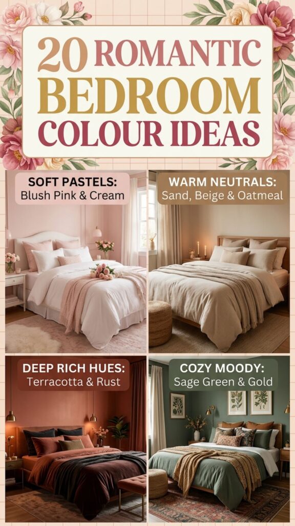
Each idea comes with honest advice, real examples, and a few things to watch out for. By the end, you’ll know exactly which palette fits your style, your light, and your relationship.
1. Soft Blush Pink for Gentle Warmth
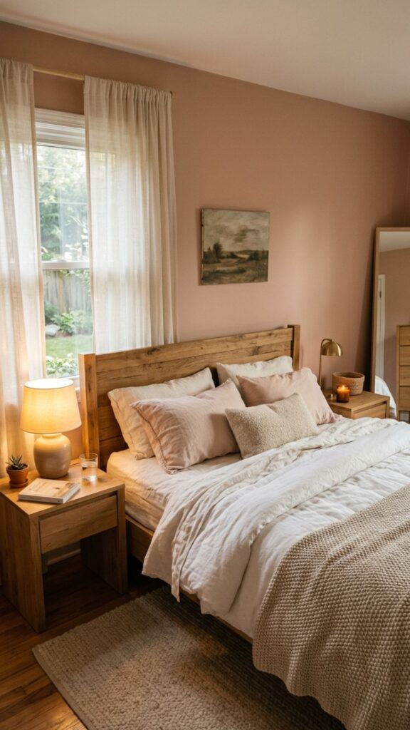
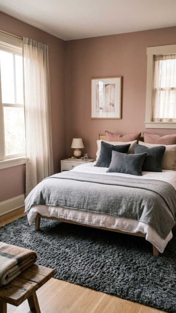
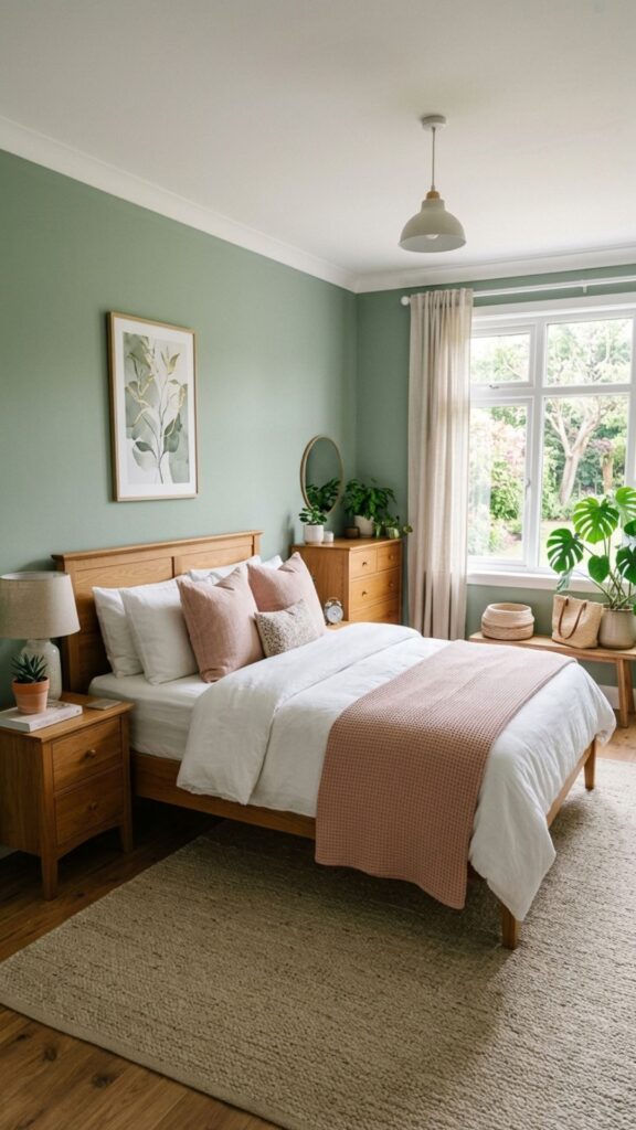
Blush pink is a quiet, grown-up take on romance that never feels childish. It wraps the room in a soft, flattering glow that makes skin look healthy and the whole space feel tender. This is one of the most popular bedroom colour ideas for couples who want warmth without anything loud.
Pair blush with warm whites, natural wood, or brushed brass to keep it feeling modern rather than sweet. The main pitfall is going too bubblegum, so lean toward dusty, muted pinks with a touch of grey. Test a sample on the wall first, since pink shifts a lot under different lighting.
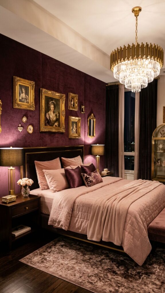
2. Deep Burgundy for Sensual Drama
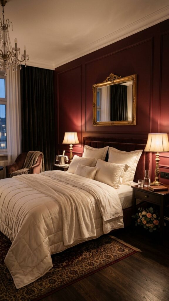
Burgundy is rich, moody, and unapologetically romantic. This deep wine red adds instant intimacy and works beautifully in bedrooms where you want a cocoon-like feel. It signals luxury and warmth at the same time, which is hard to pull off with most colours.
Because it’s dark, burgundy suits an accent wall behind the bed more than the whole room in smaller spaces. Balance it with soft lighting and creamy textiles so it feels inviting rather than heavy. Couples who love a dramatic, hotel-suite mood tend to fall hard for this shade.
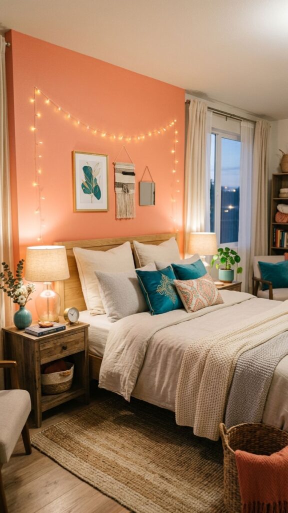
3. Warm Terracotta for Earthy Intimacy
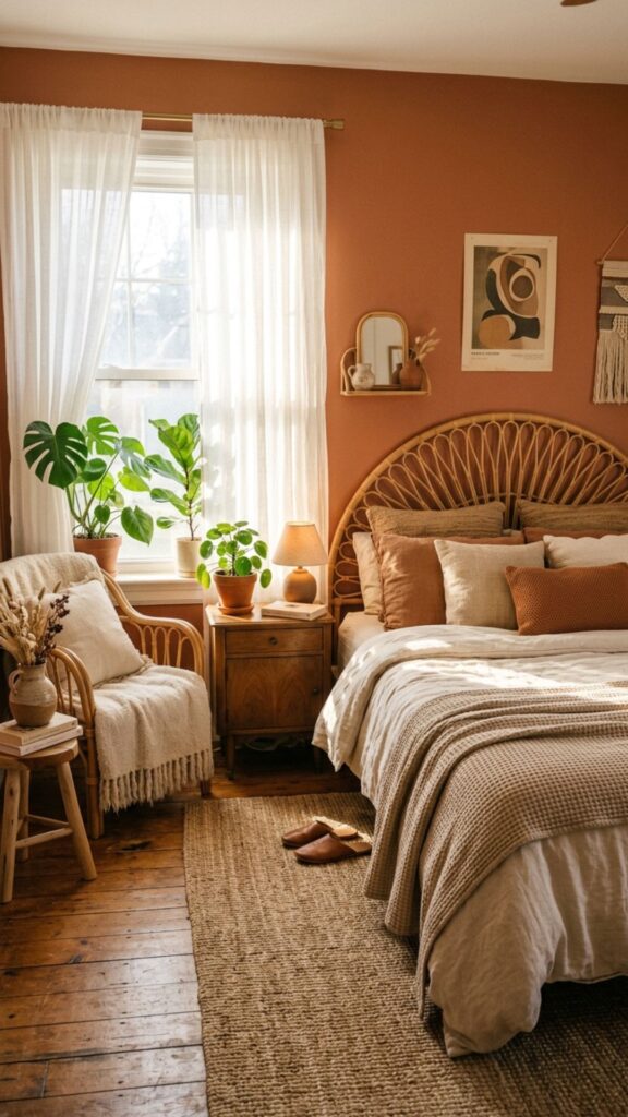
Terracotta brings a sun-baked, earthy warmth that feels both cozy and grounded. It’s romantic in a relaxed, lived-in way, perfect for couples who prefer comfort over glamour. The orange-clay tone adds energy without ever feeling harsh.
This colour pairs wonderfully with cream, olive green, and natural textures like linen and rattan. Watch out for rooms with cool, north-facing light, since terracotta can turn muddy without enough warmth. In a sunny room, it absolutely glows.
4. Dusty Rose for Subtle Romance
Dusty rose sits between pink and mauve, giving you romance with a sophisticated, slightly faded edge. It’s soft and soothing, which makes it a smart pick for a restful shared bedroom. The muted tone feels calm rather than girly.
Use dusty rose on all four walls for a gentle, enveloping effect, then layer in charcoal or deep green accents for contrast. A common mistake is matching it with bright white trim, which can feel stark. Soft off-whites and warm greys flatter it far better.
5. Charcoal Grey for Modern Sophistication
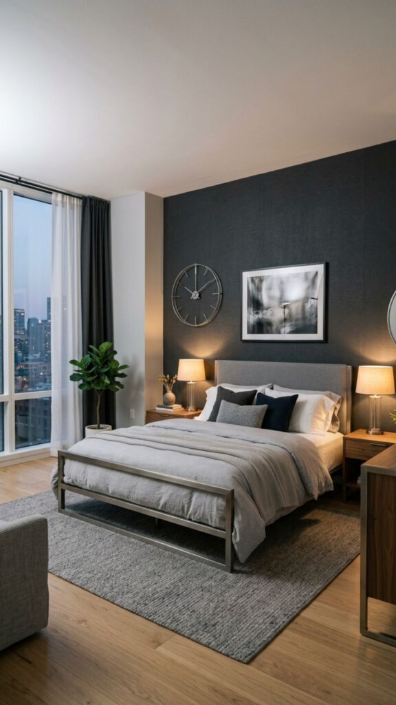
Charcoal grey may not scream romance, but it creates a sultry, intimate backdrop that’s surprisingly sensual. It makes a bedroom feel like a private, high-end escape. Paired with warm lighting and plush bedding, it turns moody in the best possible way.
The key is warmth, so add soft textiles, candlelight, and metallic touches to stop the grey from feeling cold. Use it on a feature wall if your room is small or short on natural light. Couples who love a sleek, contemporary look will appreciate how grown-up this feels.
6. Lavender for Calm and Tenderness
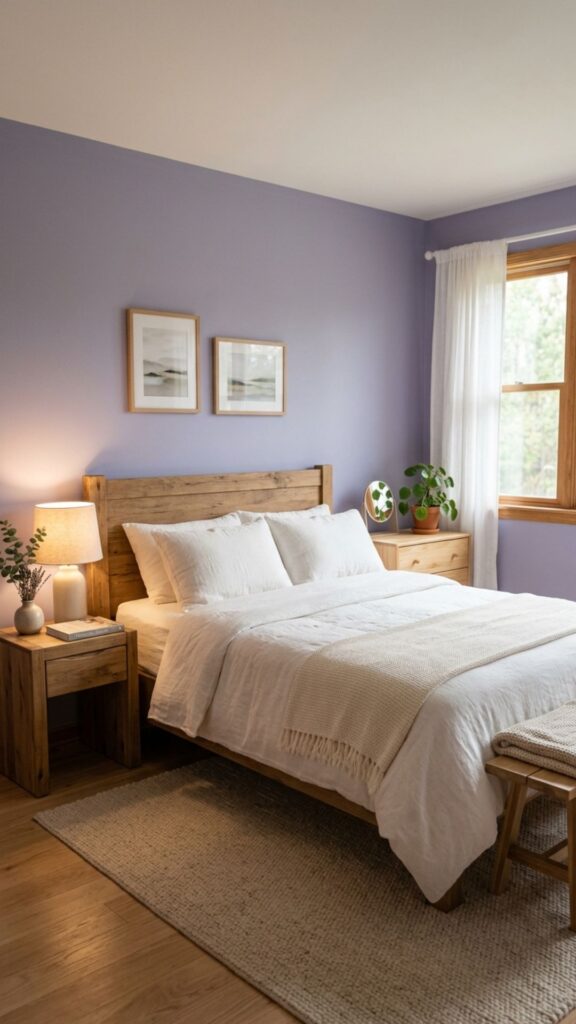
Lavender brings a soft, dreamy quality that’s both calming and gently romantic. The pale purple tone is known to ease stress, which makes it ideal for a bedroom you want to feel peaceful. It’s tender without being overly sweet.
Keep lavender muted and grey-leaning to avoid a dated, overly floral look. It works beautifully with soft greens, warm whites, and natural wood. If you worry about it feeling too cool, balance it with warm lighting and cozy textures.
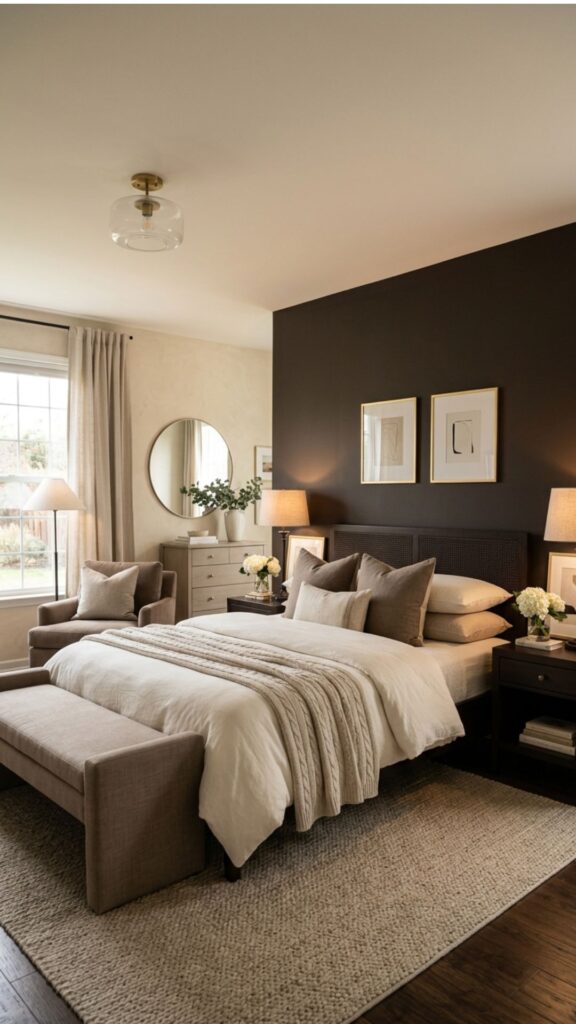
7. Rich Chocolate Brown for Cozy Luxury
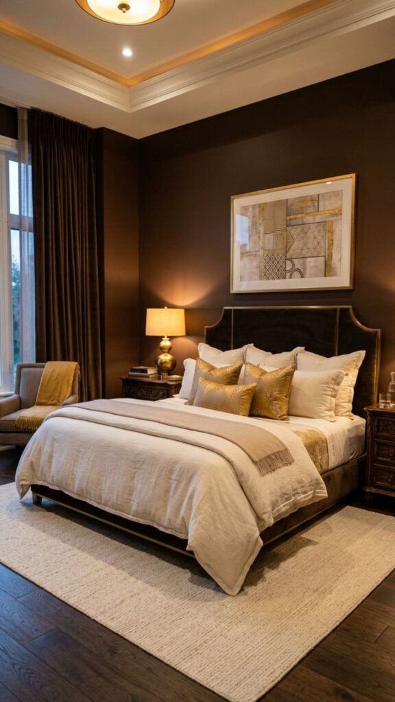
Chocolate brown feels warm, enveloping, and deeply comforting, like wrapping the room in a soft blanket. It’s an underrated romantic colour that adds instant intimacy and a sense of grounded luxury. Brown reads as natural and calming, which helps couples unwind.
Combine it with cream, gold, or blush accents to keep it from feeling too dark. The main risk is making a small room feel closed in, so use plenty of soft lighting. In larger bedrooms, a full chocolate palette feels rich and indulgent.
8. Soft Coral for Playful Affection
Coral mixes pink and orange into a warm, cheerful tone that feels affectionate and full of life. It’s romantic in a happy, energetic way rather than a moody one. This shade suits couples who want their bedroom to feel uplifting and warm.
Use coral as an accent or on a single wall, since a full room can feel intense. Pair it with soft neutrals and a touch of teal for a fresh, modern look. Keep the tone muted and slightly dusty so it stays elegant rather than bright.
9. Deep Navy Blue for Quiet Intimacy
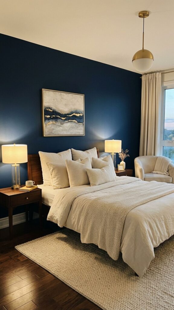
Navy is a confident, calming colour that creates a deep sense of intimacy after dark. It feels luxurious and grounding, helping the room melt into a restful mood at night. Many couples are surprised by how romantic a dark blue can feel.
Soften navy with warm metallics, layered lighting, and cream or blush textiles. Because it’s so deep, it pairs best with good lighting and works wonderfully on a feature wall. The contrast between cool navy and warm accents creates a beautifully balanced space.
10. Warm Greige for Effortless Harmony
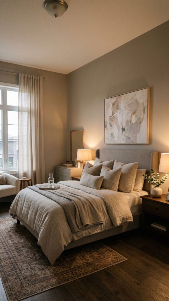
Greige, a blend of grey and beige, is the ultimate compromise colour for couples with different tastes. It’s neutral, warm, and endlessly easy to live with, which makes it one of the safest bedroom colour ideas around. It quietly flatters almost any decor.
The beauty of greige is flexibility, since you can layer romantic touches through bedding, art, and lighting. To keep it from feeling flat, add texture and a few deeper accent tones. This is the perfect base for couples who can’t agree on anything bolder.
11. Mauve for Vintage Romance
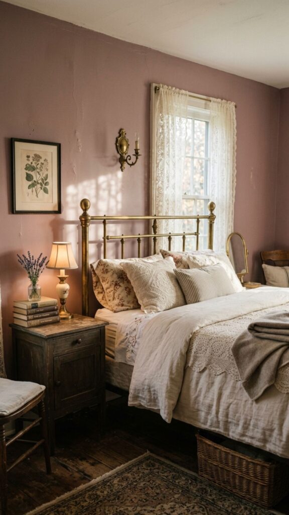
Mauve carries a soft, vintage charm that feels romantic and a little nostalgic. This grey-purple-pink blend is gentle on the eyes and creates a tender, restful atmosphere. It’s elegant without trying too hard.
Mauve pairs beautifully with antique brass, soft gold, and creamy whites. Avoid combining it with too many cool tones, which can drain its warmth. A muted mauve on all four walls makes a bedroom feel like a soft, romantic embrace.
12. Sage Green for Fresh Serenity
Sage green brings nature indoors with a calm, restorative feel that’s quietly romantic. The soft, muted green soothes the senses and pairs beautifully with warm, intimate accents. It’s a refreshing choice for couples who want calm over drama.
Sage works with almost everything, from blush and cream to wood and gold. The main thing to watch is undertone, since some sage shades lean too grey or too yellow. Test samples in your own light to find the version that feels balanced and warm.
13. Plum for Bold, Luxurious Passion
Plum is a deep, jewel-toned purple that radiates richness and passion. It’s a daring, romantic choice that makes a bedroom feel opulent and intimate. This shade suits couples who want their space to feel bold and luxurious.
Use plum on a feature wall or in textiles if a full room feels overwhelming. Pair it with soft gold, deep grey, or blush to soften the intensity. Layered, warm lighting is essential here to bring out plum’s velvety depth.
14. Creamy Ivory for Timeless Softness
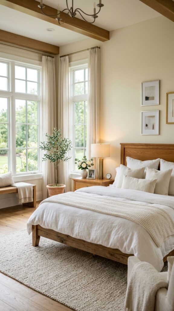
Ivory is soft, warm, and endlessly romantic in a quiet, understated way. Unlike stark white, it has a gentle warmth that makes a bedroom feel cozy and serene. It’s a timeless backdrop that lets you build romance through texture and lighting.
The trick with ivory is layering, since a flat ivory room can feel plain. Add plush bedding, warm wood, and soft metallic accents for depth. This is a wonderful choice for couples who prefer calm, light-filled spaces over bold colour.
15. Smoky Teal for Moody Elegance
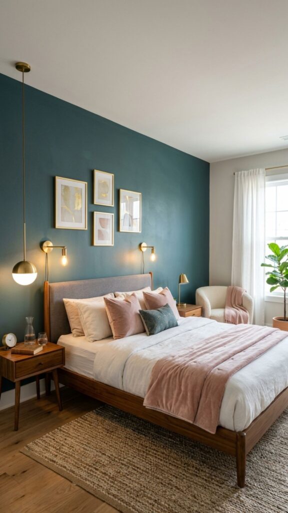
Smoky teal blends blue and green into a deep, sophisticated tone that feels both calming and sensual. It’s romantic in a moody, elegant way and reads as a custom, designer-level choice. The colour adds personality without feeling overpowering.
Pair teal with brass, blush, and warm wood to keep it inviting. Because it’s a deeper shade, it works best with good lighting and in rooms with some natural light. A single teal feature wall can transform an ordinary bedroom into something memorable.
16. Warm Peach for Soft Glow
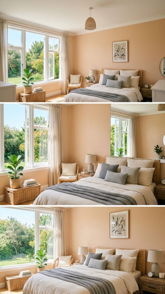
Peach gives off a soft, flattering glow that makes a bedroom feel warm and welcoming. It’s gentle, romantic, and uplifting all at once, which suits couples who want a cozy, sunny feel. The colour is forgiving and easy to live with.
Choose a muted, slightly dusty peach rather than a bright one to keep it elegant. It pairs well with cream, soft grey, and natural textures. Peach truly shines in rooms with plenty of natural light, where it feels fresh and tender.
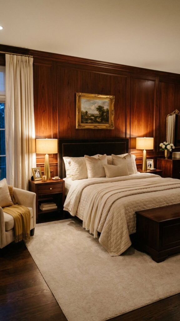
17. Espresso and Cream Contrast for Depth
Combining a deep espresso shade with creamy neutrals creates a romantic contrast full of warmth and depth. The dark-and-light pairing feels rich, balanced, and intentional. It’s a classic combination that always reads as elegant.
Use the darker tone on a feature wall or in furniture, with cream on the remaining walls. This keeps the room feeling open while still adding cozy drama. The contrast also makes layered lighting and soft textiles stand out beautifully.
18. Rosewood for Deep, Earthy Romance
Rosewood blends pink, brown, and red into a deep, earthy tone that feels mature and intimate. It’s romantic without being soft, offering warmth and richness at the same time. This shade gives a bedroom a grounded, sophisticated mood.
Pair rosewood with cream, gold, and natural wood for a cohesive, warm palette. It works as a full-room colour in larger spaces or as an accent in smaller ones. Soft, warm lighting brings out its cozy, velvety depth.
19. Pale Lilac and Grey for Modern Calm
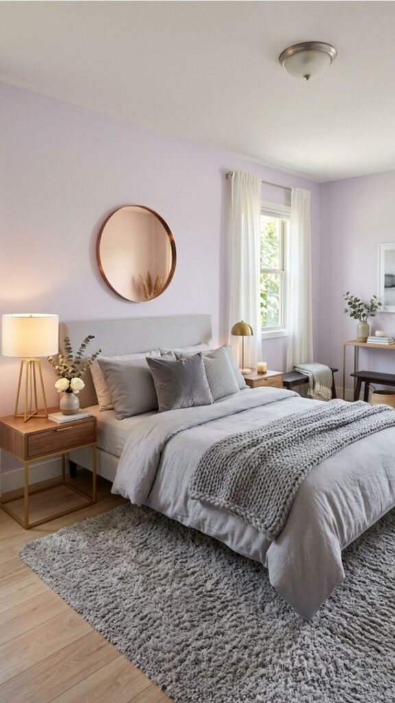
A blend of pale lilac and grey creates a fresh, modern take on romance that feels light and soothing. It’s tender and calming, perfect for couples who want a gentle, contemporary space. The cool-warm balance keeps it feeling current.
Use lilac as the main wall colour and grey in soft furnishings, or reverse it for a subtler effect. Warm metallics and cozy textures stop it from feeling too cool. Keep the lilac muted to maintain that grown-up, elegant edge.
20. Classic Red Accents for Timeless Passion
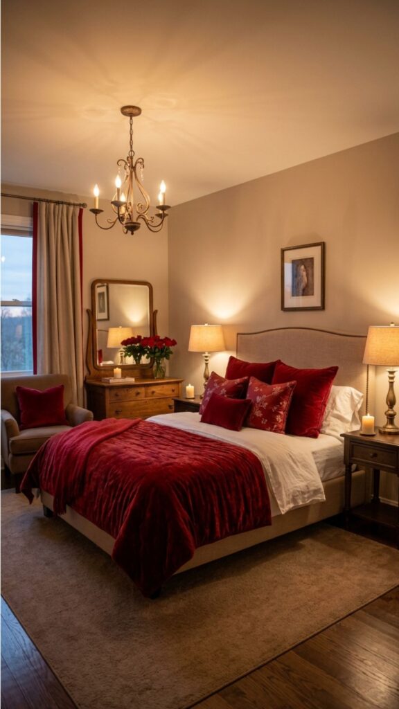
Red is the boldest romantic colour of all, and a little goes a long way. Rather than painting an entire room, use red as an accent through a feature wall, headboard, or rich textiles. This keeps the passion without overwhelming the space.
Deep, muted reds like brick or wine feel more sophisticated than bright primary red. Balance them with warm neutrals and soft lighting for an intimate glow. For couples who love drama and warmth, red accents add unmistakable romance.
Conclusion
Choosing the right colour is one of the simplest, most powerful ways to make your shared bedroom feel romantic. Whether you’re drawn to soft blush, moody navy, earthy terracotta, or daring plum, the best bedroom colour ideas balance calm with warmth and reflect both partners’ tastes. The goal isn’t just a pretty room, but a space that helps you both relax, unwind, and feel close.
Start by picking two or three shades that excite you, then test samples on your walls before committing. Watch how they shift in morning and evening light, and notice how each one makes you feel. Ready to transform your space? Choose your favourite colour from this list and bring a little more romance into your bedroom this season.
What are the best bedroom colours for couples?
Soft, warm tones tend to work best, including blush pink, dusty rose, terracotta, and warm greige. For couples who prefer drama, deep shades like navy, burgundy, and plum create an intimate, sensual mood. The ideal colour balances calm with warmth and suits both partners’ tastes.
Which colours make a bedroom feel more romantic?
Warm, muted shades create the most romantic feel, especially blush, rosewood, burgundy, and deep navy. These tones add intimacy and warmth, particularly when paired with soft, layered lighting. Avoid bright, cool colours, which can feel energizing rather than soothing.
Should couples paint the whole room or just an accent wall?
It depends on the colour and room size. Light, soft shades work well on all four walls, while bold or dark tones like plum, burgundy, or charcoal often look best on a single feature wall. This keeps the room intimate without feeling closed in.
How do I choose a bedroom colour when my partner and I disagree?
Start with a flexible neutral base like greige or ivory, then add each partner’s preferred colour through accents, bedding, and art. Testing samples together and choosing a shade you both feel calm in usually leads to an easy compromise.
Do dark colours make a small bedroom feel smaller?
Dark colours can make a room feel cozier rather than strictly smaller, but they do absorb light. To keep a small space feeling intimate yet open, use dark shades on one feature wall, add plenty of warm lighting, and balance them with lighter textiles.