Choosing the right color for your dining room is one of the most impactful decisions you can make in your home. Unlike a living room where you might spend hours lounging, or a bedroom that’s mostly about rest, the dining room is a space built around gathering — and color sets the tone for every meal, conversation, and celebration that happens there.

The problem is that most people feel stuck between safe and boring or bold and risky. This guide cuts through the confusion.
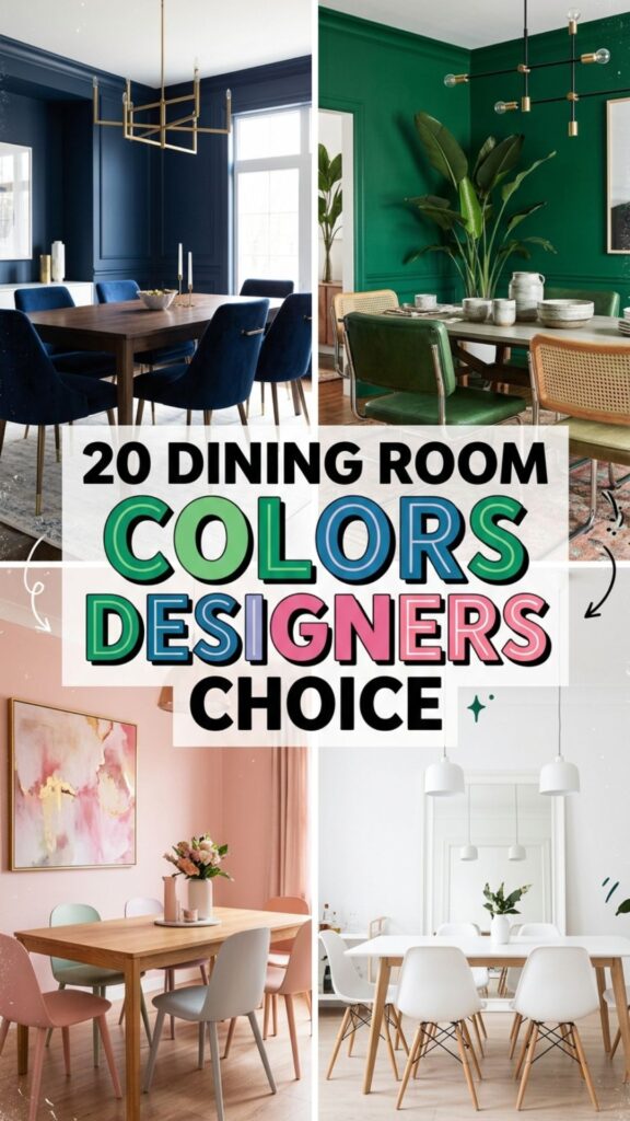
You’ll find 20 specific dining room colors that professional designers return to again and again, along with practical advice on how each one works in real spaces — including small rooms, dark layouts, open-concept plans, and family homes.
1. Classic White
White remains one of the most requested dining room colors for a simple reason: it works everywhere. It reflects natural light beautifully, makes small spaces feel larger, and provides a clean backdrop that lets your furniture, artwork, and tableware take center stage. Designers often reach for whites with a warm undertone — think cream or soft ivory — rather than a stark, bluish white, which can feel cold under artificial lighting.
In open-concept homes, white helps the dining area flow naturally into adjacent kitchens and living spaces without visual interruption. Pair it with natural wood furniture and warm-toned metals like brass or copper to keep the space from feeling clinical. Add texture through linen curtains or a jute rug to give the room depth.
2. Warm Greige
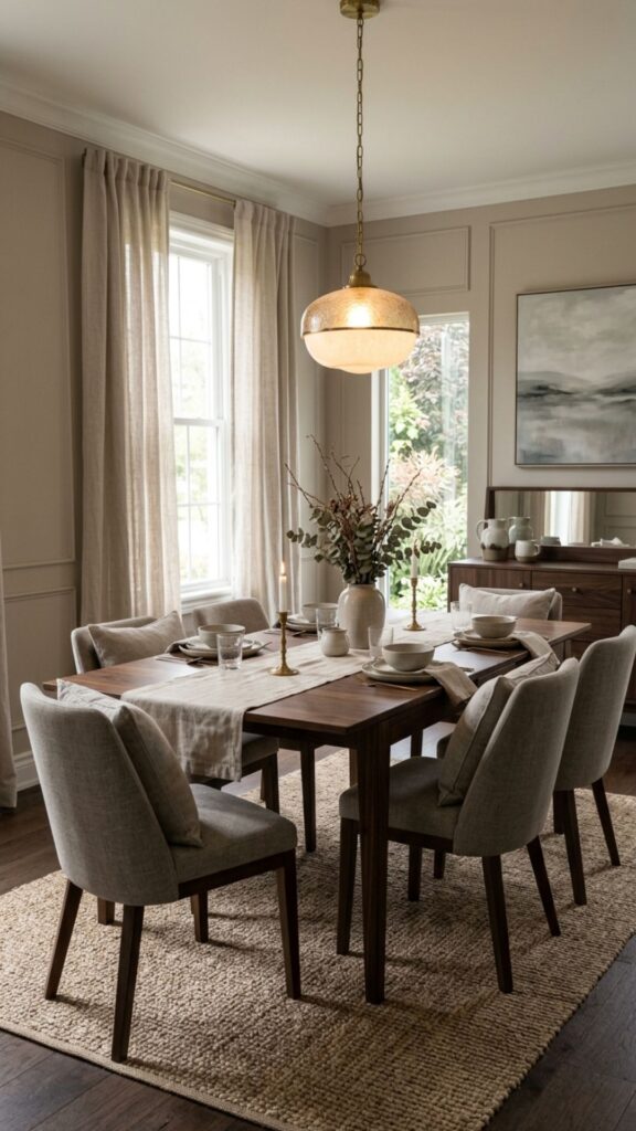
Greige — a blend of gray and beige — has become a staple in designer palettes because it’s genuinely versatile without being dull. It reads as neutral without the coldness of pure gray, and it complements both warm and cool tones in furniture and textiles. In a dining room, warm greige creates a relaxed, sophisticated atmosphere that works from casual breakfasts to dinner parties.
It’s especially effective in spaces with limited natural light. The warm undertones prevent the room from feeling washed out under overhead fixtures. Pair greige walls with dark walnut or espresso furniture for contrast, or keep everything in soft naturals for a more cohesive, layered look.
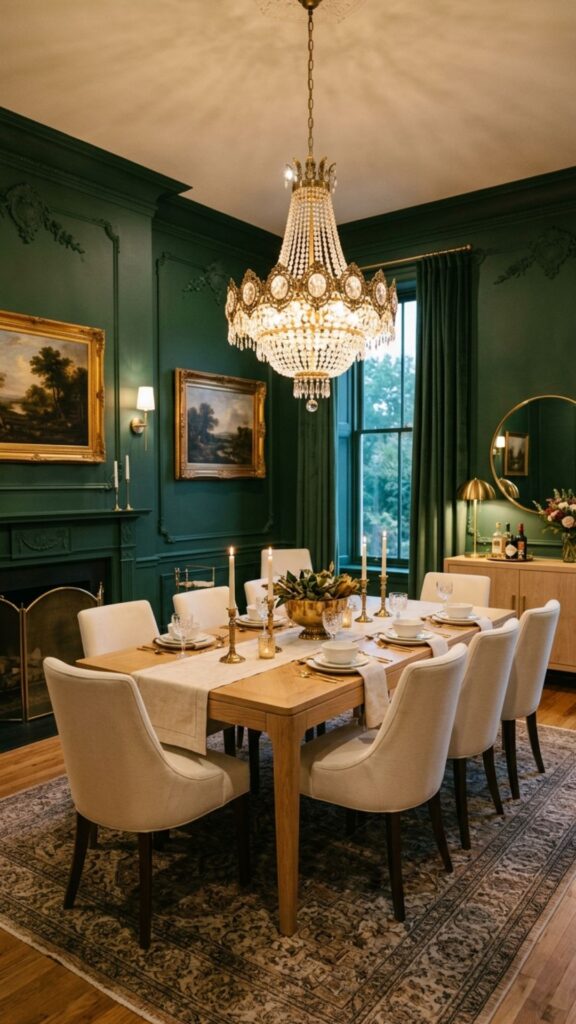
3. Deep Navy Blue
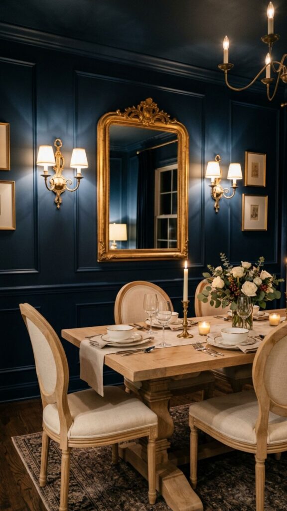
Navy blue has become one of the most designer-approved choices for formal dining rooms. It creates an intimate, enveloping atmosphere that makes evening meals feel like an occasion. Deep navy works particularly well on all four walls in smaller dining rooms — it turns the limited square footage into a deliberate, cozy asset rather than a limitation.
Balance the depth of navy with plenty of metallic accents: brass sconces, gold-framed mirrors, or polished chrome hardware make the space feel elevated rather than heavy. Light wood furniture like oak or ash provides a natural contrast that keeps the room from feeling too dark.
4. Sage Green
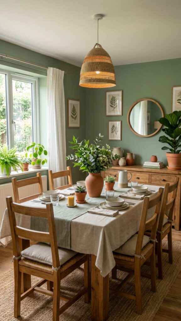
Sage green is one of those dining room colors that designers never seem to tire of — and for good reason. It’s calming without being boring, earthy without feeling outdated, and it pairs naturally with wood, linen, terracotta, and stone. In dining rooms, it promotes a relaxed mood that makes people feel comfortable staying at the table longer.
Sage works equally well in farmhouse, transitional, and contemporary dining rooms, making it a reliable choice across many design styles. For a cohesive look, bring in soft green tones through plants, ceramics, or glassware. It handles both natural and warm artificial light gracefully, which is important in a room that often sees both.
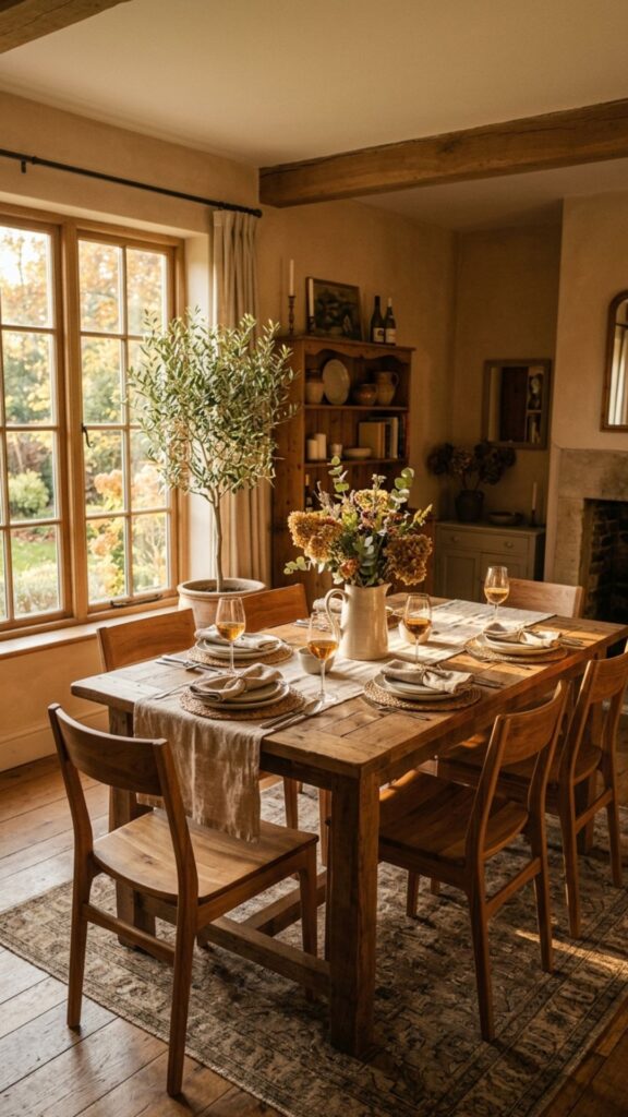
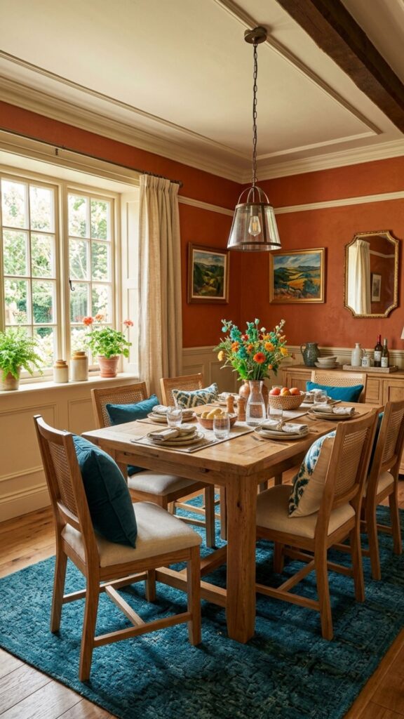
5. Warm Terracotta
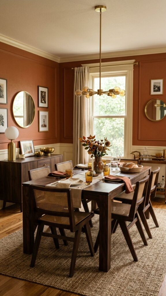
Terracotta has had a strong revival in interior design, and dining rooms are one of the best places to use it. The warm, earthy orange-red tone creates an inviting, almost Mediterranean warmth that’s particularly appealing in spaces where you want people to feel relaxed and at ease. It’s a great choice for family dining rooms where the atmosphere is casual and lived-in.
Pair terracotta walls with cream or off-white trim to soften the intensity, and ground the space with natural rattan, wicker, or dark wood furniture. Avoid cool metals like chrome or silver — brass, copper, and matte black finishes all harmonize much better with this palette.
6. Charcoal Gray
Charcoal gray is a sophisticated alternative to black that brings real drama to a dining room without overwhelming it. It works beautifully in formal dining spaces where you want a moody, intentional atmosphere — especially with low pendant lighting or candlelight that bounces off the deep-toned walls. Designers frequently use it to create a sense of occasion in rooms that are used mainly in the evenings.
In rooms with good natural light, charcoal gray can be stunning throughout the day as well. Balance it with light upholstered seating, white trim, and warm-toned wood to prevent the room from feeling oppressive. A large mirror on one wall adds light and makes the space feel more open.
7. Soft Blush Pink
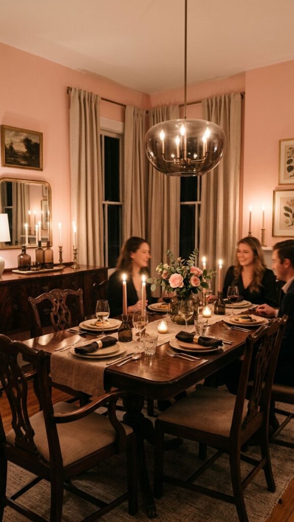
Blush pink is a dining room color that surprises people with how well it works in practice. It’s warm, flattering under candlelight, and genuinely romantic without crossing into overly feminine territory — especially when it’s paired with the right neutrals and textures. Designers who recommend it often describe the effect as “luminous,” particularly during evening meals.
Keep the rest of the space grounded with concrete, linen, smoked glass, or dark wood to let the blush tone feel intentional rather than accidental. This palette works especially well in transitional dining rooms that want something more interesting than white but softer than a statement color.
8. Forest Green
Forest or hunter green brings a rich, botanical quality to dining rooms that feels both classic and current. It has long been associated with formal dining spaces — think dark-paneled English dining rooms — but modern interpretations with lighter furniture and minimalist styling give it a fresher, more accessible edge.
This is a particularly strong choice for dining rooms that don’t get a lot of natural light, because the depth of the color turns that limitation into a design feature. Layer in brass or antique gold accessories, white or cream upholstered chairs, and a statement light fixture to complete the look.
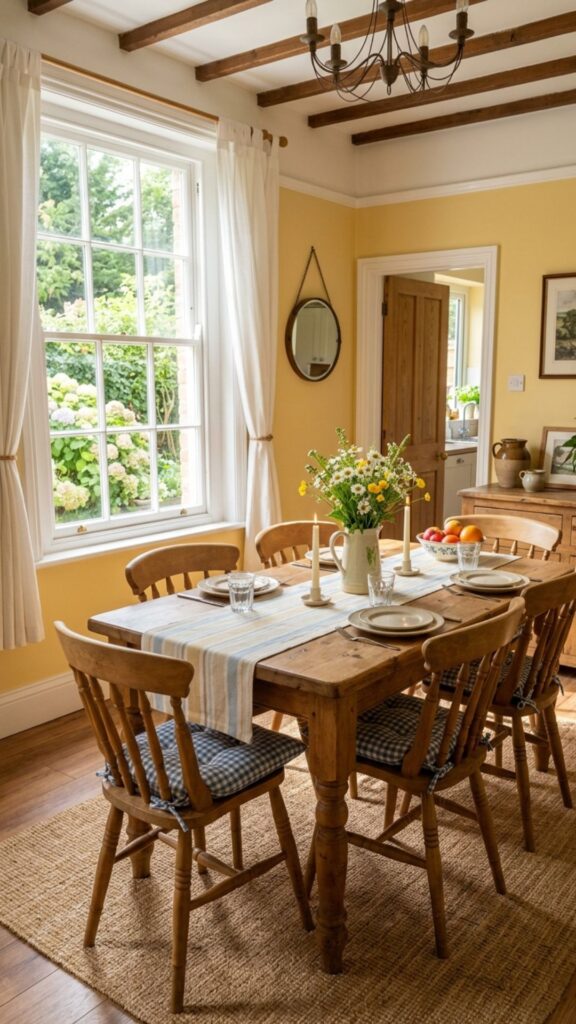
9. Warm Ochre Yellow
Ochre is yellow done with restraint. Unlike a bright or primary yellow, ochre leans into warm golden tones that feel natural, earthy, and timeless. In a dining room, it creates an energizing yet comfortable atmosphere — the kind of warm light you associate with late afternoon sun. It’s a particularly smart choice for north-facing rooms that tend to feel cooler and darker.
Ochre pairs exceptionally well with deep teal, olive green, burnt orange, and warm wood tones. Keep textiles simple and natural — linen, cotton, or jute — to balance the richness of the wall color. This is a dining room color that makes people feel genuinely happy and energized at the table.
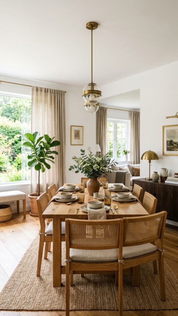
10. Off-White Linen
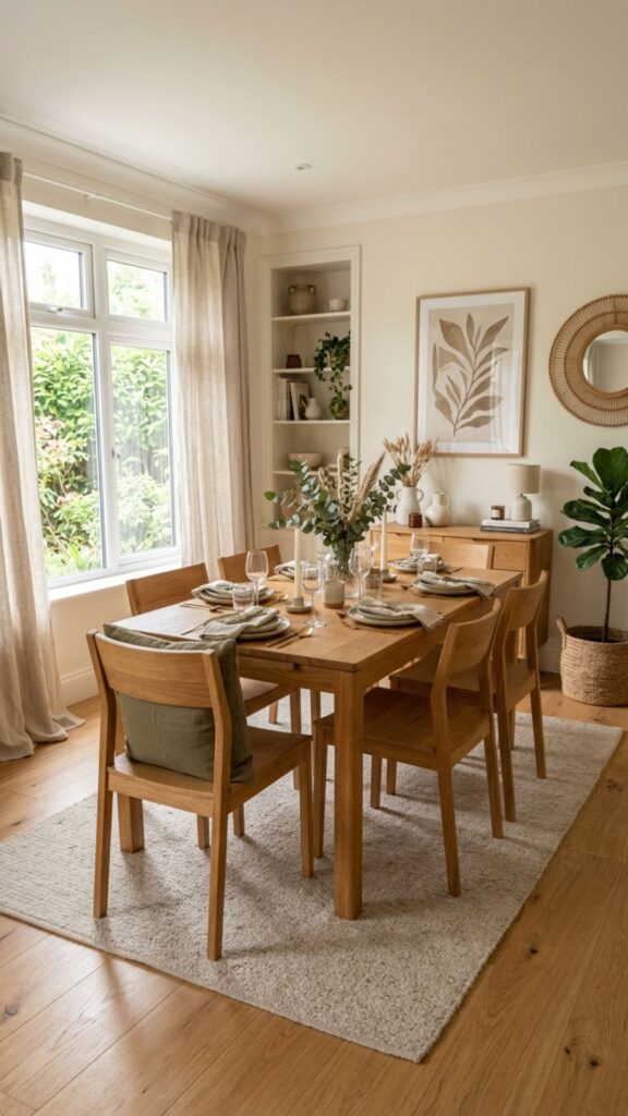
Off-white with a linen or parchment undertone is the warmer, more interesting alternative to pure white. It has the same light-reflecting qualities as white but with a softness that makes the dining room feel more relaxed and welcoming. Designers use it in everything from coastal beach houses to modern farmhouses to contemporary urban apartments.
The subtle warmth of a linen white also makes it more forgiving under different lighting conditions — it doesn’t shift to a harsh blue or cool grey under fluorescent or cool-toned LED bulbs. Pair it with natural textures, warm wood furniture, and muted earth-tone accessories for a look that feels effortlessly pulled together.
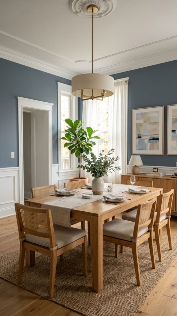
11. Dusty Blue
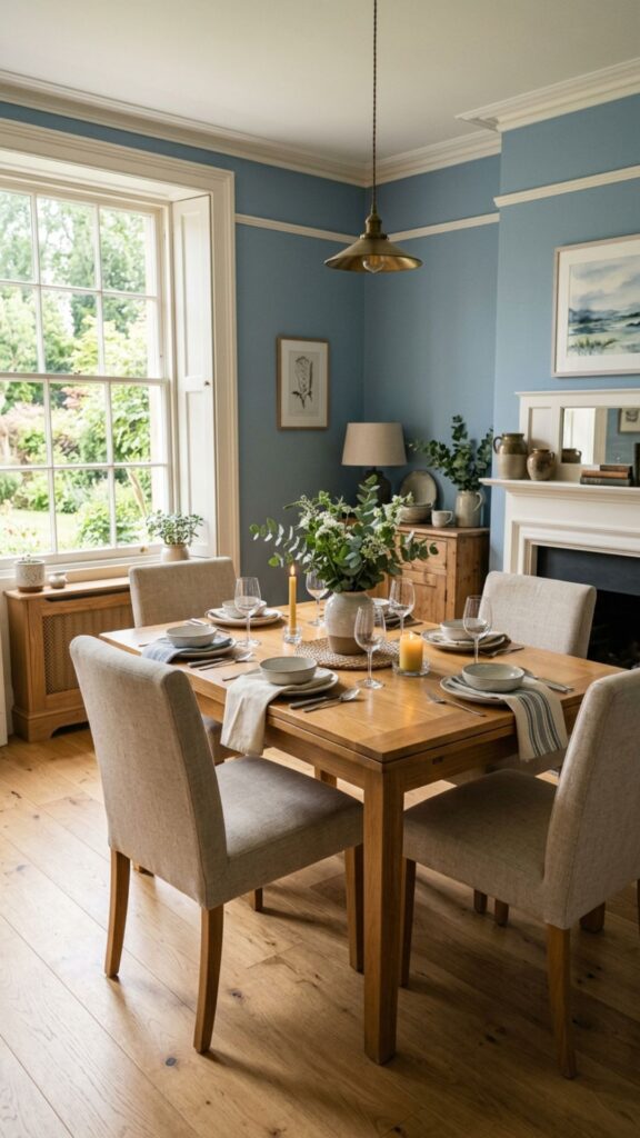
Dusty or muted blue is a calming, collected dining room color that reads as understated yet confident. Unlike bright or coastal blues, dusty blue leans toward a softer, more grayed-out tone that works well with both traditional and contemporary interiors. It creates a peaceful atmosphere without making the room feel cold or distant.
This shade works particularly well in open-plan spaces because it’s neutral enough to transition easily into adjacent rooms. Pair dusty blue walls with warm white trim, light oak flooring, and soft linen upholstery to keep the palette harmonious and livable.
12. Burgundy and Wine
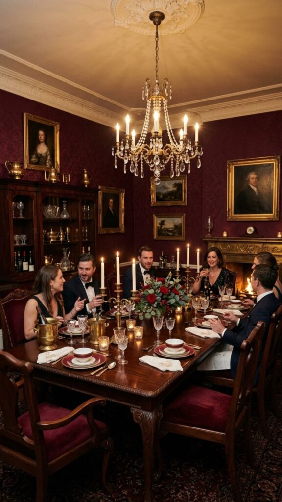
Deep burgundy is one of the most dramatic and rewarding dining room colors in a designer’s toolkit. It’s rich, deeply saturated, and creates an atmosphere of indulgent warmth — exactly what you want in a formal dining room used for entertaining. Burgundy paired with dark wood furniture, candlelight, and antique brass accents produces one of the most striking dining room interiors possible.
Don’t shy away from using it on all four walls. In a smaller dining room, full burgundy creates an intimate, jewel-box effect that feels luxurious rather than cramped. Keep the ceiling white or light cream to give the eye a place to rest and add a sense of height.
13. Soft Lavender
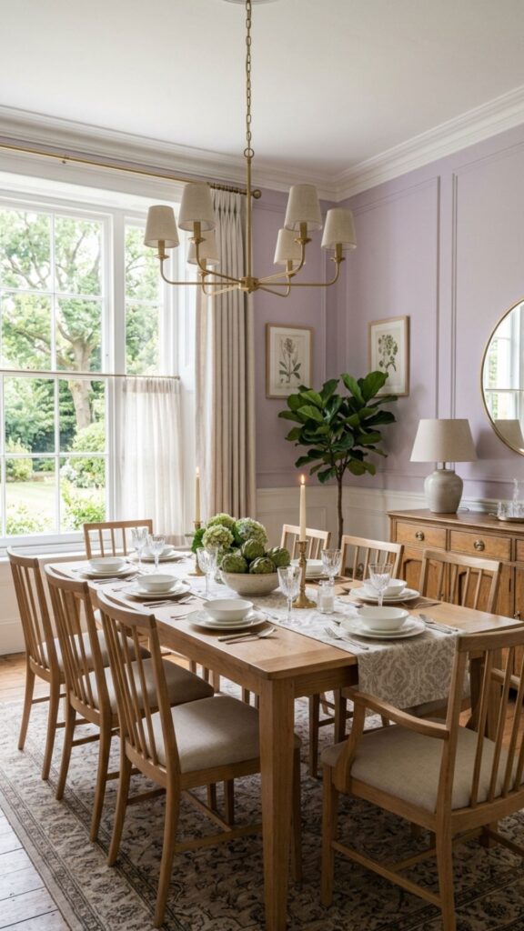
Lavender is an underused dining room color that rewards those willing to try it. It sits beautifully between warm and cool tones, creates a calm and slightly whimsical atmosphere, and works surprisingly well in spaces that receive a mix of natural and artificial light. In softer, more muted versions, lavender reads as almost a neutral.
This shade works well in transitional or eclectic dining rooms where you want something distinctive without being aggressive. Pair it with warm whites, natural wood, and soft brass to give it a grounded, sophisticated feel rather than a juvenile one.
14. Warm Chocolate Brown
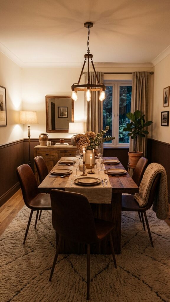
Deep chocolate brown is a grounding, enveloping color that brings real coziness to a dining room. It’s a designer favorite for spaces where warmth and comfort are the priority over brightness or formality. Brown dining rooms feel like something between a cozy library and a European bistro — intimate, unpretentious, and full of character.
Use it on the lower half of the walls with a lighter cream or warm white on the upper half and ceiling to prevent the room from feeling enclosed. Pair with natural textures — leather, linen, wool — and warm wood furniture to build a palette that’s rich but never heavy.
15. Slate Blue-Gray
Slate — a color that sits between blue and gray with a cool, stony quality — is one of those dining room colors that works with almost any furniture style or finish. It’s sophisticated without being cold, neutral without being bland. Designers use it in contemporary dining rooms where a clean, calm atmosphere is the goal.
Slate reads differently depending on the light: cooler and more gray in bright natural light, warmer and more blue under incandescent bulbs. That versatility makes it a reliable choice for dining rooms that serve multiple functions throughout the day. Pair it with white trim and natural wood for a clean, grounded look.
16. Creamy Butter Yellow
Soft butter yellow is a cheerful, uplifting dining room color that instantly makes a space feel sunny and generous. Unlike a saturated yellow, butter yellow sits at a low enough intensity to feel comfortable on all four walls without becoming overwhelming. It’s a particularly good choice for north-facing or basement dining rooms that struggle with natural light.
This is a family-friendly color that works in casual, everyday dining spaces. It pairs naturally with white trim, wood furniture, and simple cotton or linen textiles. Keep accessories and decor relatively simple so the warmth of the color can carry the room.
17. Muted Olive Green
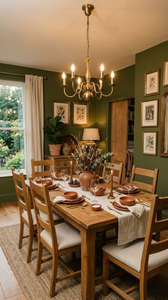
Olive green brings an organic, earthy sophistication to dining rooms that’s hard to replicate with any other color. It’s related to sage but richer, more complex, and more rooted in texture and depth. Designers use it in spaces where the goal is a warm, grounded atmosphere that still feels current and considered.
Olive pairs well with warm woods, terracotta accents, antique brass, and cream textiles. It also works beautifully alongside other earthy tones — pairing an olive dining room with rust or mustard upholstery creates a palette that feels warm, layered, and genuinely original.
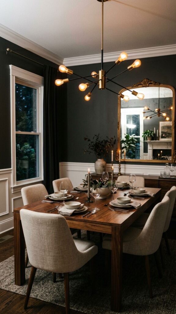
18. Inky Black
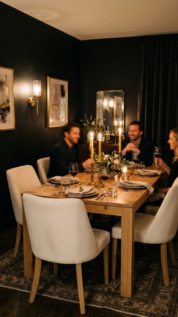
Using black in a dining room is a move that many homeowners hesitate over — and designers consistently encourage. An inky black dining room creates one of the most dramatic and sophisticated atmospheres in any home, particularly when the lighting is well-planned. Pendant lights, candles, and wall sconces all become even more impactful against a black backdrop.
Black works best in dedicated dining rooms rather than open-plan spaces, where it can define and contain the dining area with deliberate purpose. Keep the furniture in lighter tones — cream upholstered chairs, light oak or marble tabletops — to create contrast and prevent the space from feeling too closed in.
19. Pale Mint
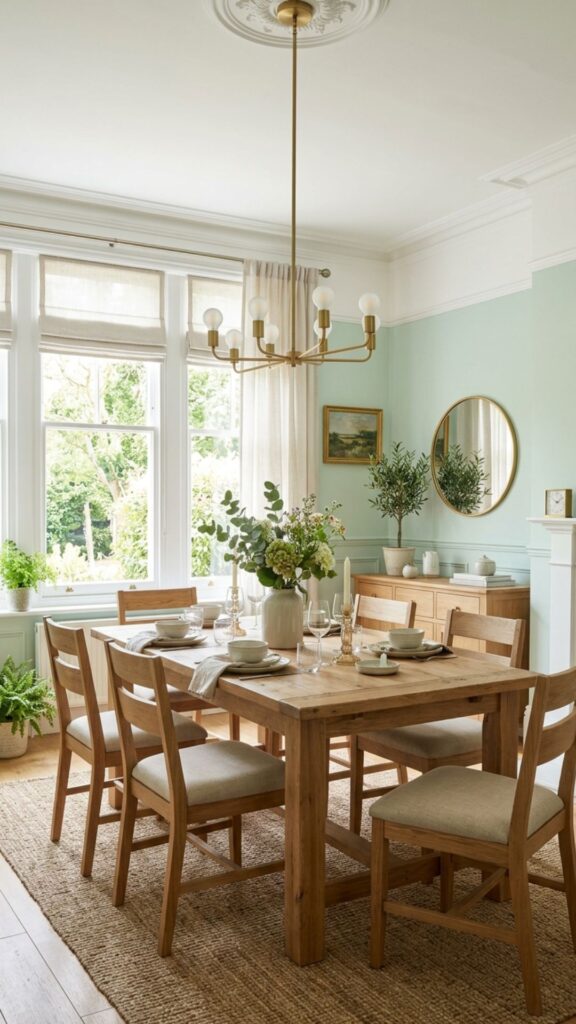
Pale mint is a fresh, airy color that brings a light, slightly retro quality to dining rooms without feeling themed or kitschy. It has a subtle green-blue tone that’s genuinely calming and pairs well with white, cream, natural wood, and soft brass accents. In well-lit dining rooms, pale mint practically glows, reflecting light in a way that makes the room feel larger.
This shade is a good choice for smaller dining spaces or rooms with lower ceilings, where its lightness helps expand the perceived volume of the room. It also works well in transitional dining spaces that serve as both an everyday family area and an occasional entertaining room.
20. Warm Rust Orange
Rust is bolder than terracotta but shares the same earthy, spirited energy. Used on a single accent wall or all four walls in a small dining room, rust orange creates a vibrant, energizing atmosphere that feels both contemporary and rooted in natural tones. Designers often use it to inject personality into otherwise neutral homes.
Pair rust with deep teal, mustard yellow, or burnt sienna for a rich, maximalist palette. For a more restrained approach, balance it with cream, white, and natural wood. Either way, rust brings a dynamic warmth to the dining room that few other colors can match.
Conclusion
The right dining room color can change how people feel the moment they sit down at your table. Whether you’re drawn to the intimacy of deep navy, the warmth of ochre, or the freshness of pale mint, there’s a shade on this list that fits your home, your light, and your lifestyle.
Pick one color that resonates with you and test a large paint swatch on your wall for a few days — observe it in the morning, afternoon, and evening before you commit. Once you find your match, the transformation is remarkable. Start small, trust the process, and don’t be afraid of color. Your dining room is one of the best places in your home to use it boldly.
What is the best color for a dining room?
There’s no single best color — it depends on your room’s size, light levels, and the atmosphere you want to create. Warm neutrals like greige and off-white work in almost any space, while deeper tones like navy, forest green, or burgundy are better suited to formal dining rooms or spaces with good natural light.
What dining room colors make a small space feel larger?
Pale, light-reflective colors like soft white, off-white linen, pale mint, and butter yellow all help a small dining room feel more open. Light dusty blues and soft lavenders also work well. If you prefer a dramatic look, painting all four walls in the same deep tone can actually make a small room feel intentionally intimate rather than cramped.
Which dining room colors work best in low-light spaces?
Warm tones perform best in low-light dining rooms because they read as inviting rather than dull under artificial light. Warm greige, ochre yellow, creamy butter yellow, terracotta, and warm chocolate brown all hold up well in rooms without strong natural light.
Should dining room colors match the rest of the house?
Not necessarily — but they should transition naturally. In open-concept spaces, choose a dining area color that shares tonal qualities with the adjacent rooms. In a separate, enclosed dining room, you have far more freedom to use a bold or distinctive color without worrying about flow.
Are dark colors a good choice for a dining room?
Yes, and designers use them frequently. Dark dining room colors like navy, forest green, charcoal, burgundy, and inky black create an intimate, atmospheric quality that’s particularly effective in the evening. The key is balancing dark walls with good lighting, lighter furniture, and reflective surfaces like mirrors or metallic accents.