Your kitchen island is more than a spot for chopping vegetables or grabbing a quick breakfast. It’s the heart of your kitchen and often the first thing guests notice. The right color can turn a plain island into a showpiece, while the wrong shade can leave the whole room feeling flat.
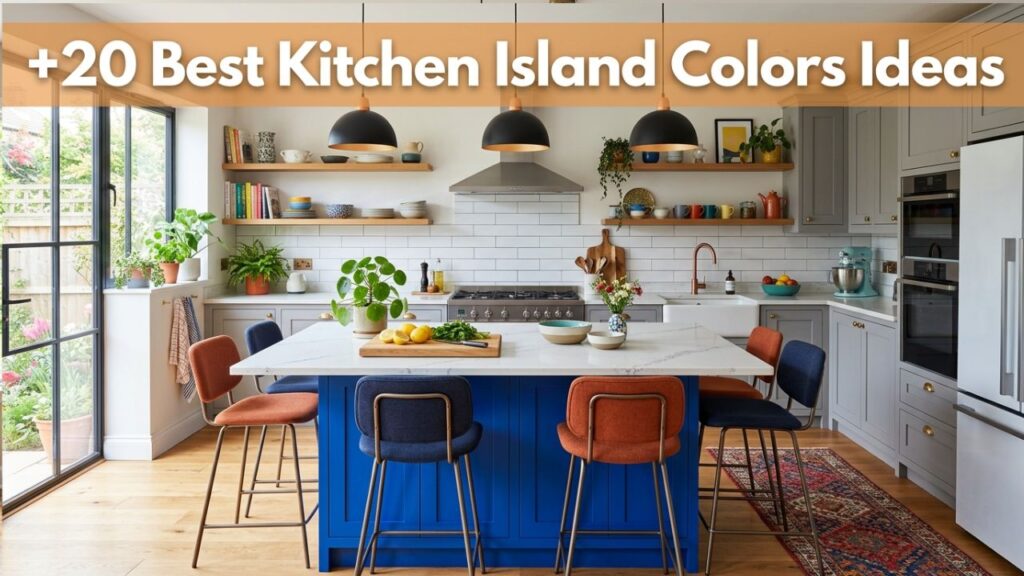
After years of helping homeowners rethink their kitchens, I’ve learned that color choices spark the most excitement and the most hesitation. Should you go bold or play it safe? Match the cabinets or make a statement?
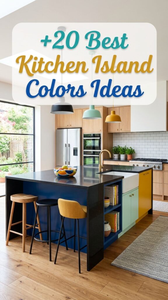
This guide walks you through 20 of the best kitchen island colors, with real examples and practical tips. By the end, you’ll know exactly which shade fits your style, your budget, and your daily life.
1. Classic Navy Blue
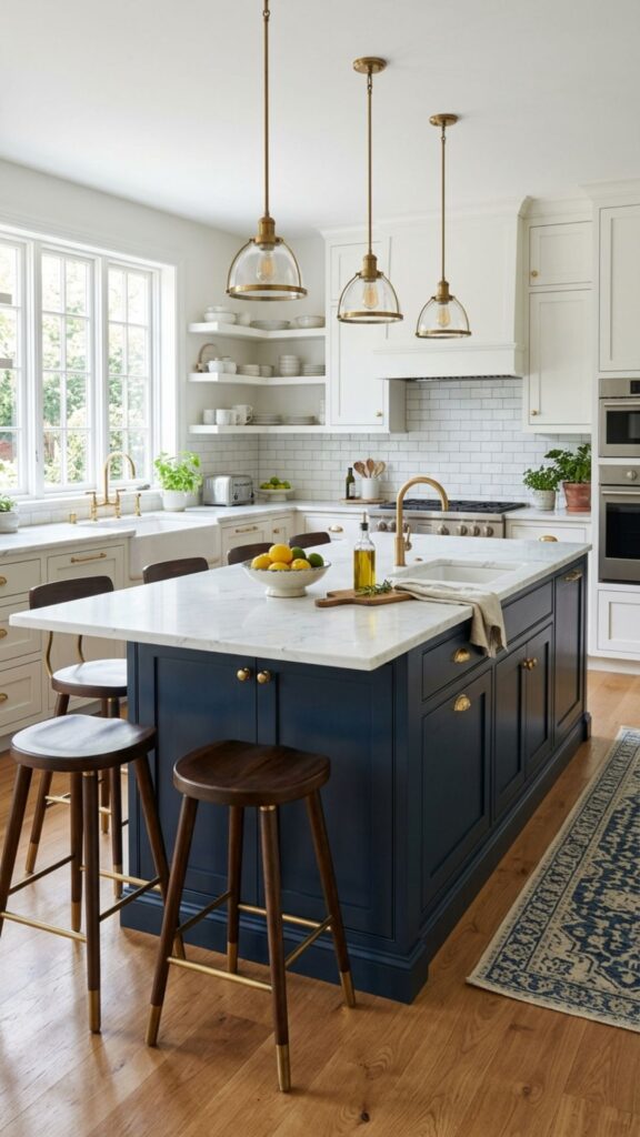
Navy blue has become a favorite for good reason. It brings depth and richness without feeling too dark or heavy. Pair it with white countertops and brass hardware, and you get a look that feels timeless yet fresh. It works beautifully in both traditional and modern kitchens.
One thing I love about navy is how forgiving it is. Fingerprints and small scuffs don’t show as easily as they do on lighter shades. If you want a color that stays stylish for years, navy is a smart, low-maintenance bet.
2. Crisp Pure White
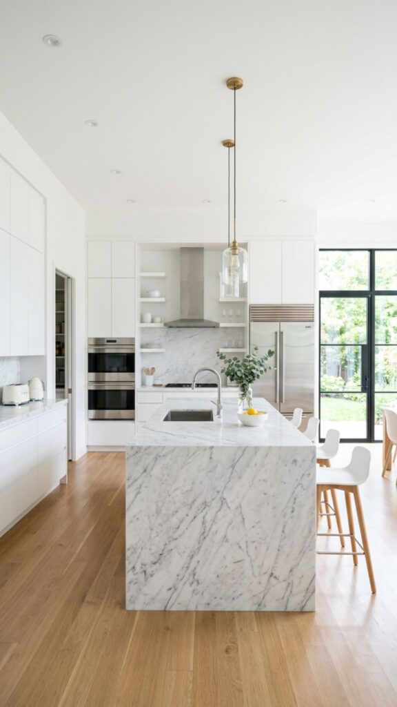
White never goes out of style. A white island keeps your kitchen feeling open, bright, and clean. It reflects light beautifully, which makes small kitchens feel larger. This shade pairs with nearly any countertop, from marble to butcher block.
The downside? White shows dirt and wear more quickly. If you have kids or cook often, choose a durable, wipeable finish. A satin or semi-gloss paint holds up better and cleans up with a quick wipe.
3. Soft Sage Green
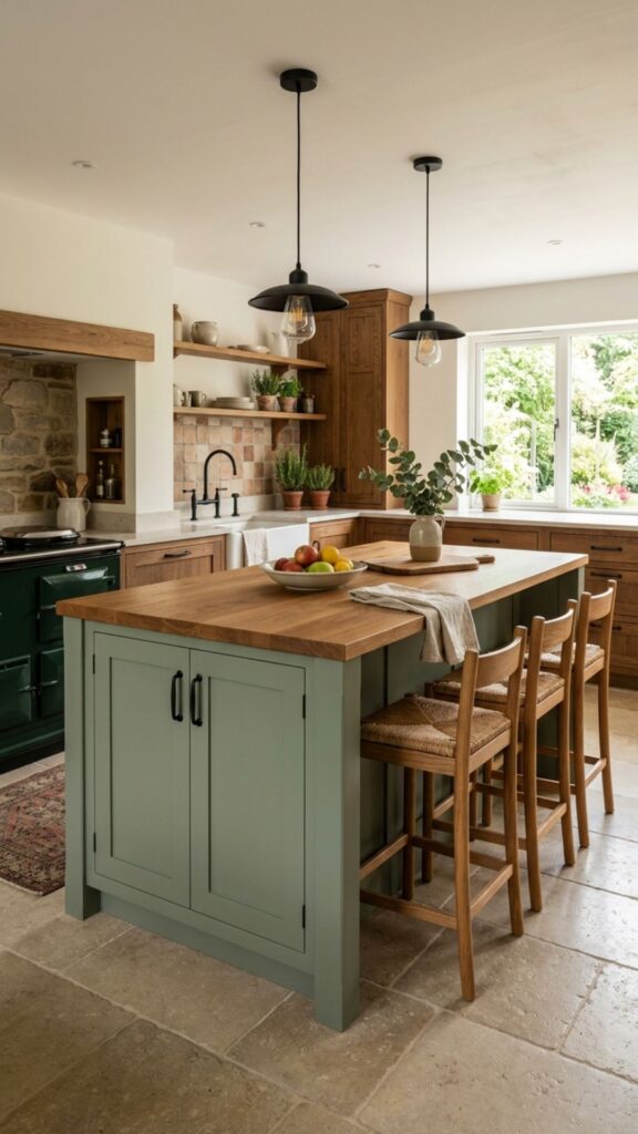
Sage green has taken over kitchens lately, and it’s easy to see why. This muted, earthy tone feels calm and natural. It works especially well with warm wood tones and natural stone. Sage adds personality without overwhelming the space.
I’ve seen sage transform dull kitchens into cozy retreats. Pair it with unlacquered brass or matte black hardware for a modern farmhouse feel. It’s one of the best kitchen island color ideas for anyone craving a fresh, organic vibe.
4. Bold Emerald Green
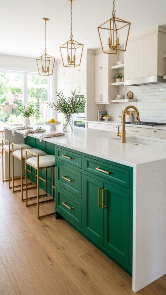
If sage feels too subtle, emerald green makes a real statement. This jewel tone brings drama and luxury to any kitchen. It looks stunning against white walls and gold accents. Emerald says confidence without shouting.
Because it’s such a strong color, use it thoughtfully. An emerald island works best when the rest of the kitchen stays neutral. That balance lets the island shine as the true focal point of the room.
5. Warm Charcoal Gray
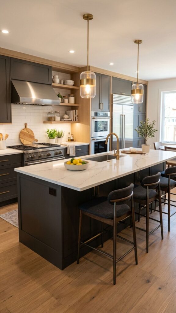
Charcoal gray sits between black and lighter grays, offering the best of both. It’s sophisticated and grounding, yet not as bold as pure black. This shade pairs nicely with white countertops and stainless steel appliances.
Gray is also incredibly versatile. It works in modern, industrial, and transitional kitchens alike. If you want something safe but still stylish, charcoal delivers elegance that won’t feel dated in a few years.
6. Dramatic Matte Black
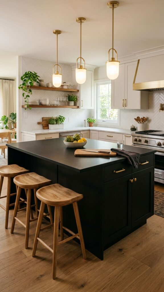
A black island brings instant sophistication. Matte black, in particular, feels modern and sleek. It anchors the room and creates striking contrast against light cabinets or countertops. This color reads as bold and intentional.
Keep in mind that black can show dust and smudges. A matte finish helps hide fingerprints better than glossy black. Add warm wood stools or brass pulls to soften the look and keep it from feeling too stark.
7. Cheerful Sunny Yellow
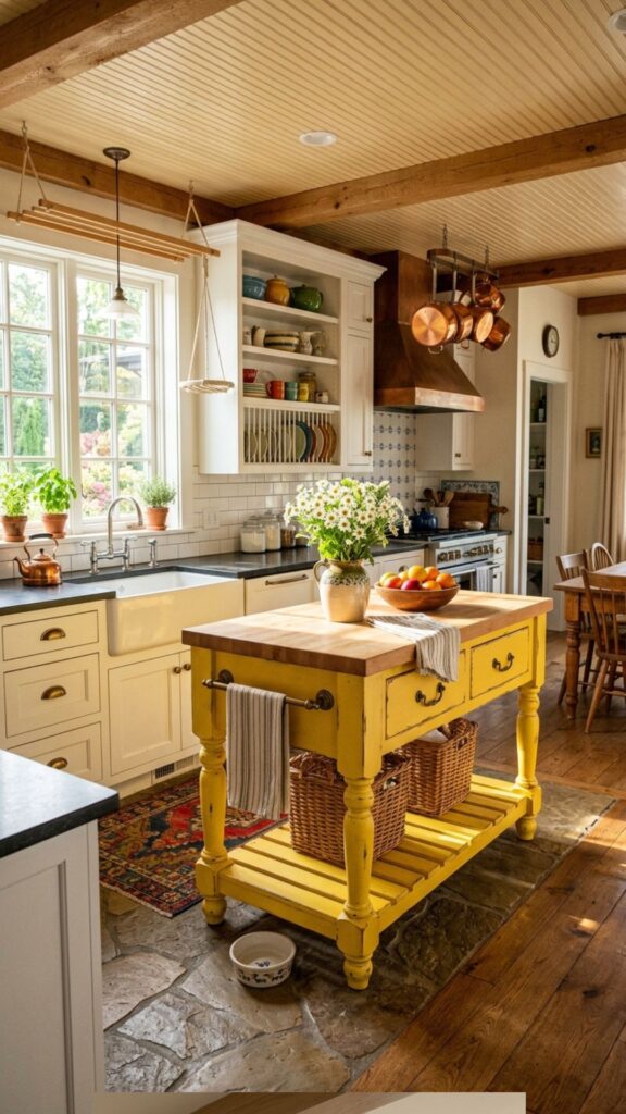
Yellow brings energy and warmth to a kitchen. A soft buttery yellow feels cozy, while a brighter shade adds playful charm. This color works wonderfully in cottage-style or vintage-inspired kitchens.
Yellow pairs best with white and gray to keep it from feeling overwhelming. Use it as an accent island in an otherwise neutral space. The result is a happy, inviting kitchen that makes mornings a little brighter.
8. Elegant Taupe
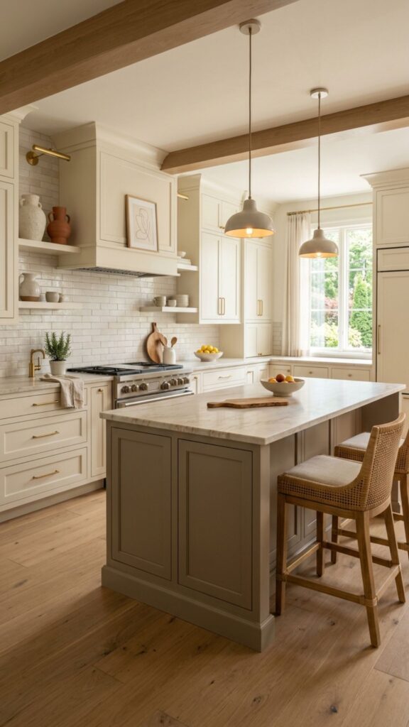
Taupe is the quiet hero of neutral colors. This warm gray-brown blend feels sophisticated and grounding. It pairs beautifully with cream cabinets and natural stone countertops. Taupe adds warmth without stealing attention.
If you love neutrals but find beige too plain and gray too cool, taupe hits the sweet spot. It’s a chameleon shade that adapts to changing trends, making it a safe long-term investment for your kitchen.
9. Rich Forest Green
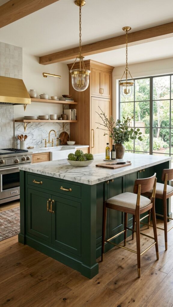
Forest green brings the outdoors in. Deeper and warmer than emerald, it feels cozy and grounded. This shade pairs beautifully with natural wood, marble, and gold accents. It’s perfect for kitchens that want a touch of nature.
I often recommend forest green to clients who want something bold but not flashy. It’s dramatic yet calming at the same time. Against a white or cream backdrop, a forest green island feels both luxurious and welcoming.
10. Soft Blush Pink
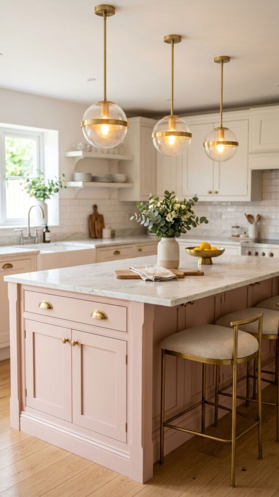
Blush pink might sound daring, but the right shade feels surprisingly sophisticated. A muted, dusty pink adds warmth and personality without looking childish. It works well in modern and eclectic kitchens.
Pair blush with brass hardware and white countertops for a chic, feminine touch. This color rewards the brave. If you want your kitchen to feel unique and full of charm, blush pink delivers a fresh, unexpected look.
11. Timeless Cream
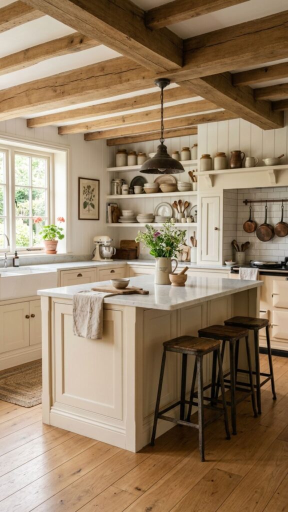
Cream offers the brightness of white with a bit more warmth. It feels soft, inviting, and never harsh. This shade suits farmhouse, traditional, and cottage kitchens beautifully. Cream pairs with wood tones and natural textures effortlessly.
Because cream is warmer than white, it hides minor wear a little better. It creates a cozy, lived-in feel that many homeowners love. For a welcoming kitchen that feels timeless, cream is hard to beat.
12. Deep Burgundy
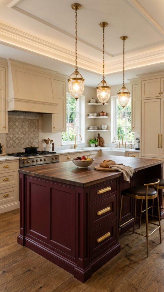
Burgundy brings richness and drama to a kitchen. This deep wine-red color feels bold and luxurious. It works especially well in traditional and formal kitchens. Paired with dark wood and gold, it creates a stately look.
Burgundy is a statement color, so use it with care. Keep the surrounding cabinets neutral to let the island stand out. The result is a warm, elegant space that feels rich and full of character.
13. Cool Slate Blue
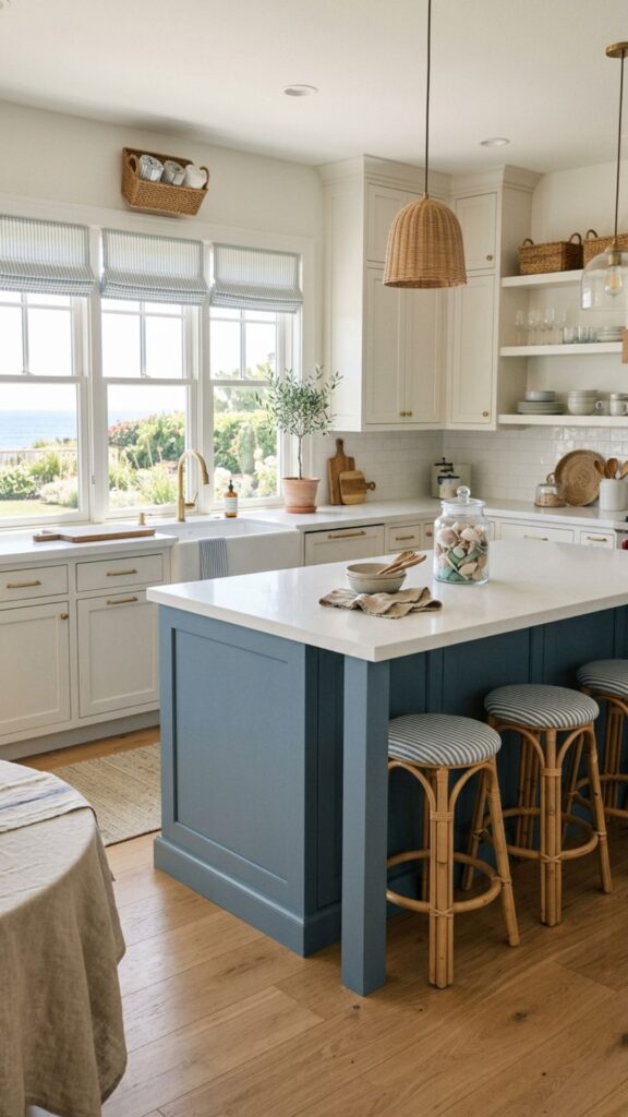
Slate blue offers a softer alternative to navy. This muted, grayish-blue feels calm and refined. It pairs beautifully with white countertops and light wood floors. Slate blue brings a relaxed, coastal vibe to any kitchen.
I’ve found this shade works well for people who want color but not intensity. It’s soothing without being boring. If you love blue but want something more subtle than navy, slate blue is a lovely middle ground.
14. Natural Wood Tone
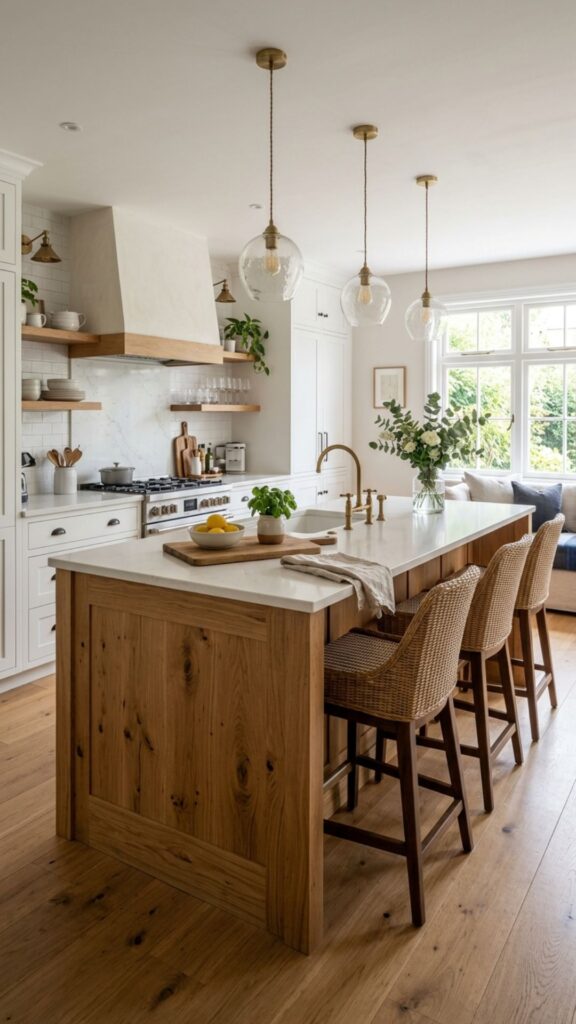
Sometimes the best color is no paint at all. A natural wood island adds warmth and texture that painted finishes can’t match. Oak, walnut, and maple each bring their own character. Wood grounds a kitchen and feels timeless.
This option pairs beautifully with painted cabinets in any shade. A wood island against white or gray cabinets creates lovely contrast. For a warm, organic kitchen with plenty of texture, natural wood is a classic choice.
15. Modern Two-Tone
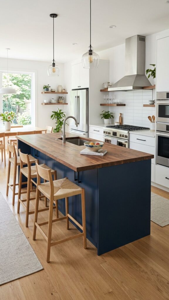
Two-tone islands mix two colors for extra visual interest. You might pair a navy base with a butcher block top, or a black island with a marble surface. This approach adds depth and helps your island stand out.
Two-tone designs also let you play with contrast. A bold base color with a light countertop keeps things balanced. This is one of my favorite kitchen island color ideas for homeowners who want something a little different.
16. Soft Lavender
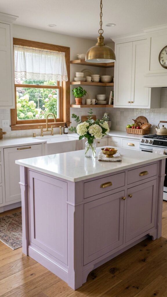
Lavender brings a gentle, dreamy quality to a kitchen. This soft purple feels calm and unexpected. It works beautifully in cottage, vintage, and eclectic spaces. Lavender adds personality while keeping things airy.
To keep lavender from feeling too sweet, pair it with gray or white. Matte black or brass hardware also adds a modern edge. For a kitchen that feels fresh and one of a kind, lavender is worth considering.
17. Warm Terracotta
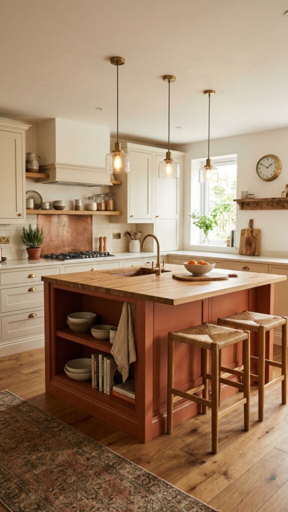
Terracotta brings earthy warmth inspired by Mediterranean design. This orange-brown clay tone feels cozy and grounding. It pairs beautifully with cream cabinets, natural wood, and warm metals. Terracotta adds instant character.
This color shines in kitchens with lots of natural light. It creates a sun-baked, welcoming feel that draws people in. If you want warmth and personality, terracotta offers a rich, inviting alternative to standard neutrals.
18. Sleek Stainless Steel
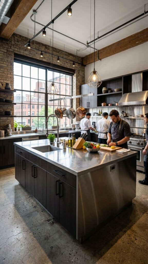
For modern and industrial kitchens, stainless steel makes a striking island choice. It feels professional and sleek, almost like a chef’s kitchen. Steel pairs well with concrete, wood, and darker cabinets. It brings a clean, commercial edge.
Stainless steel does show fingerprints, so regular wiping keeps it looking sharp. Still, its durability and modern appeal make it a favorite for design-forward homeowners. It’s practical, tough, and undeniably cool.
19. Muted Mustard
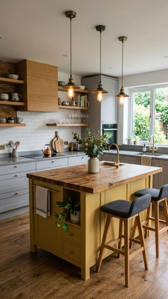
Mustard yellow offers a warmer, more grown-up take on yellow. This golden, earthy tone feels retro yet modern. It pairs well with gray, white, and natural wood. Mustard adds warmth and a hint of vintage charm.
This shade works beautifully as an accent island. Keep the rest of the kitchen neutral so the mustard can shine. For homeowners who want a bold but sophisticated pop of color, mustard is a standout option.
20. Soft Greige
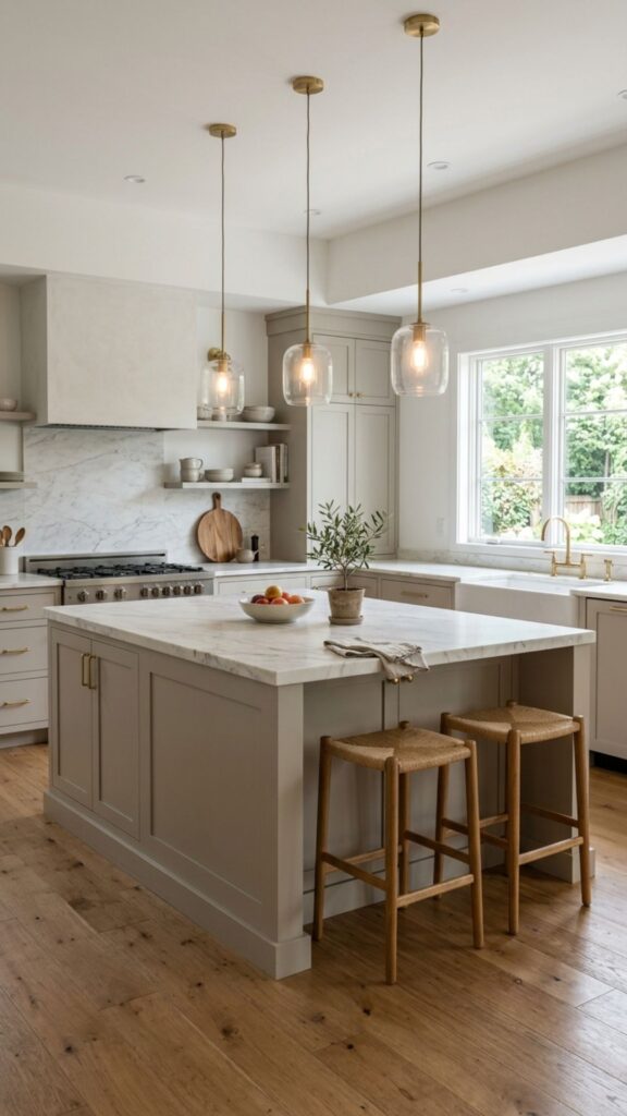
Greige blends gray and beige for the perfect neutral. It’s warm yet cool, adaptable yet interesting. This shade pairs with nearly everything, from marble to wood to stainless steel. Greige is a designer favorite for good reason.
If you can’t decide between gray and beige, greige solves the problem. It feels current without being trendy, which means it ages well. For a safe, stylish choice that works in any kitchen, greige is a reliable winner.
Conclusion
Choosing the right color for your kitchen island is one of the most rewarding design decisions you can make. Whether you lean toward bold emerald, calming sage, or timeless cream, the right shade sets the tone for your entire kitchen. Think about your daily habits, your existing finishes, and the mood you want to create.
Ready to bring your vision to life? Grab a few paint samples, test them in different lighting, and see which color speaks to you. Trust your instincts and don’t be afraid to add personality. Your dream kitchen island is just a can of paint away, so start planning your stylish new look today.
What is the most popular kitchen island color?
Navy blue and white are currently the most popular kitchen island colors. Navy adds depth and hides wear well, while white keeps kitchens bright and open. Both pair easily with a wide range of countertops and cabinet styles.
Should my kitchen island be a different color than my cabinets?
Yes, a contrasting island color is a popular and effective design choice. It creates a focal point and adds visual interest. For example, pair white cabinets with a navy or green island. Just keep the colors balanced so the room feels cohesive.
What color island makes a kitchen look bigger?
Light colors like white, cream, and soft greige make a kitchen look bigger. They reflect light and create an open, airy feel. For small kitchens, stick to lighter shades or use reflective finishes to maximize the sense of space.
Are dark kitchen islands hard to keep clean?
Dark islands like black or charcoal can show dust and fingerprints, but a matte finish helps hide smudges. Regular wiping keeps them looking sharp. Overall, darker colors often hide scuffs and stains better than pure white.
What colors work best with wood countertops?
Sage green, navy blue, charcoal gray, and cream all pair beautifully with wood countertops. These shades complement the natural warmth of wood and create a balanced, inviting look that works in both modern and farmhouse kitchens.