The bathroom is one of the smallest rooms in your home, yet it has an outsized effect on how your day starts and ends. The right color can turn a cramped, tired space into a spot that feels open, calm, and genuinely pleasant to be in.

After years of helping homeowners rethink their spaces, I’ve seen how a single shade swap can do more than a full remodel.
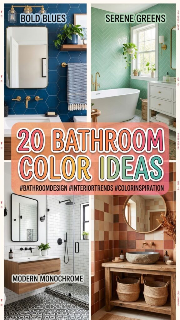
In this guide, you’ll get 20 bathroom color ideas worth trying, along with practical pairings, real-world examples, and tips on what works in tight or windowless rooms. Whether you want a spa-like retreat or a bold statement, there’s something here you can use this weekend.
1. Crisp White for Timeless Brightness
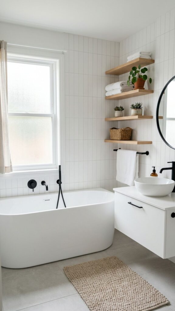
White never goes out of style, and there’s a good reason for that. It bounces light around the room, makes small bathrooms feel bigger, and gives you a clean backdrop for any towels, art, or fixtures you bring in. If your space lacks windows, white is your best friend.
To keep it from feeling sterile, layer in texture. Think a chunky knit bath mat, wood shelving, or matte black hardware. A warm white like Benjamin Moore’s “White Dove” feels softer than a stark, cool white, so pick your undertone based on your lighting.
2. Soft Sage Green for a Calm Retreat
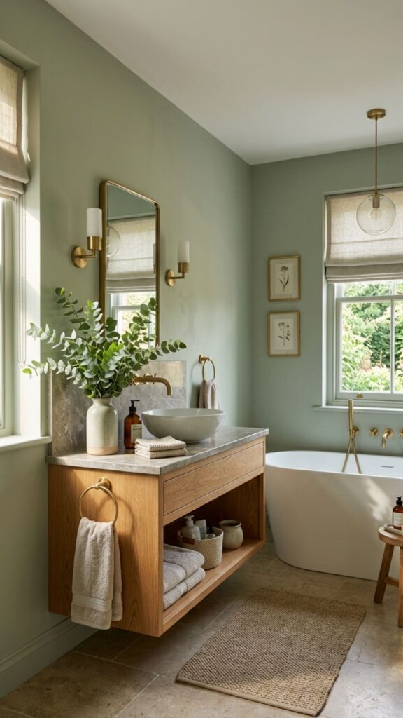
Sage green has quietly become a favorite, and it earns its place. It’s restful without being boring, and it pairs beautifully with natural materials like oak, brass, and stone. The result feels like a spa you didn’t have to leave home for.
Use sage on the walls or, for a bigger commitment, on lower cabinetry with white walls above. Add eucalyptus in a vase or a linen shower curtain to lean into that organic, grounded mood.
3. Pale Blue for an Airy, Spa-Like Feel
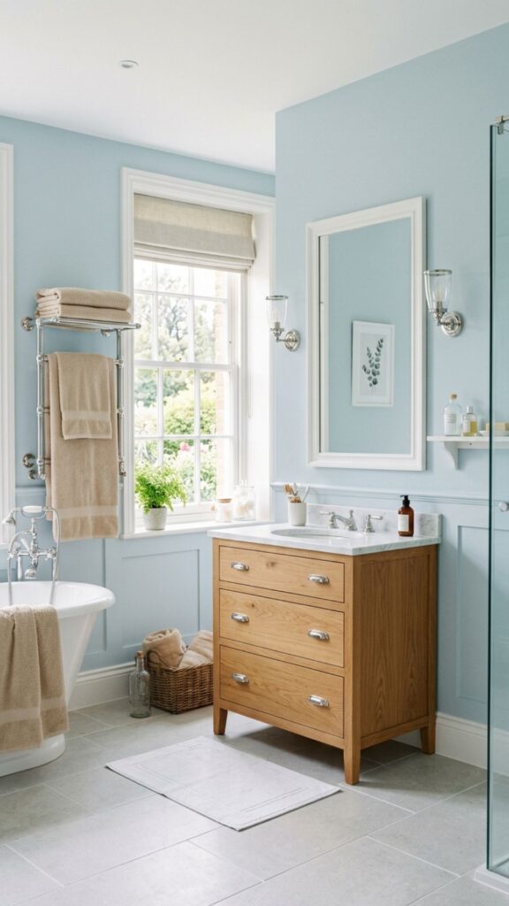
Few colors say “relax” quite like a soft blue. It mimics water and sky, which makes it a natural fit for a room built around bathing. Light blues also reflect daylight well, keeping things bright and fresh.
Pair pale blue with crisp white trim and chrome or polished nickel fixtures for a clean, classic look. If you want a little warmth, sandy beige towels or a wood vanity will balance the coolness nicely.
4. Charcoal Gray for Modern Drama
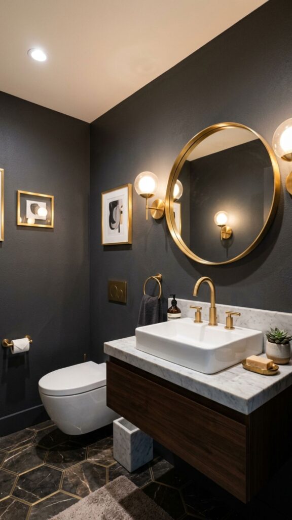
If you want your bathroom to feel sophisticated, charcoal gray delivers. It reads as moody and luxurious, especially when paired with metallics. Counterintuitively, dark colors can make a small bathroom feel cozy and intentional rather than cramped.
Balance the depth with plenty of light, both natural and artificial. Brass or gold accents pop against charcoal, and white sanitaryware keeps the space from feeling closed in. This works especially well in powder rooms where you’re going for impact.
5. Warm Terracotta for Earthy Character
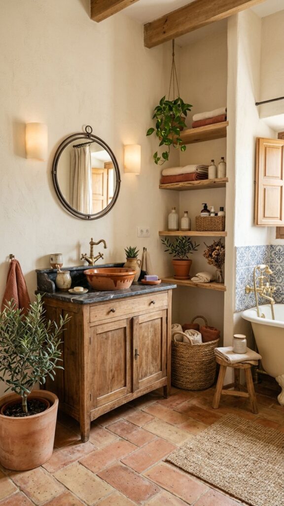
Terracotta brings the warmth of sun-baked clay indoors. It feels grounded, welcoming, and a little Mediterranean. This shade flatters most skin tones in the mirror, which is a small but real bonus when you’re getting ready.
Pair terracotta with cream, warm wood, and woven baskets for a relaxed, lived-in vibe. For a modern twist, combine it with deep green tiles. The contrast feels fresh without being loud.
6. Blush Pink for Subtle Softness
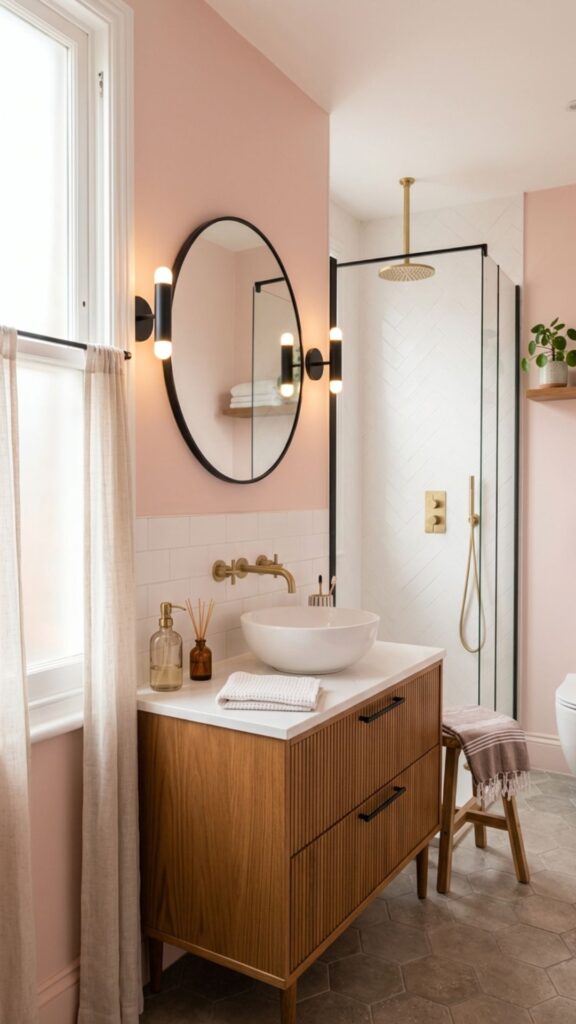
Blush pink has shed its old reputation. Today it reads as elegant and contemporary, not childish. As a soft neutral, it adds warmth and a gentle glow that flatters everyone.
Keep it grown-up by pairing blush with gray, charcoal, or matte black fixtures. A blush wall with white tile and brushed brass taps strikes a balance between cozy and refined.
7. Navy Blue for Bold Sophistication
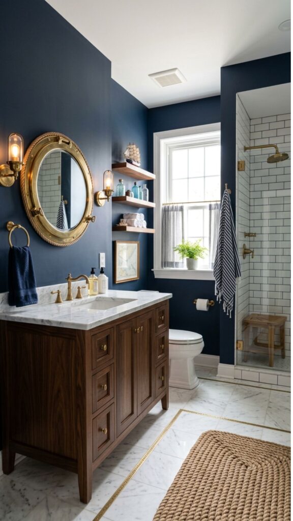
Navy is the dependable choice when you want richness without going fully dark. It’s deep enough to feel dramatic but classic enough to age well. Among bathroom color ideas, navy is the safe bet for bold homeowners.
Use it on a vanity, an accent wall, or wainscoting paneling. Navy loves white marble, brass, and warm wood. Together, they create a look that feels polished and a touch nautical.
8. Sunny Yellow for an Energizing Lift
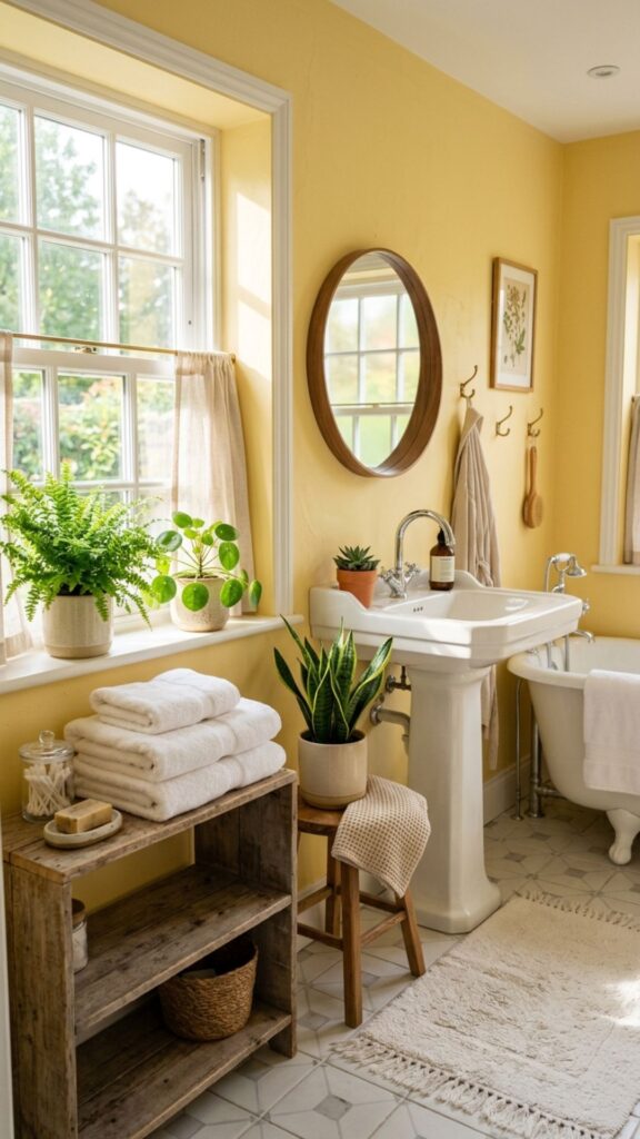
Yellow wakes up a room like nothing else. A soft buttery yellow brings cheer to a morning routine and pairs well with white for a clean, sunny feel. It’s ideal for bathrooms that get limited natural light.
Go easy on saturation, though. A pale or muted yellow stays inviting, while a neon shade can overwhelm in a small space. Add white towels and a few green plants to keep things balanced.
9. Greige for Effortless Neutrality
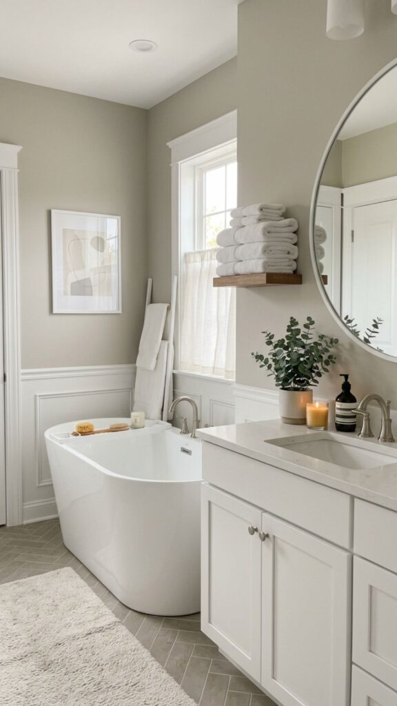
Greige, the blend of gray and beige, is the ultimate flexible neutral. It’s warmer than gray and cooler than beige, so it works in almost any light. If you can’t decide, greige rarely disappoints.
This shade is perfect for resale-friendly renovations because it appeals broadly. Pair it with white trim and let your towels, plants, and art bring in seasonal pops of color.
10. Deep Forest Green for a Luxe Touch
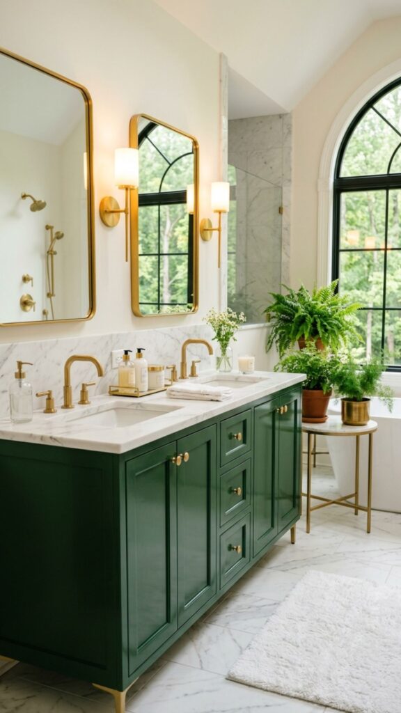
Forest green feels rich, established, and a little glamorous. It pairs naturally with brass and marble, making it a go-to for an upscale look. Used on a vanity, it grounds the whole room.
For a striking scheme, combine forest green cabinetry with white marble countertops and gold hardware. The greenery feels especially at home with a few potted ferns nearby.
11. Lavender for a Gentle, Restful Mood
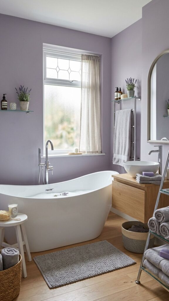
Lavender brings a soft, soothing quality that suits a bathroom meant for unwinding. It’s a touch unexpected, which gives the room personality without shouting for attention.
Keep lavender muted rather than bright purple. Pair it with white, soft gray, and silver accents. A lavender wall with a clean white tub feels serene, almost like a quiet exhale at the end of a long day.
12. Black and White for Classic Contrast
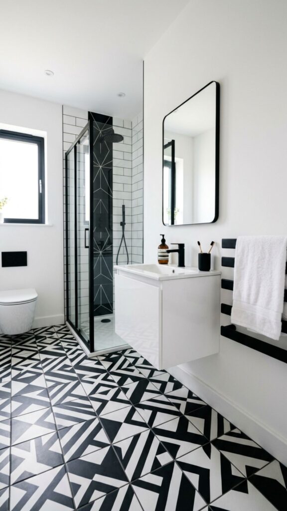
You can’t go wrong with black and white. This pairing is graphic, crisp, and endlessly adaptable. It works in tiny powder rooms and large primary baths alike.
Try black-and-white floor tile with white walls and black fixtures for a timeless look. The high contrast keeps the space feeling sharp and intentional, and it photographs beautifully.
13. Teal for Vibrant Personality
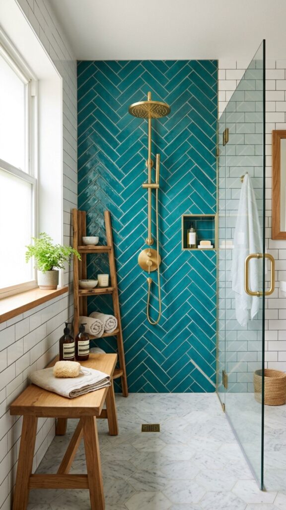
Teal sits right between blue and green, offering the calm of both with extra energy. It’s bold without being aggressive, making it a fun choice for people who want color but not chaos.
Use teal tiles in the shower or on a feature wall. It pairs well with white, natural wood, and gold. The combination feels fresh, retro, and modern all at once.
14. Mushroom Taupe for Understated Warmth
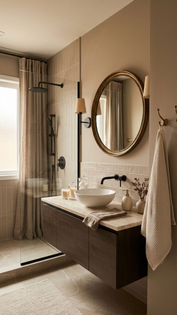
Mushroom taupe is the quiet hero of neutral palettes. It’s warm, soft, and surprisingly versatile, working with both cool and warm accents. It feels calm without being cold.
This shade suits anyone wanting a spa-like result without bright color. Pair it with cream, soft white, and matte black or aged brass for a refined, grounded space.
15. Coral for a Playful Pop
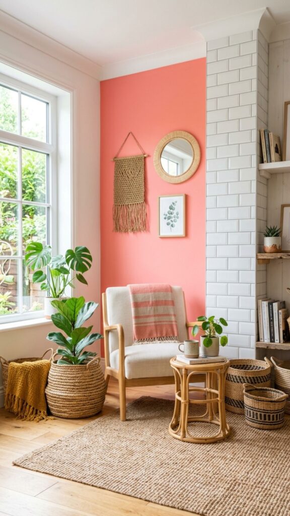
Coral brings energy and warmth in equal measure. It’s lively, cheerful, and ideal for guest bathrooms or family spaces where you want a little fun. It also flatters the complexion in mirror lighting.
Balance coral’s brightness with plenty of white and natural texture. A coral accent wall, white tile, and woven accessories keep it feeling fresh rather than overwhelming.
16. Slate Blue-Gray for Quiet Elegance
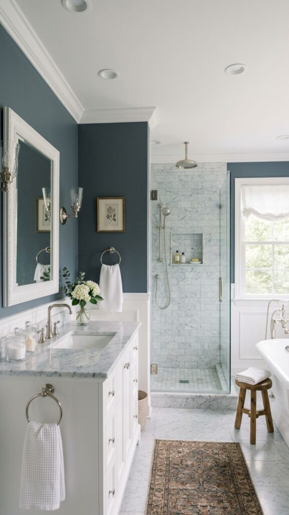
Slate blue-gray hits a sweet spot between calm and sophisticated. It shifts subtly with the light, looking bluer by day and grayer at night. That depth gives the room a custom feel.
Pair it with white trim, marble accents, and chrome or nickel fixtures. It’s a great choice if navy feels too dark but plain gray feels too flat.
17. Buttercream for Soft, Cozy Warmth
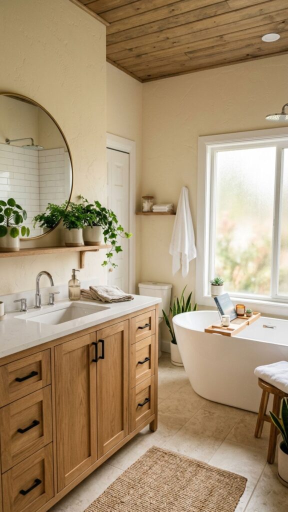
Buttercream is yellow’s gentler cousin. It adds warmth and coziness without the punch of a brighter shade. In a north-facing bathroom that gets cool light, it brings a welcome glow.
Combine buttercream walls with white fixtures and warm wood for a relaxed, inviting feel. A few greenery accents keep it from feeling too sweet.
18. Emerald for Jewel-Toned Glamour
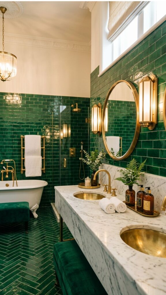
Emerald is for when you want your bathroom to feel like a treasure. It’s saturated, rich, and unapologetically luxurious. Used in glossy tile, it practically glows.
Pair emerald with brass fixtures, white marble, and plenty of light. Even a small dose, like an emerald vanity, transforms an ordinary room into something memorable.
19. Two-Tone Walls for Visual Interest
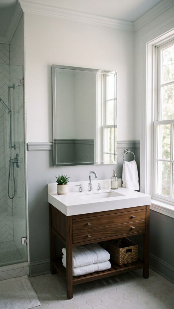
Splitting your walls into two colors adds depth and a custom look without much extra effort. A darker shade on the bottom anchors the room, while a lighter shade up top keeps it airy.
Try a soft gray lower half with white above, divided by simple molding. This trick also hides scuffs near the floor, which is handy in a busy family bathroom.
20. Monochrome Tonal Palette for Cohesive Calm
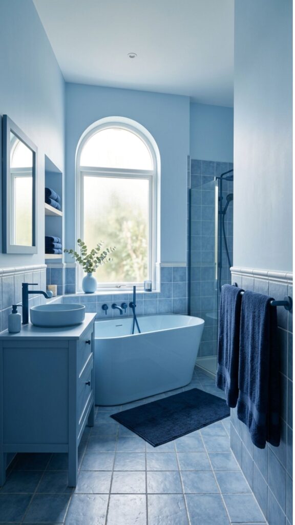
A monochrome scheme uses different shades of one color for a layered, restful effect. Think pale blue walls, mid-blue tile, and deep blue towels. It feels intentional and deeply calming.
This approach works with almost any base color. The key is varying the tones and adding texture so the room stays interesting rather than flat. It’s one of the most reliable bathroom color ideas for a polished, put-together space.
Conclusion: Pick a Palette and Start Fresh
Color is the fastest, most affordable way to refresh a bathroom. From timeless white to dramatic emerald, the right shade can shift the entire mood of your daily routine. The best choice depends on your light, your space, and the feeling you want to walk into each morning.
Start small. Grab a few paint samples, tape them to your wall, and watch how they look across morning, afternoon, and evening light. Once a color feels right at every hour, commit to it and bring in towels, plants, and hardware to complete the look. Your fresh new bathroom is just a paintbrush away.
What is the best color for a small bathroom?
Light, cool colors work best in small bathrooms. White, pale blue, and soft greige reflect light and make the space feel larger and brighter. For added depth without shrinking the room, use a darker shade only on a single accent wall.
What colors make a bathroom look bigger?
Whites, soft blues, pale greens, and light grays make a bathroom look bigger. These shades reflect both natural and artificial light, creating an open, airy feel. Using one continuous color on walls and trim also reduces visual breaks and expands the space.
What are the most relaxing bathroom colors?
Soft blues, sage green, lavender, and warm neutrals like greige are the most relaxing bathroom colors. They mimic nature and lower visual stimulation, helping the room feel spa-like and calm.
Can I use dark colors in a bathroom?
Yes, dark colors like charcoal, navy, and forest green work well in bathrooms. They create a cozy, sophisticated mood, especially in powder rooms. Just balance them with good lighting, white fixtures, and reflective metallic accents.
How do I choose a bathroom color that won’t date quickly?
Stick with timeless neutrals and classic pairings like white, greige, navy, and black-and-white. Bring trendier colors in through easily swapped items such as towels, art, and accessories so you can update the look without repainting.