A tired bedroom doesn’t always need new furniture, fresh flooring, or a full renovation. Sometimes, one wall of color is all it takes. A single accent wall can shift the entire mood of a room in an afternoon, and it costs far less than a remodel.

That’s the beauty of a bedroom feature wall. With a quart or two of paint, you can add depth, warmth, or drama without touching the rest of the space.

In this guide, you’ll learn 18 paint-based ideas, from calming neutrals to bold statements, plus tips on picking colors, matching furniture, and avoiding the regret of a shade you don’t love. Grab a few swatches and let’s find your perfect wall.
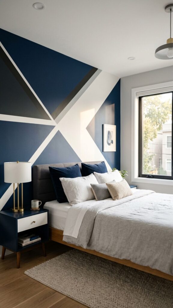
1. Go Bold With Deep Navy
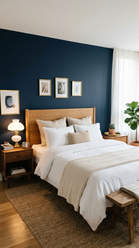
Deep navy is one of the most popular feature wall colors for a reason. It feels rich and cozy without being as heavy as black, and it pairs beautifully with white trim, wood tones, and brass accents. Paint it behind the bed to frame your headboard like a piece of art.
Navy works in both small and large rooms. In a tight space, it adds depth that makes the wall feel like it recedes. Balance it with light bedding and a few warm metallics so the room feels layered rather than dark.
2. Keep It Calm With Soft Sage
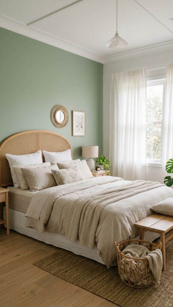
Soft sage green brings a quiet, nature-inspired feel to the bedroom. It’s gentle on the eyes, which makes it ideal for a room meant for rest. Sage pairs well with natural materials like linen, rattan, and light oak.
This shade reads as a neutral, so it won’t fight with your existing furniture. If you’re nervous about commitment, sage is a safe but stylish choice. It looks especially fresh against crisp white ceilings and pale wood floors.
3. Add Warmth With Greige
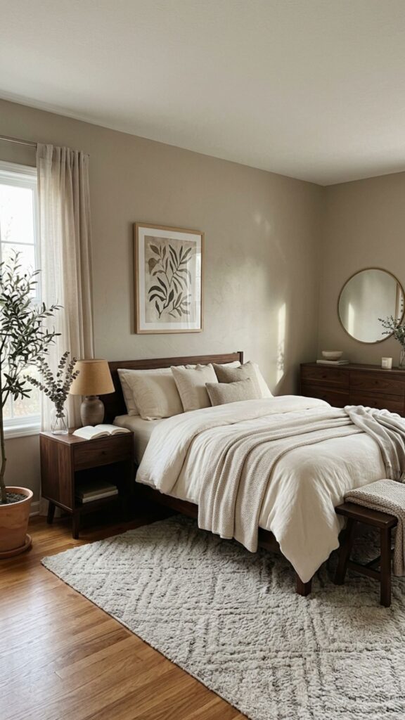
Greige, a blend of gray and beige, is the ultimate flexible neutral. It feels warmer than plain gray and more modern than tan, so it suits almost any decor style. Use it when you want a feature wall that’s subtle rather than loud.
Because greige shifts with the light, test it at different times of day before you commit. It can lean cooler in north-facing rooms and warmer in sunny ones. Pair it with cream bedding and dark wood for a grounded, calming look.
4. Bring Earthy Energy With Terracotta
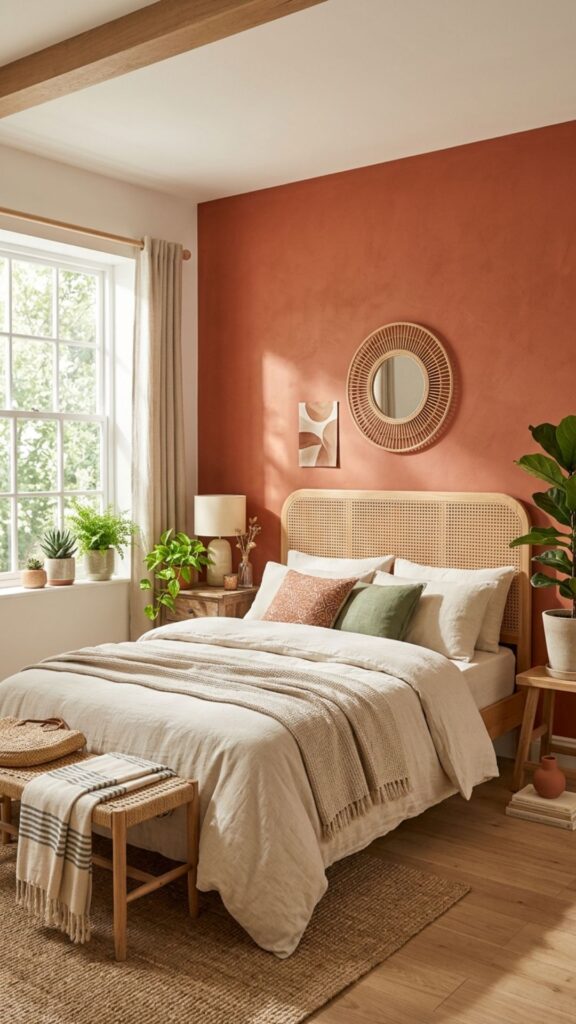
Terracotta delivers warmth and personality without feeling overwhelming. This clay-inspired orange-brown adds a cozy, sun-baked glow that works year-round. It’s a great pick if you want color but find navy or charcoal too dark.
Style terracotta with cream, tan, and touches of green to echo a natural palette. It looks stunning behind a wooden or cane headboard. In a room with plenty of daylight, the color practically glows.
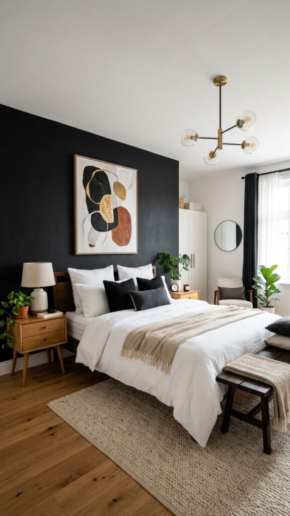
5. Make a Statement With Charcoal
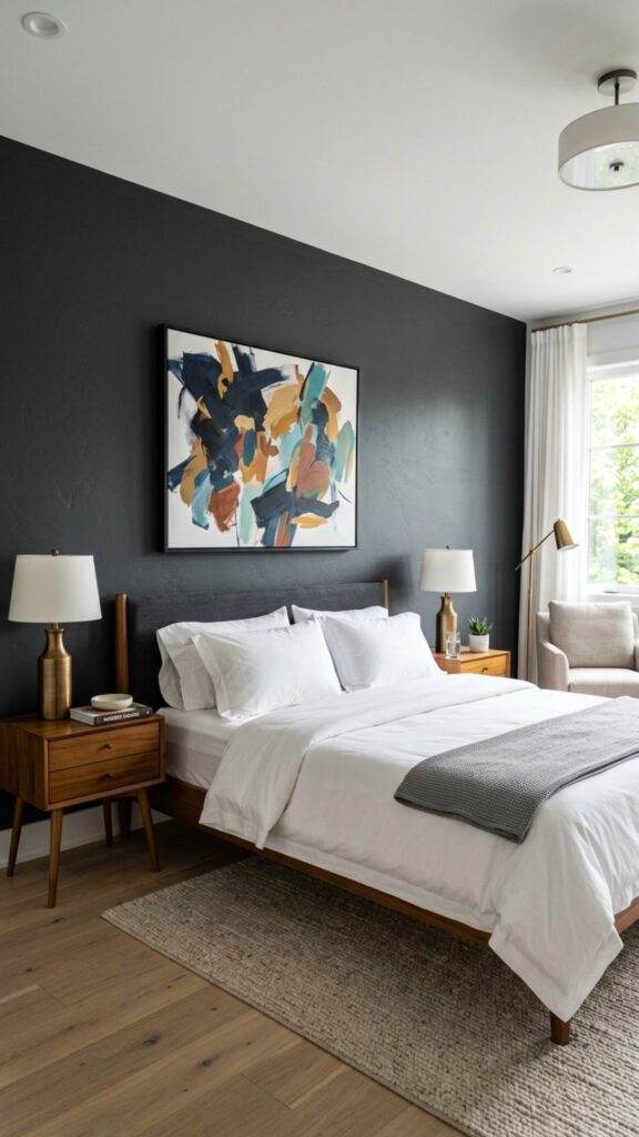
Charcoal gray creates instant drama and a modern, sophisticated mood. It’s softer than true black but still bold enough to anchor the whole room. A charcoal feature wall makes light furniture and bright art really pop.
To keep the space from feeling closed in, add plenty of texture and light tones elsewhere. Think white bedding, a chunky knit throw, and a warm bedside lamp. Charcoal pairs especially well with metallic gold or copper accents.
6. Soften the Room With Blush Pink
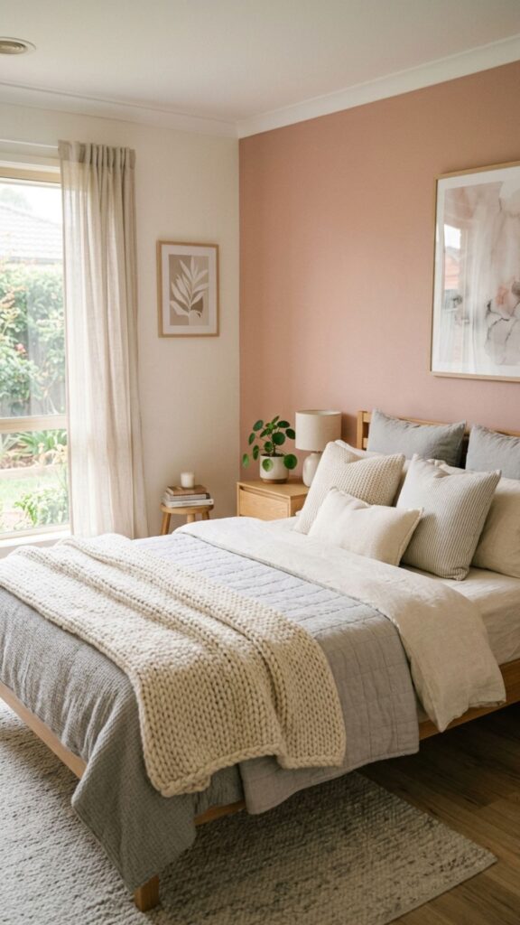
Blush pink is far more versatile than people expect. The muted, dusty version reads as a warm neutral rather than a sweet pastel, so it suits grown-up bedrooms beautifully. It adds a gentle glow that flatters the whole space.
Pair blush with gray, white, or even deep green for a balanced look. It works well in rooms with limited natural light, since it keeps things feeling soft and warm. Try it behind the bed with simple, neutral bedding to let the color shine.
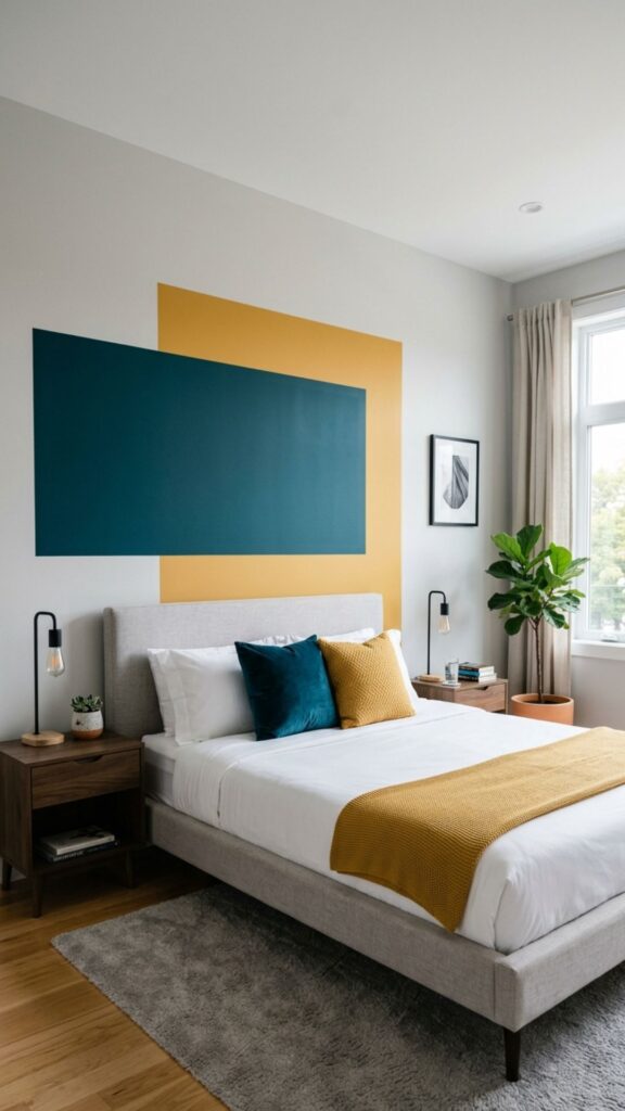
7. Try Eye-Catching Color Blocking
Color blocking uses two or more bold shades on one wall to create a graphic, modern effect. You might paint the lower two-thirds one color and the top a contrasting tone, or add a large painted square behind the bed. This approach turns paint into instant artwork.
Use painter’s tape for crisp, clean lines, and stick to two or three colors so it doesn’t feel chaotic. Pick shades from the same family for a subtle look, or go high-contrast for real impact. It’s a budget-friendly way to add personality.
8. Frame Your Bed With a Painted Arch
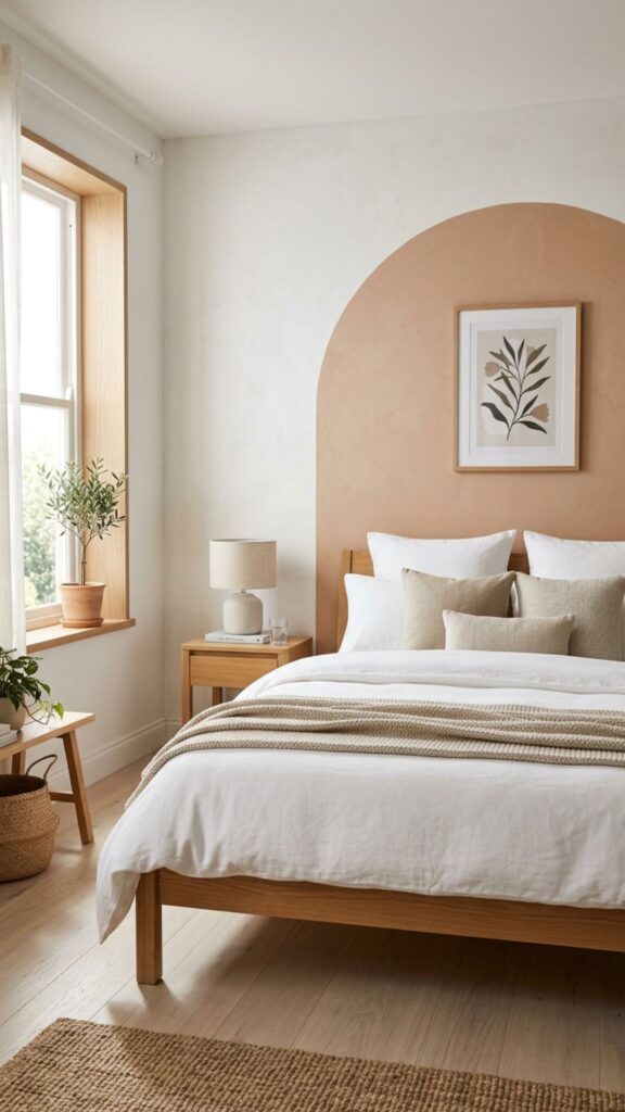
A painted arch is a popular, renter-friendly trend that adds shape and softness. You simply paint an arched shape on the wall behind your headboard, creating a faux frame without any hardware. It instantly draws the eye to your bed.
Use a pencil, a string, and a pushpin to map out the curve before you paint. A soft terracotta, sage, or muted blue works beautifully for this. The arch makes even a plain headboard feel intentional and designed.
9. Keep It Light With a Half-Painted Wall
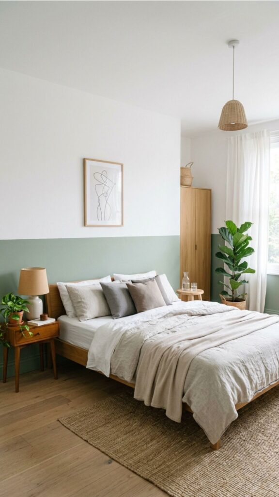
A half-painted wall adds color while keeping the room feeling open and airy. You paint the bottom half or two-thirds of the wall and leave the top white or neutral. This trick visually lowers the wall, which can make ceilings feel higher.
This look is great for renters and commitment-shy decorators, since it uses less paint and feels less permanent. Run a level line of tape to keep the divide straight. Pair a muted lower color with a crisp white top for a clean, modern finish.
10. Add Depth With Textured Paint Effects
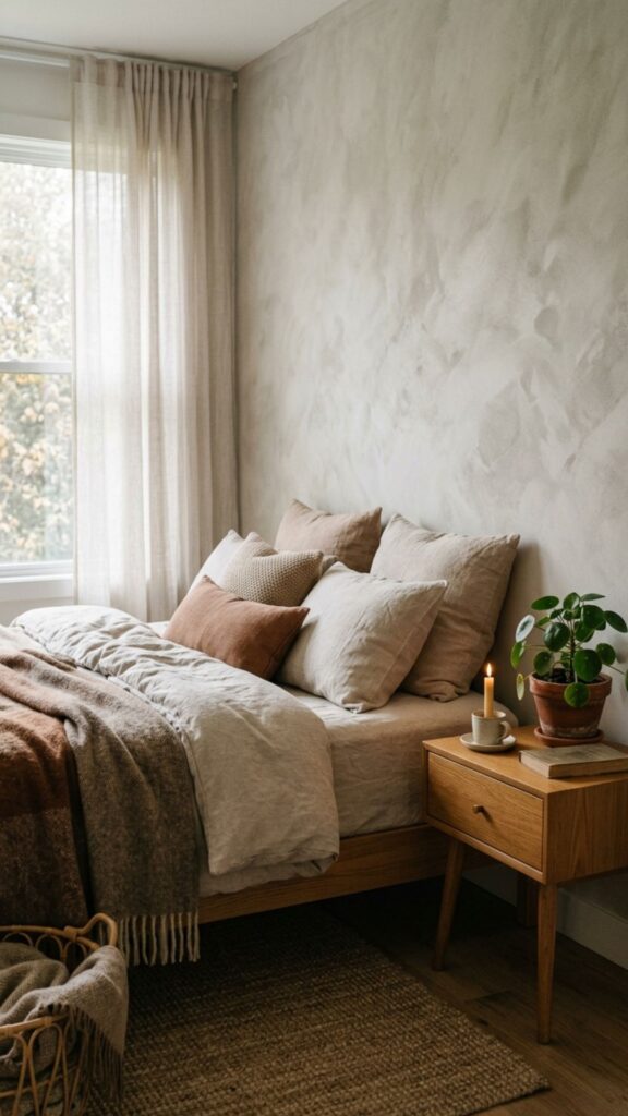
Textured techniques like limewash and color wash add subtle movement and depth to a feature wall. Instead of one flat color, you get soft, cloudy variations that catch the light. This gives the wall a rich, plaster-like quality.
Limewash is especially forgiving and easy to apply with a wide brush in crisscross strokes. It works well in earthy tones like clay, sage, and soft gray. The result feels custom and high-end, even on a small budget.
11. Stay Timeless With Classic White-on-Texture
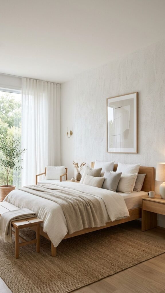
If color feels risky, a textured white feature wall offers contrast without committing to a shade. Use a matte white limewash or a subtle plaster effect to add interest through texture alone. The wall stands out quietly, through depth rather than color.
This approach suits minimalist and Scandinavian-style bedrooms. It keeps the room bright while still giving one wall a focal point. Layer in natural wood and soft textiles to complete the calm, airy feel.
12. Create Drama With Deep Forest Green
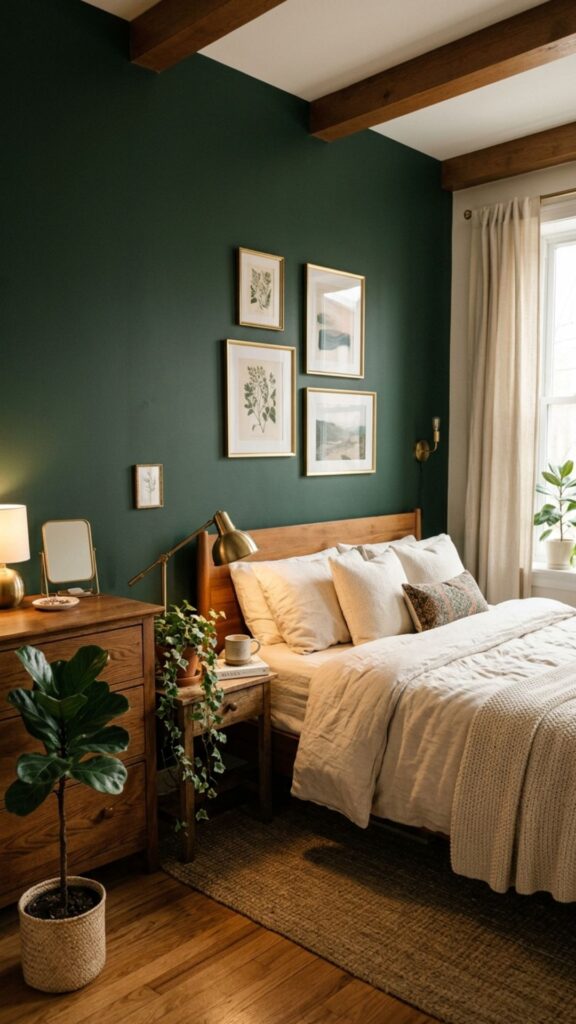
Deep forest green brings the same richness as navy with a slightly warmer, earthier feel. It pairs wonderfully with brass, wood, and cream, creating a cozy, library-like mood. This shade feels both classic and current.
Forest green works as a bold backdrop for a wooden or upholstered headboard. Keep the surrounding walls light so the feature wall stays the star. Add a few plants nearby to play up the natural, grounded vibe.
13. Brighten Small Rooms With Soft Sky Blue
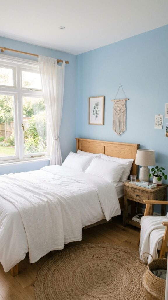
A pale, soft blue can make a small bedroom feel larger and more open. Light, cool colors visually push walls back, which adds a sense of space. Sky blue also brings a fresh, airy calm that’s perfect for sleep.
This shade pairs nicely with white, gray, and natural wood. It’s a gentle way to add color without darkening a compact room. Use it on the wall behind the bed and keep the rest of the room light and simple.
14. Go Moody With Plum or Aubergine
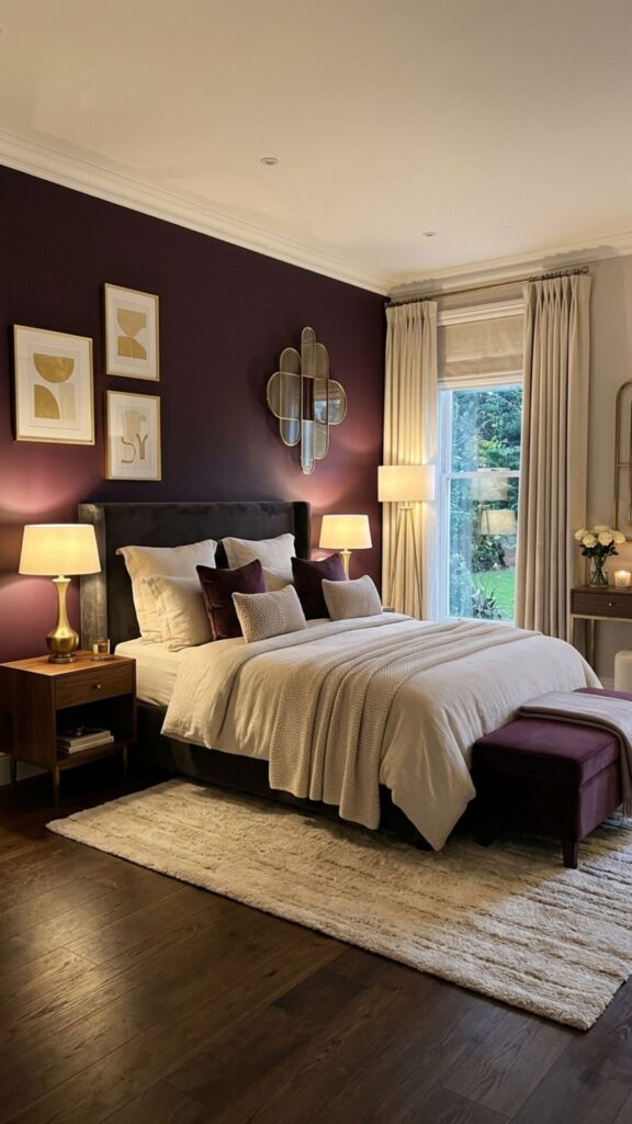
Plum and aubergine offer a luxurious, unexpected take on a dark feature wall. These deep purples feel warm and enveloping, making them ideal for a cozy, intimate bedroom. They’re bold without feeling cold.
Balance the richness with soft neutrals like cream, blush, or warm gray. Gold or brass accents bring out the warmth in the color. This is a great choice if you want something memorable that still feels restful.
15. Try Warm Mustard for a Retro Touch
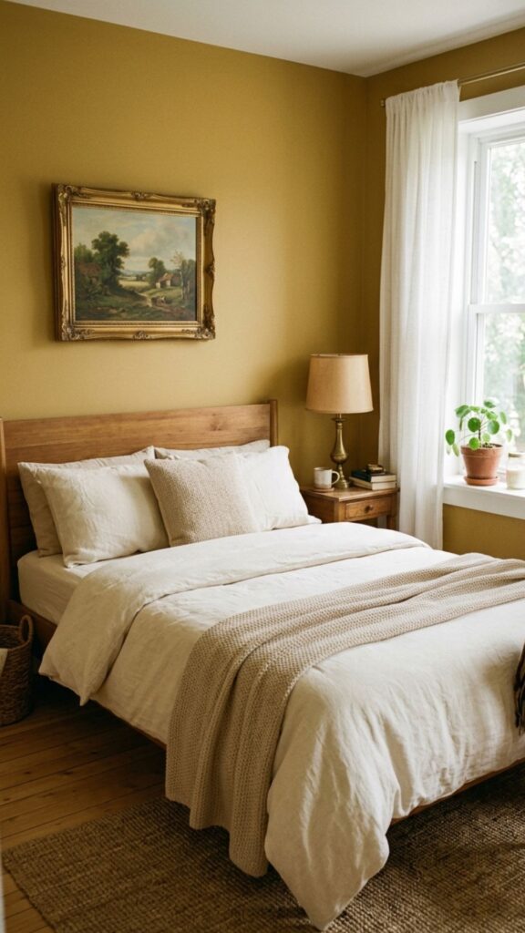
Mustard yellow adds cheer and a touch of vintage charm. The muted, golden version feels sophisticated rather than loud, so it works as a true accent. It instantly warms up a room that feels flat or cold.
Pair mustard with gray, navy, or white to keep it grounded. It looks great behind a simple bed with neutral linens. A little goes a long way, which makes it perfect for a single feature wall.
16. Keep It Subtle With Tonal Layering
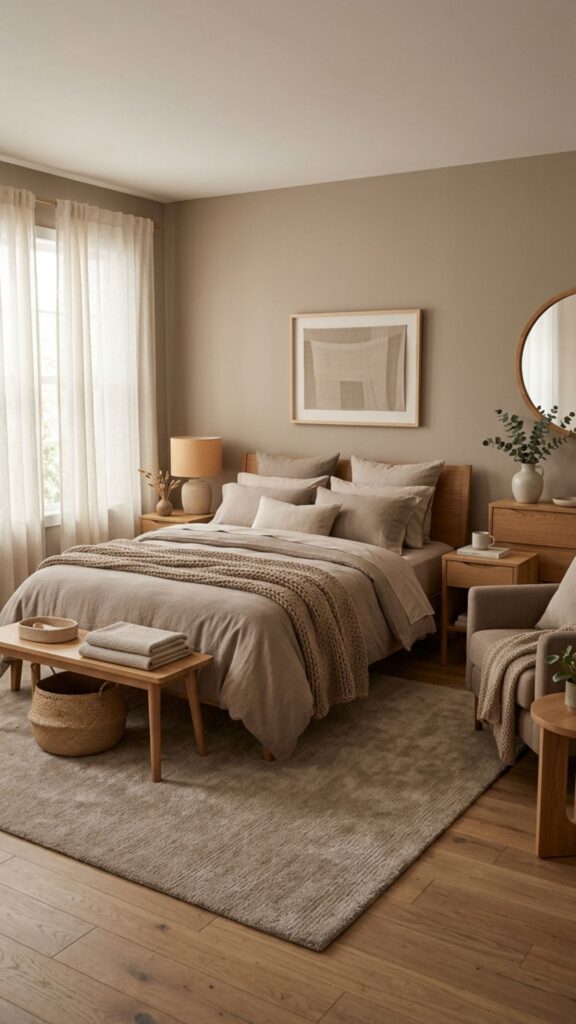
Tonal layering means using slightly different shades of the same color across the wall and decor. For example, a soft taupe wall paired with deeper taupe and cream accents creates a calm, cohesive look. It feels rich without any harsh contrast.
This approach is nearly foolproof for matching furniture, since everything stays in one color family. Choose three tones, from light to dark, and spread them across the wall, bedding, and accents. The result is soothing and effortlessly pulled together.
17. Add Contrast With Warm Black
A warm black feature wall sounds daring, but it can feel surprisingly cozy. Black with a hint of brown or charcoal undertone creates a soft, modern backdrop that makes everything else stand out. It’s bold but never harsh when balanced well.
Keep the rest of the room bright with white bedding, natural wood, and good lighting. Black works best as a backdrop for art, light furniture, or a statement headboard. Used carefully, it makes a small bedroom feel intentional and chic.
18. Test a Trending Two-Tone Block
A two-tone block combines color blocking and the half-wall idea into one bold shape. Paint a large rectangle or square of color behind the bed in a contrasting shade, leaving a border of the base wall around it. It frames your bed like built-in art.
This works especially well when the block color matches an accent in your bedding or rug. Use tape and a level to keep the edges sharp. It’s a fresh, low-cost way to give your bedroom feature wall a designer touch.
Conclusion
A fresh coat of paint on one wall is the fastest, most affordable way to transform your bedroom. Whether you lean toward calming sage, dramatic navy, or a playful painted arch, the right bedroom feature wall sets the tone for the entire room.
Here are your quick takeaways:
- Pick a color that supports rest, not just trends.
- Test swatches in your own light before committing.
- Match your wall to one accent already in the room.
- Use tape and a level for clean, professional results.
Ready to refresh your space? Choose one idea from this list, grab a few sample pots, and paint a test patch this weekend. One bold wall might be all it takes to fall in love with your bedroom again.
Which wall should be the feature wall in a bedroom?
The wall behind your bed is usually the best choice, since it’s the natural focal point of the room. It frames your headboard and draws the eye as soon as you walk in. Avoid walls broken up by windows or doors, as they make the color look choppy.
What colors make a small bedroom look bigger?
Light, cool shades like soft sky blue, pale sage, and warm greige help small rooms feel more open. These tones reflect light and visually push the walls back. Painting just one wall a soft color adds depth without closing in the space.
How do I choose a feature wall color without regretting it?
Buy sample pots and paint large test patches on the wall, then watch them at different times of day. Make sure the color works with your bedding and furniture before committing. Picking a shade you already love in your wardrobe or decor is a safe bet.
Does a bedroom feature wall make a room look smaller?
Not if you choose wisely. A darker wall behind the bed can actually add depth and make a room feel cozier rather than cramped. Keep the other walls light and add good lighting to maintain balance and openness.