Your bathroom should feel like a small escape, not just a room where you brush your teeth and rush out the door. The right colors can change everything. They soften the morning light, calm your mind after a long day, and make a tiny space feel like a retreat.
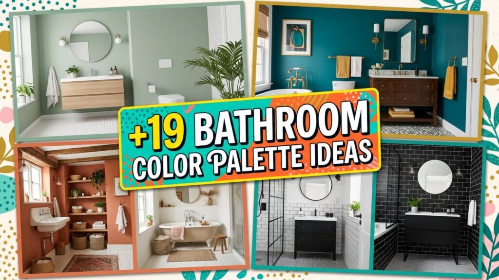
I’ve spent years helping homeowners rework their bathrooms, and the same truth comes up again and again: paint and tile choices matter more than expensive fixtures. Get the colors right, and even a small bathroom can feel like a luxury spa.

Below you’ll find 19 bathroom color palette ideas, each with practical tips on how to use them. Whether you love soft neutrals or crave a bit of drama, there’s a combination here for you.
1. Soft Sage Green and Warm White
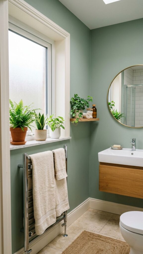
Sage green has a quiet, grounding quality that instantly slows your breathing. Pair it with a warm white on the trim and ceiling, and you create a balance that feels fresh but never cold. This bathroom color palette works beautifully in rooms with natural light, where the green picks up subtle shifts throughout the day.
To pull it off, use sage on the walls and keep your vanity a clean white or natural wood. Add a few green plants and linen towels in cream, and the whole space starts to feel like a garden spa. It’s forgiving, too, hiding water spots better than stark white.
2. Pale Blue and Crisp White
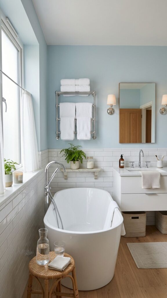
Few combinations say “spa” louder than pale blue and white. Blue calls to mind water, sky, and stillness, which makes it a natural fit for a room built around bathing. The crisp white keeps things light and prevents the blue from feeling heavy.
Try a soft powder blue on the walls with glossy white subway tile in the shower. White towels and a chrome faucet finish the look. If you want a little warmth, swap in brushed brass hardware for a gentle contrast that keeps the room from feeling chilly.
3. Greige and Soft Taupe
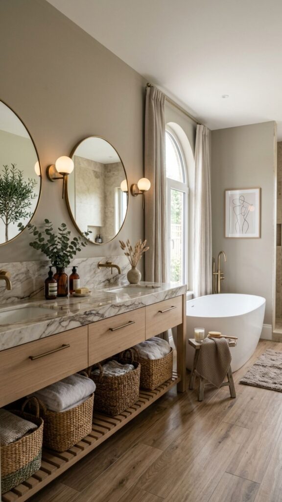
Greige, the clever mix of gray and beige, is one of the most flexible colors you can choose. It reads as neutral without being boring, and it pairs with almost any accent. Layer it with a soft taupe for a tone-on-tone look that feels rich and restful.
This palette shines when you add texture. Think wood-look tile, a stone countertop, and woven baskets. The slight warmth keeps the space inviting, and because the tones are so muted, your bathroom stays calm even on hectic mornings.
4. Charcoal Gray and Bright White
If you love a bit of drama, charcoal gray delivers without overwhelming the room. Used on a single feature wall or the lower half of the walls, it adds depth and makes white fixtures pop. The contrast feels modern and clean.
Balance is key here. Keep the ceiling and trim bright white so the dark tone doesn’t close in the space. Add warm lighting and natural wood accents to soften the edges. This bathroom color palette suits modern homes that want a touch of boldness.
5. Creamy Beige and Natural Wood
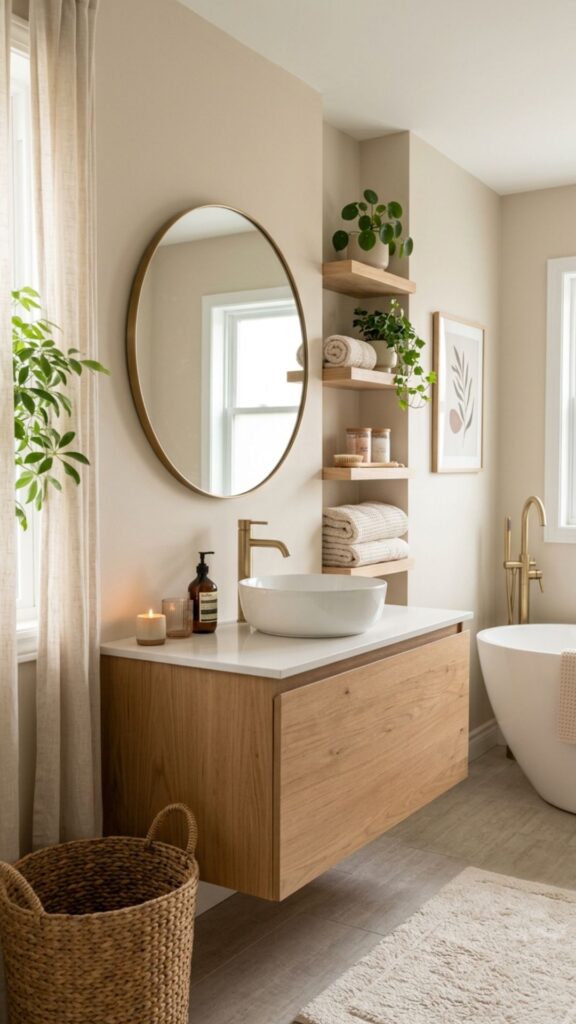
Beige gets a bad reputation for being dull, but the right shade is warm and welcoming. Pair a creamy beige with natural wood tones, and you create a Scandinavian-inspired retreat that feels effortless. The look is timeless and easy to update with new accessories.
Use beige on the walls and bring in wood through the vanity, shelving, or a stool. Keep metals soft, like matte black or aged brass. The combination feels organic, like a quiet cabin spa tucked into your home.
6. Dusty Rose and Warm Gray
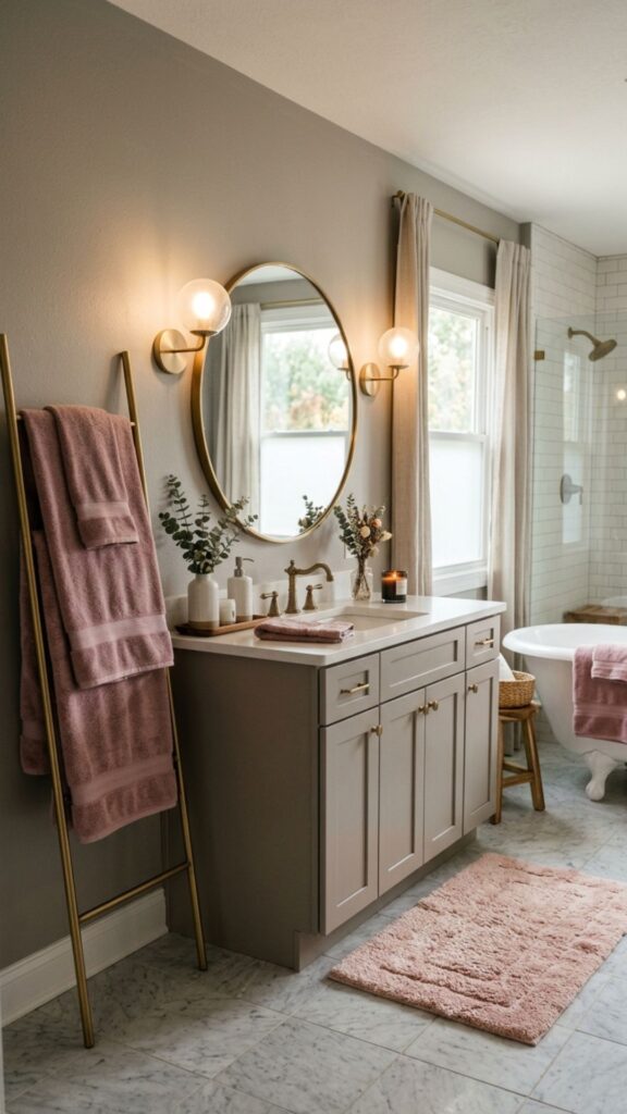
Dusty rose brings a gentle blush of color without tipping into bright pink. It feels romantic and soft, especially when grounded by a warm gray. Together they create a palette that’s cozy and a little unexpected.
This works well in powder rooms or primary bathrooms where you want a personal touch. Paint the walls in warm gray and use dusty rose for towels, a bath mat, or a painted vanity. The result feels styled but never fussy.
7. Deep Navy and Gold Accents
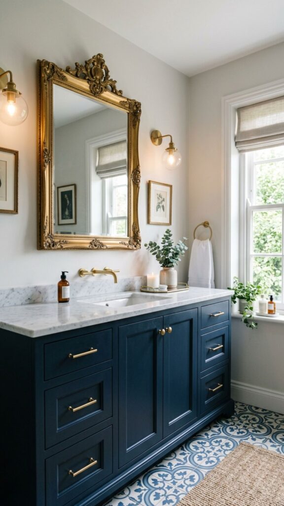
Navy is the dark color that never goes out of style. It feels rich, calming, and surprisingly versatile. Pair it with gold or brass accents, and your bathroom takes on a quietly luxurious mood.
Use navy on the vanity or lower walls, and keep the upper walls light to balance the depth. Gold faucets, mirror frames, and light fixtures add warmth and shine. This bathroom color palette feels like a boutique hotel without the boutique price tag.
8. Soft Lavender and White
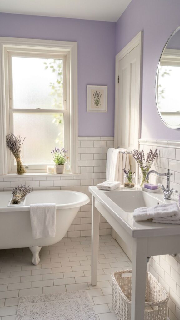
Lavender has a long association with relaxation, and for good reason. A pale, dusty version of the color feels soothing rather than sweet. Combined with white, it creates an airy, calming space perfect for unwinding.
Keep the lavender soft and muted so it reads as a neutral with a hint of color. Pair it with white tile and silver or chrome fixtures. Add a few sprigs of dried lavender or eucalyptus, and the spa feeling is complete.
9. Earthy Terracotta and Cream
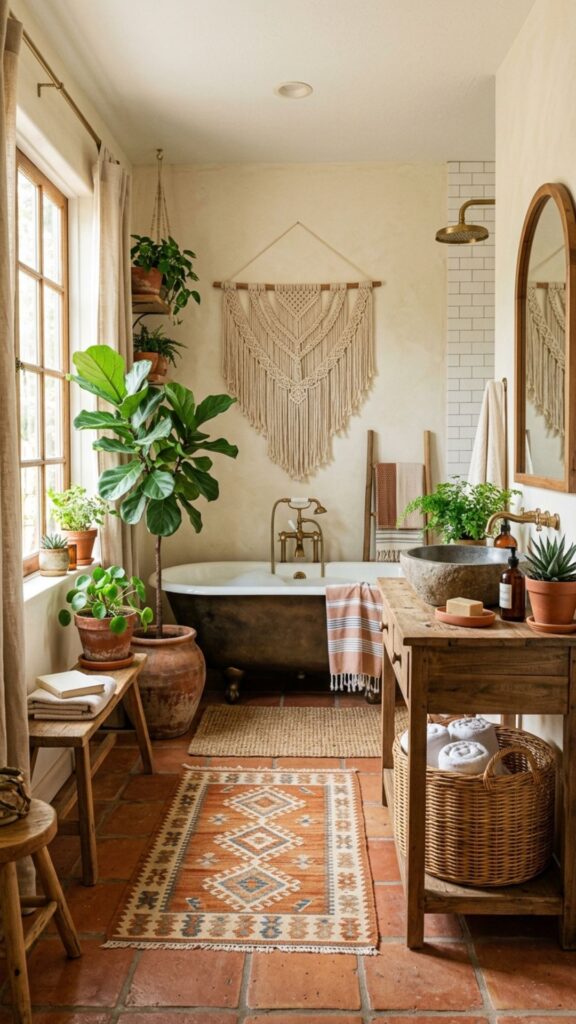
Terracotta brings warmth and an earthy, sun-baked feel to a bathroom. It’s grounding and natural, especially when balanced with a soft cream. This palette suits homes that lean toward Mediterranean or boho styles.
Use terracotta sparingly, perhaps on floor tile or a single accent wall, and let cream do the heavy lifting on the walls. Add clay pots, woven textures, and warm wood for a space that feels relaxed and inviting all year round.
10. Cool Mint and Pale Gray
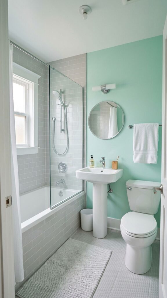
Mint green feels fresh and clean, like a breath of cool air. When you pair it with pale gray, the brightness calms down into something more sophisticated. The result is light, modern, and easy to live with.
This palette works especially well in smaller bathrooms, where the light tones make the space feel bigger. Use mint on the walls and gray for tile or grout. White fixtures keep everything crisp and clean.
11. Warm Greige and Black Accents
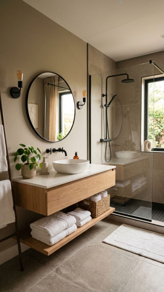
For a look that feels both modern and cozy, combine warm greige walls with sharp black accents. The contrast adds structure without coldness, and it photographs beautifully if you love sharing your home online.
Black shows up best in the small details: faucets, towel bars, a framed mirror, or window trim. Keep the rest of the palette soft so the black reads as intentional rather than heavy. This combination ages well and pairs with nearly any style.
12. Seafoam Green and Sandy Beige
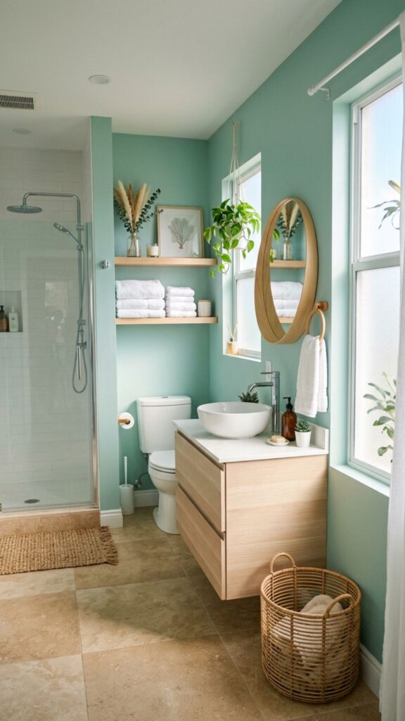
Seafoam green and sandy beige bring the coast right into your bathroom. The pairing feels breezy and relaxed, like a quiet morning by the water. It’s a soothing choice that never feels trendy or dated.
Use seafoam on the walls and beige in your tile or stone surfaces. Add natural fiber rugs, light wood, and a few shells or coral accents if you like a coastal touch. The palette stays calm and works in homes far from any beach.
13. Soft Gray and Blush Pink
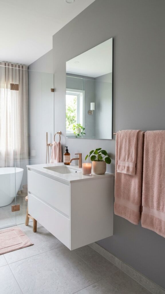
Gray and blush is a pairing that balances cool and warm beautifully. The gray keeps things grounded and modern, while the blush adds a soft, flattering glow. It’s gentle on the eyes and creates a peaceful mood.
Paint the walls a soft gray and bring blush in through towels, art, or a vanity. Rose gold hardware ties the two tones together and adds a hint of shine. This bathroom color palette suits anyone who wants subtle color with plenty of calm.
14. Olive Green and Warm Brown
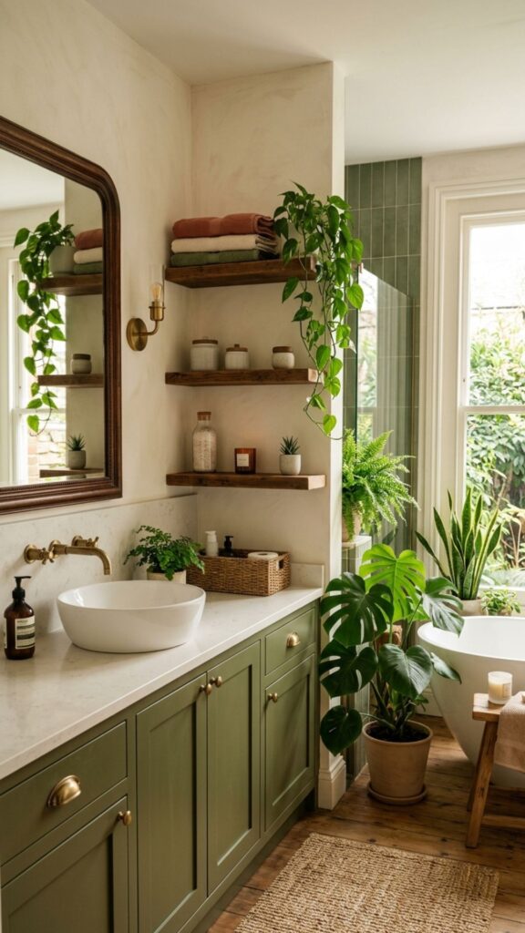
Olive green has a deep, earthy quality that feels rooted and serene. Paired with warm brown wood tones, it creates a nature-inspired retreat. The combination feels grounded, like stepping into a forest spa.
Use olive on the walls or cabinetry and let wood appear in shelving, frames, and accessories. Soft, warm lighting brings out the richness of both tones. Add greenery to echo the palette and the whole room feels alive.
15. Crisp White and Light Wood
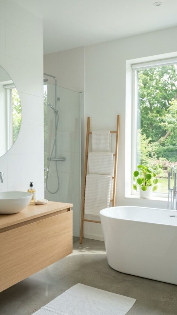
Sometimes simple is best. An all-white bathroom paired with light wood feels clean, bright, and endlessly calming. There’s a reason this look appears in spas around the world, it never overwhelms the senses.
Keep walls and tile white, then warm the space with light oak or ash wood. The contrast is gentle, and the room feels open and airy. Add plush white towels and a single plant for a touch of life.
16. Slate Blue and Soft Gray
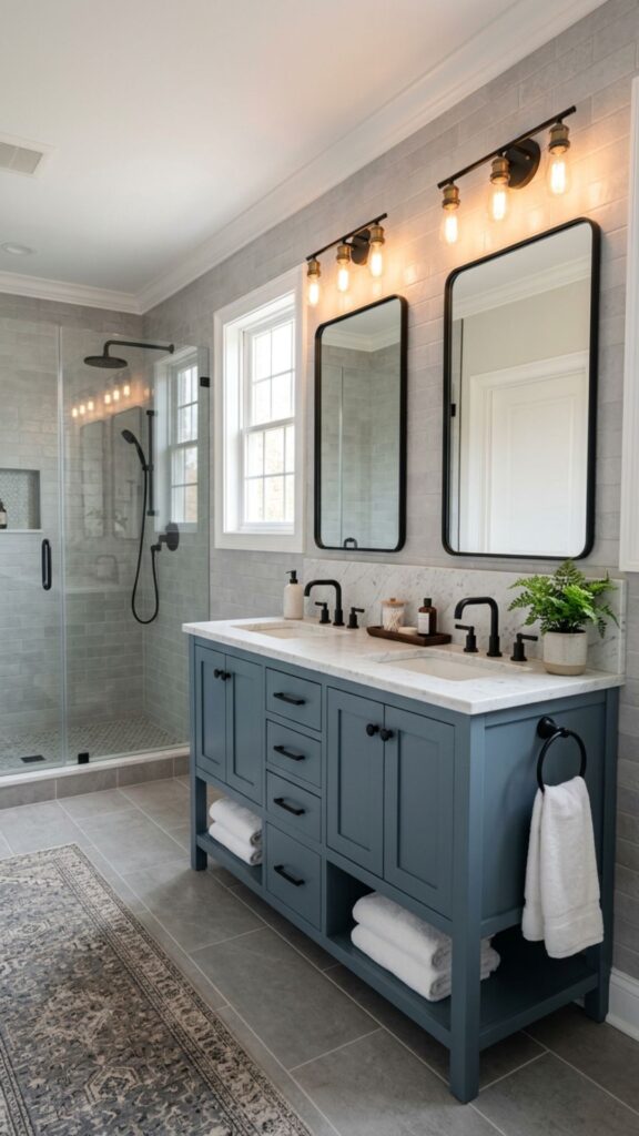
Slate blue sits between blue and gray, giving you the calm of water with the steadiness of stone. Paired with a soft gray, it creates a moody yet peaceful space that feels modern and refined.
Use slate blue on a vanity or feature wall and surround it with gray tile and white trim. Matte black or pewter hardware keeps the look cohesive. This palette suits anyone who wants depth without going fully dark.
17. Buttery Yellow and White
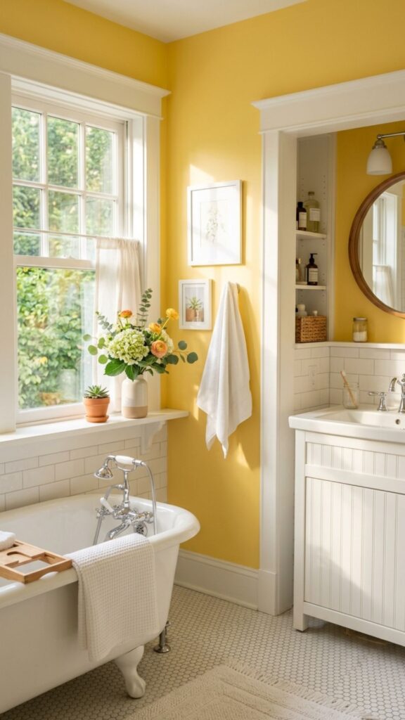
Yellow might seem bold for a bathroom, but a soft, buttery shade is warm and cheerful without being loud. Paired with crisp white, it brings sunshine into the room even on gray days.
Keep the yellow gentle and muted so it feels soothing rather than bright. Use it on the walls with plenty of white tile and trim to balance it out. Natural light makes this palette glow, turning your morning routine into something a little brighter.
18. Mushroom Taupe and Ivory
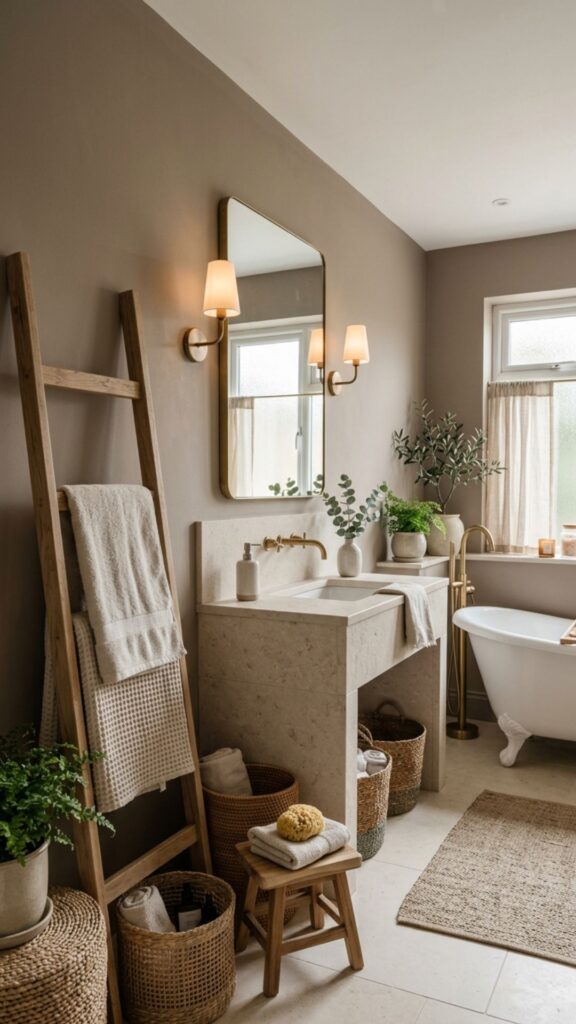
Mushroom taupe is a soft, complex neutral with hints of gray, brown, and purple. It feels rich and grounding, especially when paired with a clean ivory. Together they create a calm, layered look that never feels flat.
Use taupe on the walls and ivory for tile, trim, and linens. Add texture through stone, wood, and woven details. This bathroom color palette suits people who love neutrals but want something with a little more depth.
19. Pale Aqua and White Marble
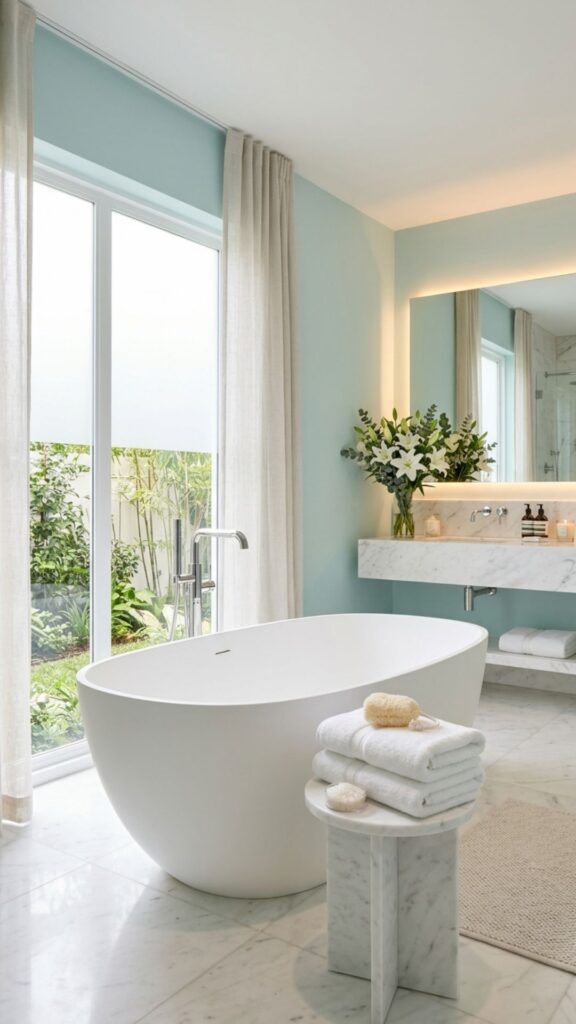
Pale aqua brings the calm of clear water, and when it meets white marble, the effect is pure luxury. The cool tones feel refreshing and clean, while the marble adds a sense of timeless elegance.
Use aqua on the walls and let marble shine in countertops or shower surrounds. Chrome or polished nickel fixtures keep the look crisp and bright. This combination feels like a high-end spa, perfect for soaking away a long day.
Bringing Your Spa Bathroom to Life
The right bathroom color palette does more than look good. It sets a mood, calms your mind, and turns an everyday room into a place you actually want to spend time. From soft sage and pale blue to deep navy and earthy terracotta, every option here can help you build the spa feeling you’re after.
Start by choosing one palette that speaks to you, then test paint samples on your walls before committing. Notice how the colors shift in morning and evening light. Once you’ve found your match, layer in towels, plants, and natural textures to complete the look.
Ready to create your own spa retreat? Pick your favorite palette from this list, grab a few sample swatches this weekend, and start transforming your bathroom into the calming escape you deserve.
What is the best color palette for a small bathroom?
Light, cool colors work best in small bathrooms. Pale blue, soft white, mint green, and light gray reflect more light and make the space feel larger. Pairing one light color with white trim keeps the room open and airy.
What colors make a bathroom feel like a spa?
Soft, muted tones create the most spa-like feel. Sage green, pale blue, warm beige, and soft gray are top choices because they calm the senses. Adding natural materials like wood and stone enhances the effect.
Should bathroom walls be lighter or darker than the tiles?
There’s no strict rule, but lighter walls with similar-toned tiles create a calm, cohesive look. If you want contrast, a darker accent wall paired with light tile adds depth without overwhelming a small space.
How many colors should I use in a bathroom color palette?
Stick to two or three colors for a balanced, restful result. Choose one main color for the walls, one supporting neutral, and one accent for fixtures or details. Too many colors can make even a large bathroom feel busy.
Are dark colors a good idea in bathrooms?
Yes, when balanced correctly. Dark tones like charcoal or navy add drama and richness, but they work best alongside plenty of white or light wood. Good lighting is essential to keep a dark bathroom from feeling cramped.