Color is one of the fastest ways to transform a dining room from forgettable to genuinely impressive. The right shade on your walls — or even just on your ceiling, trim, or an accent piece — can make a space feel warmer, more dramatic, or quietly sophisticated without a single piece of new furniture.
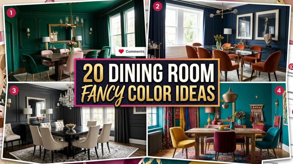
This guide covers 20 dining room fancy color ideas that work across different home styles, budgets, and lighting conditions.
Whether you’re starting from scratch or refreshing a room that feels a little flat, you’ll find specific, practical suggestions here backed by real interior design principles. Each idea includes guidance on how to apply it so you can make confident choices rather than just guessing at the paint store.
1. Deep Navy Blue for a Bold, Timeless Statement
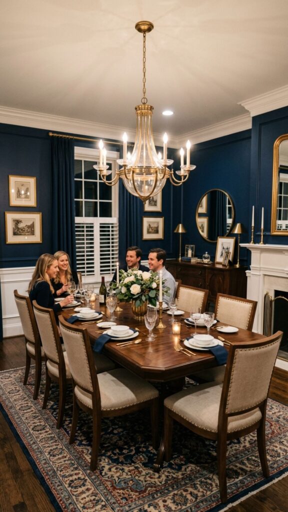
Navy blue is one of the most elegant colors you can bring into a dining room. It reads as both rich and grounded — commanding without being aggressive. On all four walls, it creates the kind of dramatic, enveloping atmosphere that makes dinners feel like occasions. Pair it with brass hardware, white trim, and warm wood furniture to keep it from feeling cold.
If four navy walls feel like too much of a commitment, try it on a single accent wall behind your buffet or sideboard. That single move shifts the entire energy of the room and gives you a taste of how the color performs in your specific lighting before you go further.
2. Warm Burgundy for a Sophisticated, Intimate Feel
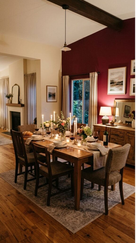
Burgundy and deep wine tones have long been associated with fine dining — and for good reason. They create warmth and intimacy without relying on heavy textures or expensive finishes. A single burgundy wall in a dining room instantly draws the eye and anchors the space in a way that feels deliberate and refined.
Pair it with cream or off-white on the remaining walls so the room doesn’t read as too dark. Burgundy works especially well in rooms with warm-toned hardwood floors and candlelit table settings — the color seems to glow when the lighting is soft and low.
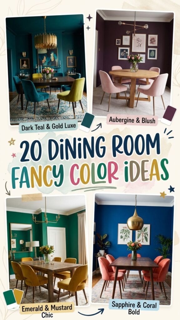
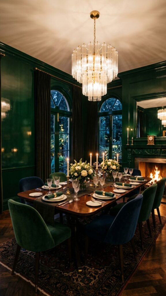
3. Forest Green for an Earthy, Elevated Look
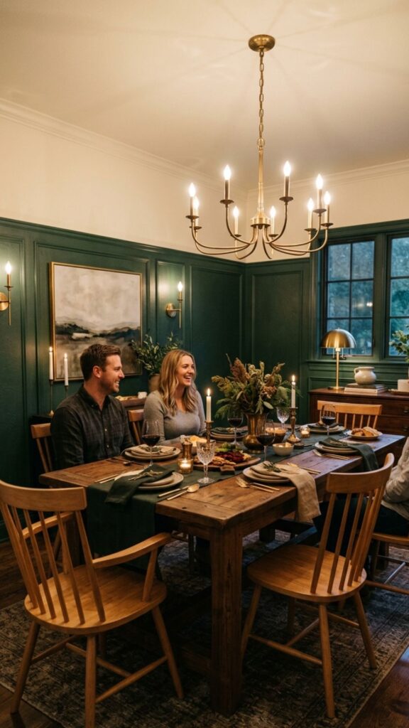
Deep forest green brings the outside in while still feeling genuinely upscale. It’s one of the most versatile fancy dining room colors available right now — equally at home in a traditional setting with crown molding and in a more modern room with clean lines and minimal furniture.
Apply it on all walls for a moody, immersive effect, or use it on the lower half of the wall with a contrasting cream above a chair rail for a more classic two-tone approach. Either way, pair forest green with natural wood tones, aged brass, or matte black fixtures for the best result.
4. Charcoal Gray for a Modern, Upscale Atmosphere
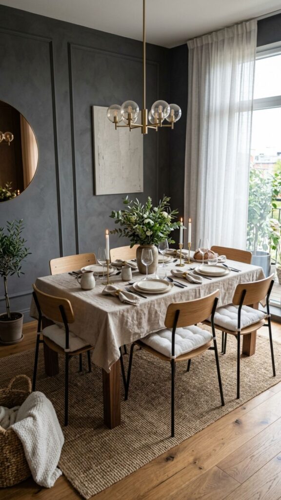
Charcoal gray is often underestimated, but in a dining room, it can look genuinely luxurious. The key is choosing a charcoal with a warm undertone rather than a blue-gray — warm charcoals feel cozy and grounded, while cool gray can read as stark or impersonal in a space meant for gathering.
Use charcoal on the walls and keep your textiles and tableware in soft whites, ivory, and natural linen. This contrast makes the room feel polished without requiring much in the way of accessories or art.
5. Rich Terracotta for a Warm, Gathered Ambiance
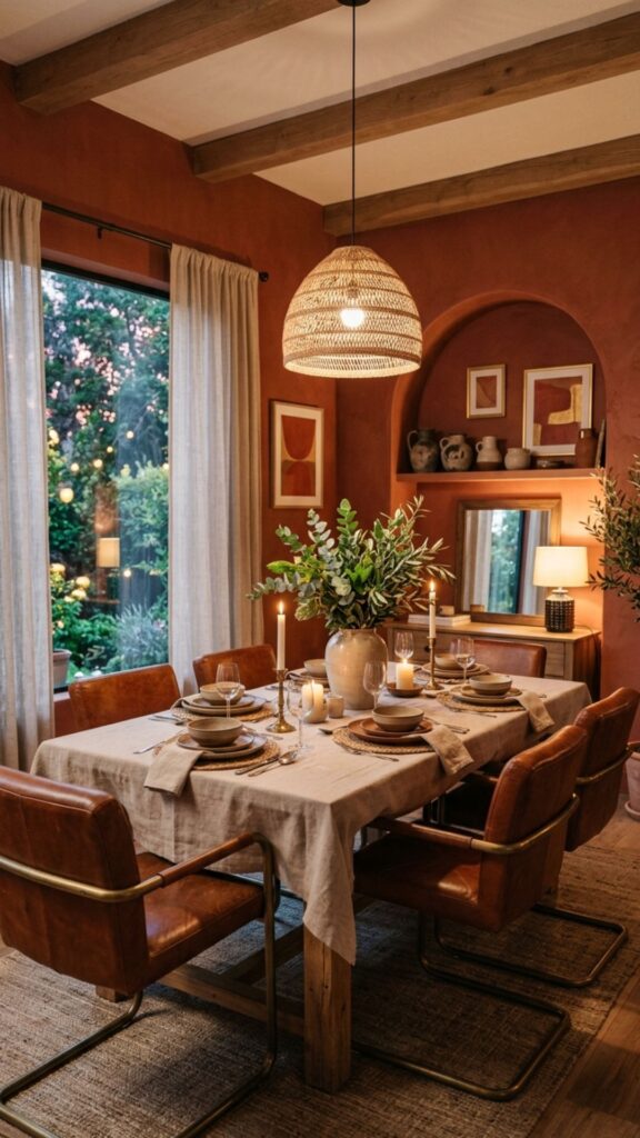
Terracotta is having a well-deserved moment in interior design, and it works beautifully in dining rooms because of the natural warmth it lends to evening meals. The orange-clay undertones reflect candlelight in a flattering way that almost no other color can match.
Choose a deeper, more saturated terracotta rather than a pale blush version if you want to bring true elegance to the space. Style it with natural linen, worn leather, wood furniture in warm brown tones, and greenery — the combination feels sophisticated and deeply welcoming at the same time.
6. Dusty Mauve for a Quiet, Romantic Elegance
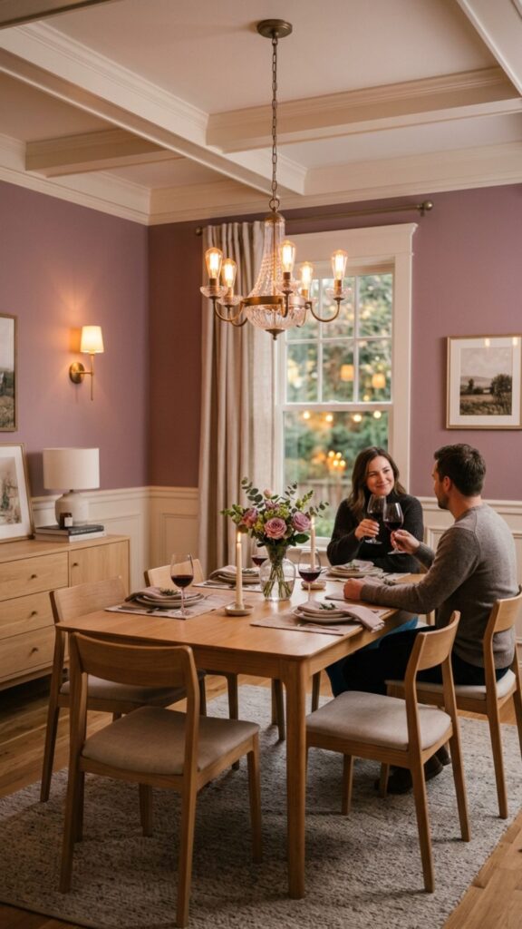
Mauve sits between pink and gray in a way that feels grown-up and refined rather than overtly feminine. A dusty, muted mauve on dining room walls has a hushed, romantic quality — it’s subtle enough that most guests won’t immediately name the color, but they’ll feel its effect.
Pair mauve with warm white trim, soft lighting, and light wood or antique-finish furniture. Avoid pairing it with anything too bright or saturated, which can make the mauve look washed out rather than intentional.
7. Midnight Black for a Dramatic, High-Impact Space
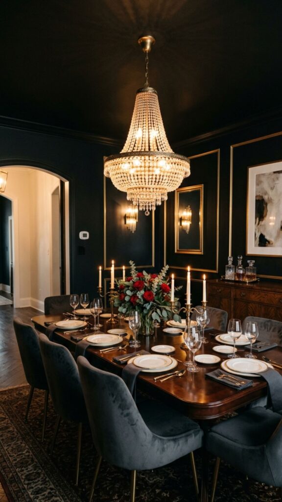
A black dining room sounds bold, but it’s one of the most striking and photogenic choices available for a fancy dining room color scheme. In a room with good lighting — a statement chandelier, wall sconces, or generous natural light — black walls recede and let your furniture, tableware, and people become the visual focus.
Don’t limit black to just the walls. A black ceiling combined with black walls creates a fully immersive space that feels like stepping into a private club. Use this approach in rooms with at least one strong light source to prevent the space from feeling oppressive.
8. Sapphire Blue for a Jewel-Toned Vibrancy
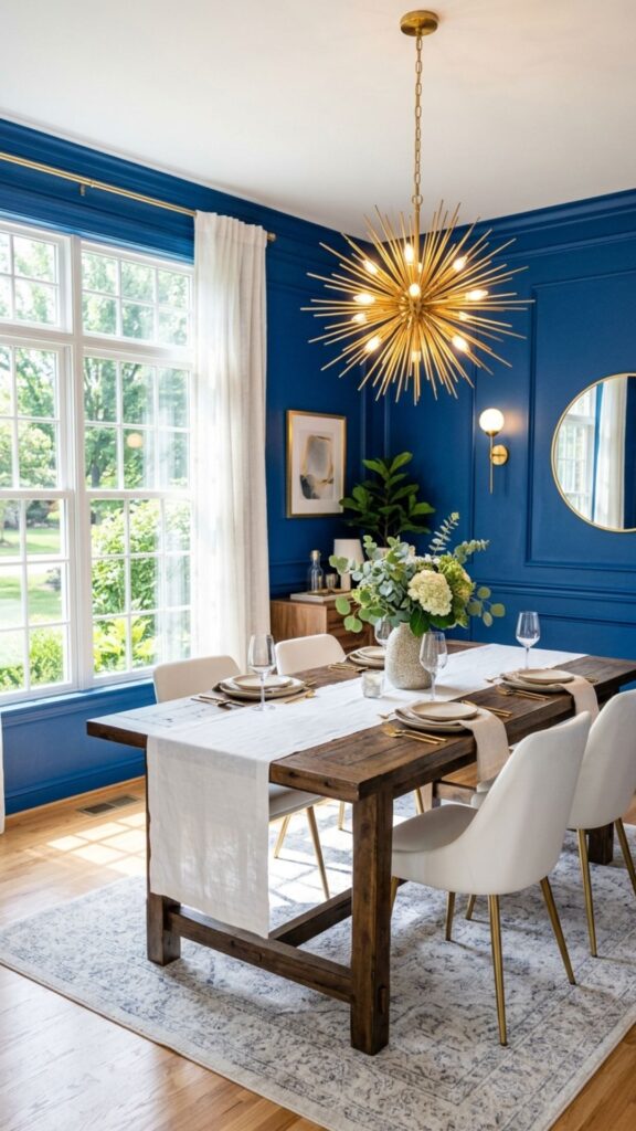
Where navy is deep and classic, sapphire brings a brighter, more energetic quality while still reading as elegant. It’s a jewel-toned color that works particularly well in dining rooms that receive lots of natural light, since the brightness of the shade responds well to sunlight and creates a vivid, lively atmosphere.
Pair sapphire walls with white or cream upholstery on dining chairs, gold or brass light fixtures, and a simple white table runner. The color itself does most of the decorative work, so keep your furnishings clean and relatively restrained.
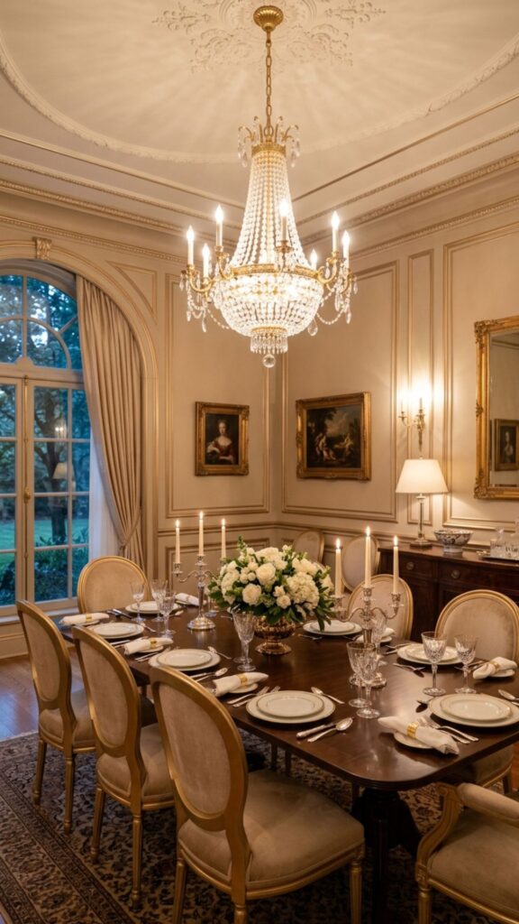
9. Warm Ivory for an Understated, Refined Elegance
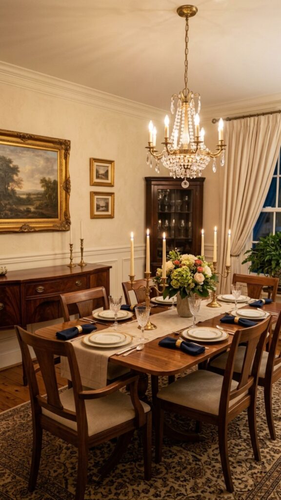
Not every fancy dining room needs a saturated or dramatic color. Warm ivory — a step softer than pure white, with yellow or pink undertones — creates an atmosphere of refined simplicity that lets high-quality furniture and textiles carry the room.
Choose an ivory with a clear warm undertone rather than a cold or greenish white, which can feel clinical in a dining space. Layer ivory walls with gold accents, white linen, natural wood, and soft ambient lighting for a result that feels timeless rather than trendy.
10. Plum and Eggplant for a Regal, Luxurious Dining Room
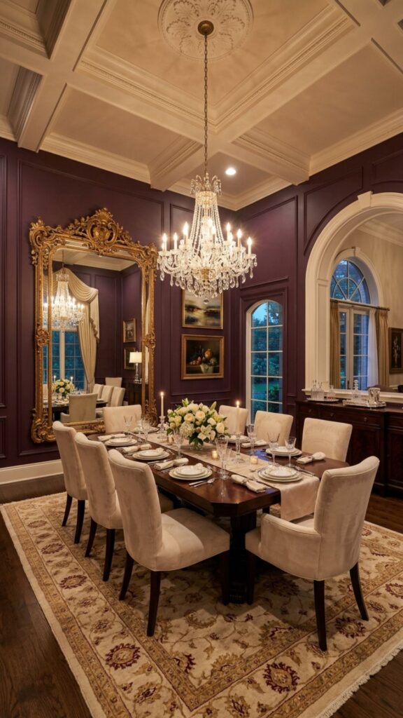
Deep plum and eggplant tones bring unambiguous luxury to a dining room. These colors work especially well in rooms with higher ceilings, since the depth of the shade can feel intense in a smaller, low-ceilinged space. Used well, they create a setting that feels genuinely regal.
Balance eggplant walls with lighter furniture — cream, taupe, or soft gold upholstery — to prevent the room from feeling visually heavy. A large mirror hung opposite the main light source will help reflect light and keep the space from closing in on itself.
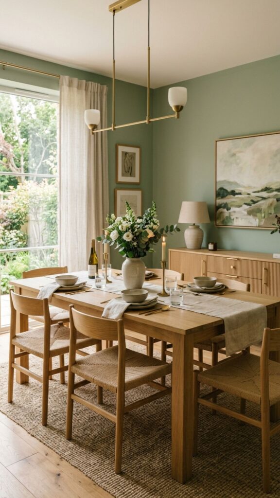
11. Sage Green for a Calm, Cultivated Atmosphere
Sage green is softer and lighter than forest green, giving a dining room a fresh, cultivated feel without the drama of a darker shade. It’s one of those colors that looks different at every hour of the day — warm and golden in morning light, cooler and more muted in the evening — which gives it an almost living quality.
Sage pairs well with white oak furniture, linen textiles, and matte brass or black hardware. It’s one of the most universally flattering fancy dining room colors because it works well with almost every natural light condition.
12. Bronze and Amber Tones for a Candlelit Warmth
Painting a dining room in a deep amber or bronze tone creates an effect similar to being bathed in candlelight all the time. These warm, golden-brown shades amplify the coziness of evening dining and make even ordinary meals feel slightly special.
Use this color in a dining room that gets moderate natural light during the day, so the warmth of the amber reads as intentional rather than dim. Pair with dark wood furniture, deep red or rust-toned textiles, and layered lighting for the full effect.
13. Slate Blue-Gray for a Polished, Contemporary Feel
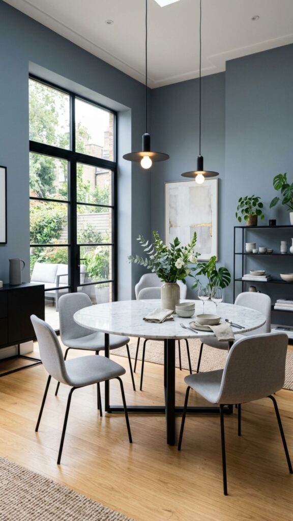
Slate — a blue with strong gray undertones — bridges the gap between cool and warm in a way that feels effortlessly polished. It has just enough color to feel intentional and just enough neutrality to work with almost any furniture style or wood tone.
Use slate on all four walls for a cohesive, calm dining atmosphere. Pair it with light gray or white upholstered chairs, natural stone or marble table accessories, and simple pendant lighting. This is a color that ages extremely well and doesn’t feel dated after a few years.
14. Deep Teal for an Opulent, Resort-Style Dining Room
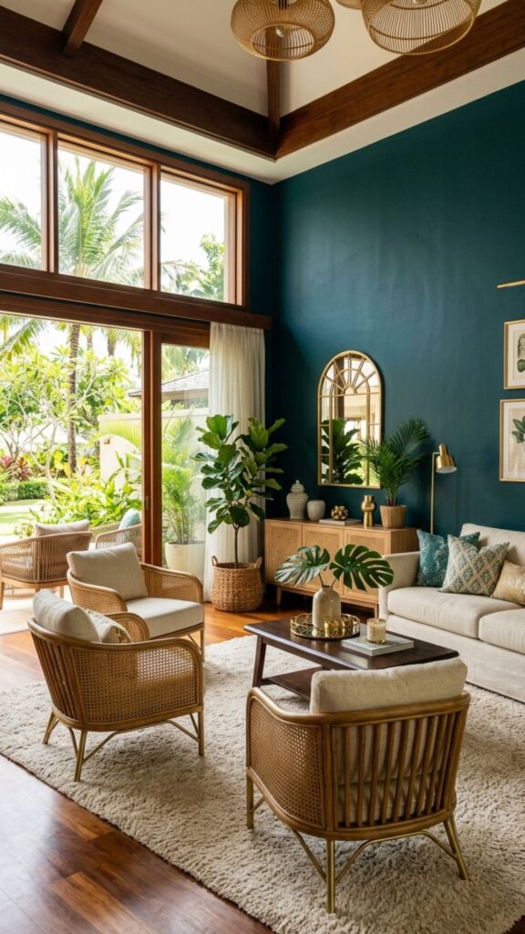
Deep teal sits between blue and green in a way that feels genuinely opulent. It has a slightly tropical richness that elevates a dining room without tipping into anything too casual or beachy — especially when paired with the right materials.
Use deep teal on the walls and layer in gold, rattan, and warm wood tones to balance the cool intensity of the color. Natural light makes teal walls look rich and luminous; evening light with warm bulbs gives it a deeper, moodier tone that’s perfect for dinner parties.
15. Champagne and Warm Gold Accents on Neutral Walls
Rather than painting the walls gold — which can easily tip into excess — use a warm champagne or greige wall color and layer in true gold through paint accents, trim details, or a painted ceiling. A gold or warm-metallic ceiling above a neutral dining room wall is a striking, unexpected design choice that reads as genuinely fancy without overwhelming the space.
This approach works well in formal dining rooms where you want the elegance to feel tonal and layered rather than statement-driven. Use it alongside white, cream, or warm taupe wall color for the most balanced effect.
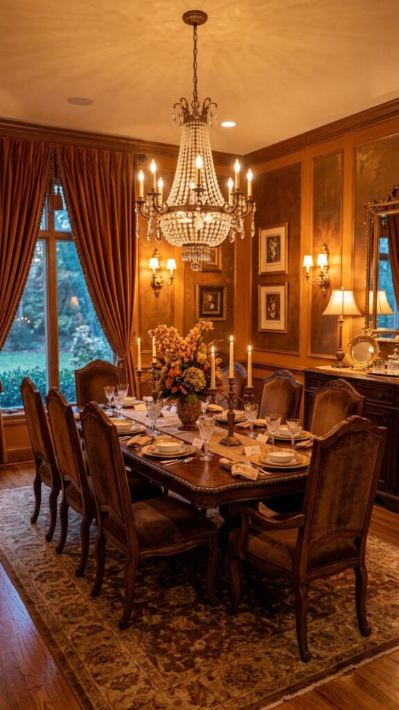
16. Dark Mocha Brown for a Grounded, Luxurious Feel
Deep chocolate and mocha brown tones bring a grounded, library-like elegance to a dining room. Brown is often overlooked as a wall color in favor of more obviously striking choices, but a well-chosen dark brown creates one of the coziest and most genuinely elegant dining environments possible.
Pair it with cream or ivory textiles, warm amber or brass lighting, and furniture in a contrasting lighter wood tone — white oak or natural maple both work well. The contrast between light furniture and dark walls keeps the room from feeling cave-like.
17. Soft Blush for a Modern Elegant Dining Space
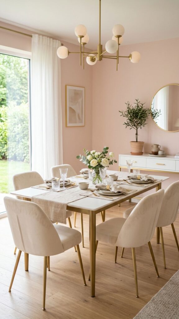
Pale blush pink — especially a version that leans more peach or antique rose than bubblegum — is genuinely sophisticated in a dining room context. It creates a soft, warm glow that flatters everyone at the table, which makes it not just a design choice but a practical one.
Choose a blush with warm, slightly dusty undertones rather than a cool, bright pink. Pair it with white furniture, gold hardware, and natural linen for a result that feels modern, editorial, and quietly luxurious.
18. Classic White With Architectural Detail
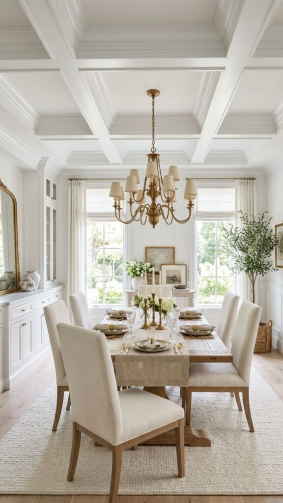
Sometimes the fanciest choice is a perfectly executed white room that lets architectural details — crown molding, wainscoting, coffered ceilings — do the heavy lifting. In a dining room with good bones, white makes every detail pop and gives the space a timeless, gallery-like quality.
The key is choosing the right white. Warm whites with cream or yellow undertones work better in dining rooms than stark, blue-toned whites, which can feel cold under artificial evening lighting. Layer in texture through textiles, natural wood, and warm metallics to keep the white from reading as flat.
19. Two-Tone Walls With a Chair Rail for Classic Elegance
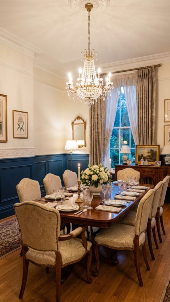
A two-tone paint treatment using a chair rail — a molding running horizontally at roughly chair height — is a time-tested approach to creating a fancy dining room color scheme. Typically, a deeper, richer color goes on the lower portion of the wall, and a lighter shade or white sits above the rail.
This approach gives you the visual weight and richness of a dark color without covering every inch of wall in it. Common pairings include navy below and soft white above, deep green below and cream above, or charcoal below and warm ivory above — all of which look polished and well-considered.
20. Glossy Paint Finish for a High-Sheen, Luxurious Effect
The color matters, but so does the finish. Applying almost any of the shades on this list in a high-gloss or satin finish rather than flat matte transforms the look entirely. Gloss reflects light, creates depth, and gives walls a lacquered quality that reads as genuinely luxurious.
This technique works especially well with deep, saturated colors — navy, black, forest green, eggplant — where the reflective surface amplifies the richness of the shade. Use a professional painter for gloss finishes if possible, since they require precise application to avoid visible brush marks and roller lines.
Make Your Dining Room Feel Like It Belongs in a Magazine
Choosing the right color is the single highest-impact change you can make in a dining room without moving a wall or replacing furniture. A well-chosen shade transforms the mood, the perceived size, and the overall sophistication of the space — and most of these ideas can be achieved in a single weekend.
Start with one color that genuinely excites you — not one that just feels safe. Pull a paint sample, tape it to the wall, and live with it for two days in different lighting conditions before committing. Once you choose, go confidently. The dining rooms that look the most impressive are the ones where someone made a real decision and followed through.
If this guide helped you find your direction, share it with someone redesigning their space — and take that first step toward the elegant dining room you’ve been picturing.
What is a fancy dining room color?
A fancy dining room color is one that creates a sense of elegance, sophistication, or deliberate style — typically through deep, saturated tones like navy, forest green, burgundy, or black, or through carefully executed neutrals like warm ivory, sage, or slate. The “fancy” quality comes as much from how the color is applied and paired as from the color itself.
What color makes a dining room look more elegant?
Deep, rich colors tend to read as the most elegant in dining rooms. Navy blue, forest green, charcoal, burgundy, and dark plum all create a sense of luxury and intention. Warm neutrals like ivory, champagne, and sage can also feel elegant when paired with quality furnishings and warm lighting.
How do I choose a paint color for my dining room?
Start by considering your lighting — both natural and artificial — since the same color can look very different in a north-facing room versus a south-facing one. Pull two or three paint samples, apply large swatches directly on the wall, and evaluate them at different times of day. Also consider your existing furniture and flooring tones to ensure the wall color works with what you already have.
Can I use dark colors in a small dining room?
Yes. Dark colors in a small dining room can actually make the space feel more intentional and cozy rather than cramped — especially when paired with good lighting, mirrors, and lighter furniture. The key is to avoid also using heavy window treatments or dark flooring at the same time, which can compound the feeling of a low-light space.
What paint finish is best for a dining room?
Satin and eggshell finishes work well for most dining rooms — they have a slight sheen that reflects light without being as demanding as high gloss, and they’re easier to clean than flat matte. High-gloss finishes can look stunning in a fancy dining room setting but require careful, professional application for the best result.